
Most pre-launch landing pages flop because they try to do too much. Vague headlines, weak CTAs, a random list of features, maybe even a newsletter opt-in no one asked for.
The result? A pretty page that collects bounce rates instead of emails.
High-performing pre-launch pages are focused. They lead with clarity, show the product in a way that feels real and exciting, and make it easy for visitors to sign up. Everything on the page supports that one outcome: collecting emails from interested buyers.
You land, you get the value, you sign up. Done.
This guide breaks down what makes those pages work. You’ll see real-world examples from recent launches, specific strategies you can apply, and tools to help you build a page that feels credible, intentional, and worth clicking on.
By the end, you’ll be able to put together a high-converting pre-launch page that builds momentum before the real start.
[[cta2]]
Why Pre-Launch Pages Matter More Than You Think
A pre-launch landing page gives you more than a head start. It gives you control. Before anything is live, you already know who’s interested, what’s working, and how to drive traffic that actually converts.
Here’s what it unlocks:
- Collect qualified emails
Every visitor who signs up is a lead you can reach again without paying for another click. The earlier you start collecting, the more prepared you’ll be to turn interest into revenue when the time comes.
- Validate demand
If no one signs up, that’s useful too. A pre-launch page shows if your offer is resonating. You’ll learn what works, what doesn’t, and what needs adjusting before it’s too late.
- Build day-one momentum
Most successful launches start with a crowd that’s been warmed up and waiting. A strong email list means you don’t show up empty-handed when the campaign goes live.
If you’re figuring out how to start a Kickstarter or Indiegogo campaign, this is where things really begin. A pre-launch page helps you build that early momentum and learn what actually resonates before going live.
- Improve ad performance
Running ads during pre-launch helps warm up your audience ahead of time. When the product goes live, you’re reaching people who’ve already seen it before instead of starting from zero. That familiarity increases click-through rates, lowers acquisition costs, and makes your live campaigns far more efficient.
- Reduce risk
You don’t want to be guessing on launch day. A pre-launch page lets you test different headlines, incentives, and visuals before the stakes get high. It gives you data to work with.
- Prepare your messaging
You can use the pre-launch window to figure out what language gets clicks, what visuals resonate, and what incentives drive action. It’s like having a dry run before the spotlight hits.
- Increase ROI across the board
Email converts better than almost every other channel. It’s cheaper to retarget, easier to personalize, and more likely to lead to a sale. A great pre-launch page builds that engine early, so you’re not relying on hope later.
If you're looking through crowdfunding campaign examples to see what helped them promote their campaigns, most of them started with a page like this. Focused, testable, and built to collect intent.
The Anatomy of a High-Converting Pre-Launch Page
High-converting pre-launch pages are structured with intent. Every section supports one outcome: getting the visitor to sign up. The layout, copy, visuals, and incentives are all working together to create momentum toward that single action. Whether you’re building it yourself or working with crowdfunding consultants, this structure makes it easier to focus every element on sign-up conversion.
Here’s what shows up consistently on pages that perform well:
1. One goal, one CTA
Your page has one job: capture intent. That means no navigation bar, no outbound links, and no mixed calls to action like “Follow us on Instagram” or “Check out our blog.” The CTA button should appear above the fold and again after key sections. Same wording every time. This builds rhythm.
Common CTA language that works:
- “Join the Waitlist”
- “Get Early Access”
- “Reserve My Spot”
- “Unlock the Launch Deal”
If you’re running a referral program, save that ask for the thank-you page. Keep this page focused.
2. Clear value prop
The headline is doing heavy lifting. It needs to make three things instantly obvious:
- What the product is
- What problem it solves
- What’s in it for the reader
Avoid punchline copy or vague mission statements. Nobody’s signing up for “the future of connected living.” They’ll sign up for “Control every smart device from one app. Launching soon.”
If you’re struggling here, start with:
[Product] that [solves problem] for [target audience].
3. Clean, mobile-first layout
More than half your traffic will see the page once, on mobile, in 10 seconds or less. Build for that.
- One-column layout
- 16–20px body text
- CTA button always visible or easy to reach
- Avoid “above-the-fold only” thinking. People do scroll, but only if the first view earns it
Don’t cram in extra content. If it doesn’t support the CTA, it’s noise.
4. Visuals that do the selling
Words work better when visuals are pulling their weight.
- Product-based? Show the product in use, not floating on a blank background.
- Tech? Use short looping demos, animations, or a clean UI walkthrough.
- Not built yet? Use renders or lifestyle imagery to sell the feeling of the end result.
Avoid generic stock photos or cluttered collages. Clarity >>>>> volume.
5. Trust signals
When you're new, people look for signs you're real. Use whatever you've got:
- “Featured in” media logos
- Quote from a beta user
- Number of signups so far
- Countdown to launch date
- Partner logos, accelerator badges, or even a recognizable domain name
If you're running a Kickstarter or Indiegogo campaign, adding “Coming soon to [platform]” can build context and urgency.
Real Pre-Launch Page Examples (2023–2025)
There’s no shortage of landing page inspiration online, but most of it focuses on aesthetics, not performance. The examples below were chosen because they converted, drove actual traction, and followed the structure you’ve already seen: clear value, focused layout, strong incentive, and zero fluff. They also give you a shortcut through the usual crowdfunding research rabbit hole.
Let’s break down what worked.
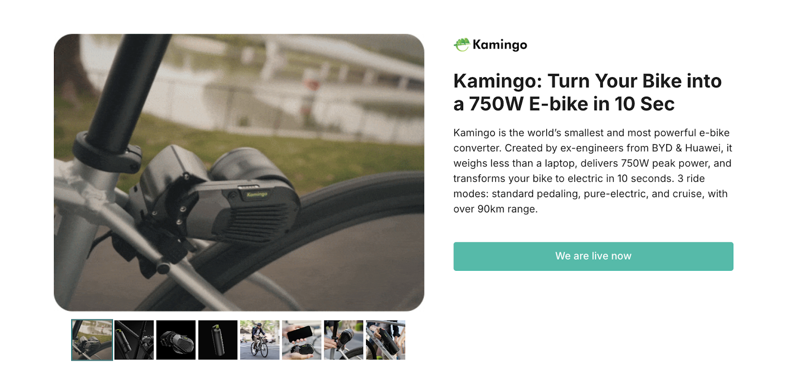
1. Kamingo
What it is: A snap-on e-bike conversion kit that turns any regular bike into a 750W e-bike in 10 seconds.
What works:
The headline is ultra-clear: “Turn Your Bike into a 750 W E-Bike in 10 Sec.” No fluff, all function. The page backs it up with strong visuals showing the converter in action: installing, riding, removing. It’s easy to understand and easy to want.
Key features are listed right under the fold: 90km range, 3 ride modes, only 2.3kg. They reinforce the pitch without overwhelming the reader. Trust signals like “engineered by ex-BYD and Huawei” and “1,000km tested” help establish credibility.
The CTA (“Live Now on Kickstarter”) is repeated in key spots and doesn’t compete with anything else on the page. While it doesn’t include viral loops or lead magnets, it doesn’t need to—the product alone pulls interest.
Takeaway:
Clarity and proof do the heavy lifting. If your product has a strong hook, show it in action and let the headline speak plainly.
2. Circular Ring 2
What it is: A titanium smart ring with medical-grade ECG, 140+ biomarkers, AI-driven health insights, and zero subscriptions.
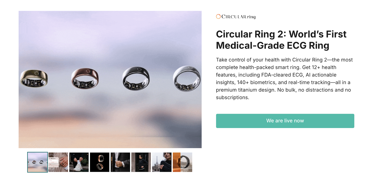
Why it works:
This page nails clarity, credibility, and conversion all at once. The headline gets straight to the point. “World’s First Medical-Grade ECG Ring” is a powerful hook that positions the product as both innovative and medically serious.
The visuals follow through: glossy ring renders paired with heartbeat visuals and app screenshots keep things grounded in function.
The copy balances feature-heavy info (12+ health metrics, AI assistant, no subscription fees) with digestible structure. It uses a large font, plenty of spacing, and an intuitive flow that keeps you scrolling.
Every section answers one unspoken question: “Why should I care?” Whether it's medical validation, battery life, or family health tracking, the benefits feel real and relevant.
The page also avoids the common trap of overcrowding. Each block does one job, fast. The CTA stays sticky and visible without being pushy.
Takeaway:
This is what product-first storytelling looks like. Show the tech, speak to real needs, and keep the path to sign-up friction-free.
3. Turbo Italy TAC-200R
What it is: A 4-in-1 portable air conditioner that cools, dehumidifies, purifies, and heats with no ducts or installations required.
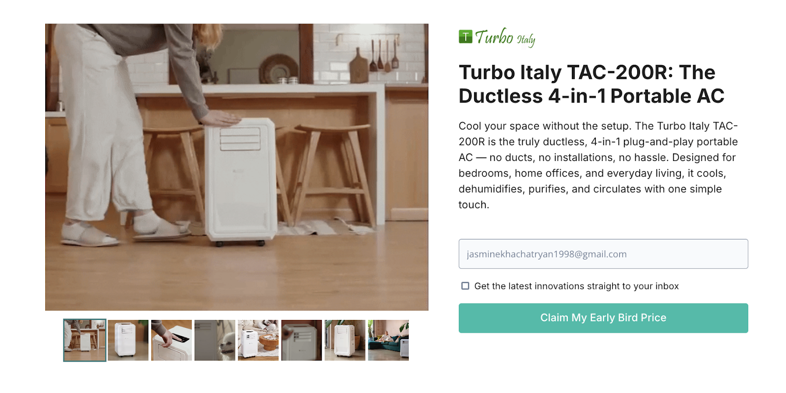
Why it works:
The hero message is simple and confident: “The Ductless 4-in-1 Portable AC.” It’s immediately clear who this is for: anyone looking for convenience without the usual AC setup hassle.
The core benefits are spelled out in one line: “No Ducts. No Installations. No Headache.” This gives the product a strong everyday appeal and tackles the most common objections up front.
Lifestyle photos dominate the layout, showing real indoor use across different scenarios like cooking, lounging, working out. The product looks easy to move and easy to live with.
Copy supports the visuals with phrases like “complete air solution” and “cooling without distractions,” keeping the tone accessible.
The page makes smart use of UI-focused shots too, like the touch panel and remote control. These help show off the smart features without needing heavy explanation.
Takeaway:
If your product removes friction, lead with that. This page is a clean example of benefit-first positioning backed by lifestyle visuals and user-friendly language.
4. Night Storm X1
What it is: A 4K night vision monocular with 1200m range, photo/video capture, and AI-optimized clarity.
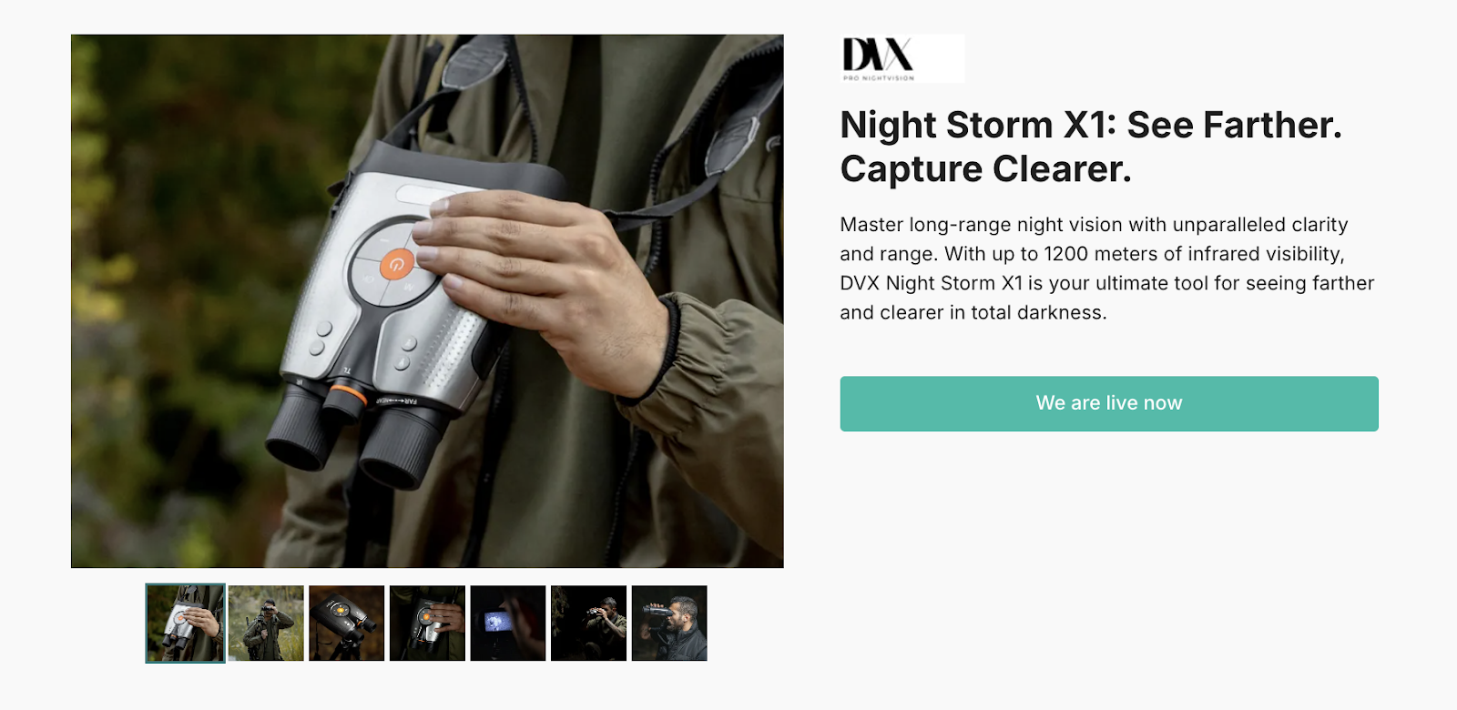
Why it works:
The headline is straight to the point: “See Farther, Capture Clearer.” It tees up the two biggest selling points, vision and clarity, without overselling. Right below, the hero visuals back it up: clean product angles, actual nighttime footage, and target distance shots that instantly show capability.
The page builds credibility with well-placed spec blocks (4K recording, 8× zoom, IR sensors, weatherproofing) and a visual rhythm that keeps you moving. Even the high-intensity language like “military-grade,” “capture movement in total darkness” feels earned.
What makes this page click is that it never wanders. It’s a gear-focused pitch made for a gear-focused audience. Clear imagery, quick feature hits, and a direct CTA all support that.
Takeaway:
When your product speaks to enthusiasts, clarity and performance cues win. Skip the lifestyle fluff and show exactly what your tech can do, even if it's pitch black.
5. FUELL Flluid
What it is: A high-end e-bike with up to 362 km range, automatic shifting, and app-based control.
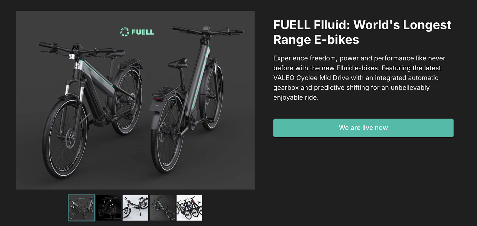
Why it works:
The headline lands the punch fast: “World’s Longest Range E-Bikes.” That’s all it needs to say. Everything else on the page reinforces that bold claim. From sleek renders to up-close shots of the tech, it gives the product room to feel premium without overexplaining.
Each feature gets its own visual-first section—automatic shifting, GPS theft protection, smart control via app—all laid out in a confident scroll. The tone feels built for a buyer who already knows what to look for in high-end mobility and wants validation, not hand-holding.
Instead of stacking paragraphs, it’s broken into sharp, focused highlights that keep you moving. The copy supports the value prop without trying too hard. The product’s appeal is in the engineering and design, and that’s exactly what this page lets shine.
Takeaway:
This is a masterclass in premium positioning. If your product’s biggest flex is performance, lead with that, then use structure and design to make every scroll feel like progress toward a “yes.”
6. Sentinel XR
What it is: Gaming and streaming glasses that give you a 180-inch 1080p display, anywhere you go.
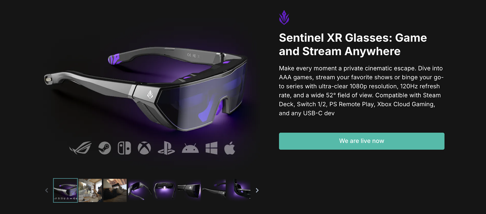
Why it works:
This page balances tech specs with experience. The headline and visual combo instantly deliver the product promise: “Your Own 180-Inch Display On The Go.” That’s the hook. It’s clear, bold, and easy to imagine.
It then stacks use cases: gaming on AAA titles, watching Netflix, playing PS5 or Xbox, all from a lightweight pair of glasses. The visuals support this flow perfectly—high-quality renders, lifestyle shots, and simple icon-based spec highlights like “120Hz refresh,” “1ms latency,” and “adaptive sync.” You don’t have to dig to get the point.
There’s also a smart shift from techy appeal to lifestyle: a woman watching a movie from bed, gaming from the couch, a clean remote play section. This moves the glasses from “cool device” to “daily upgrade.”
The sticky CTA stays visible, and the layout keeps things smooth and digestible. It’s a functional, emotionally-driven pitch wrapped in a sleek presentation.
Takeaway:
Pair specs with scenes. If your tech product solves multiple problems, show them through real-life moments, not spec dumps. Let users picture the upgrade.
7. YASHICA Vision Camera
What it is: A 4K night vision camera designed to capture full-color detail in pitch-black conditions, indoors or outdoors.
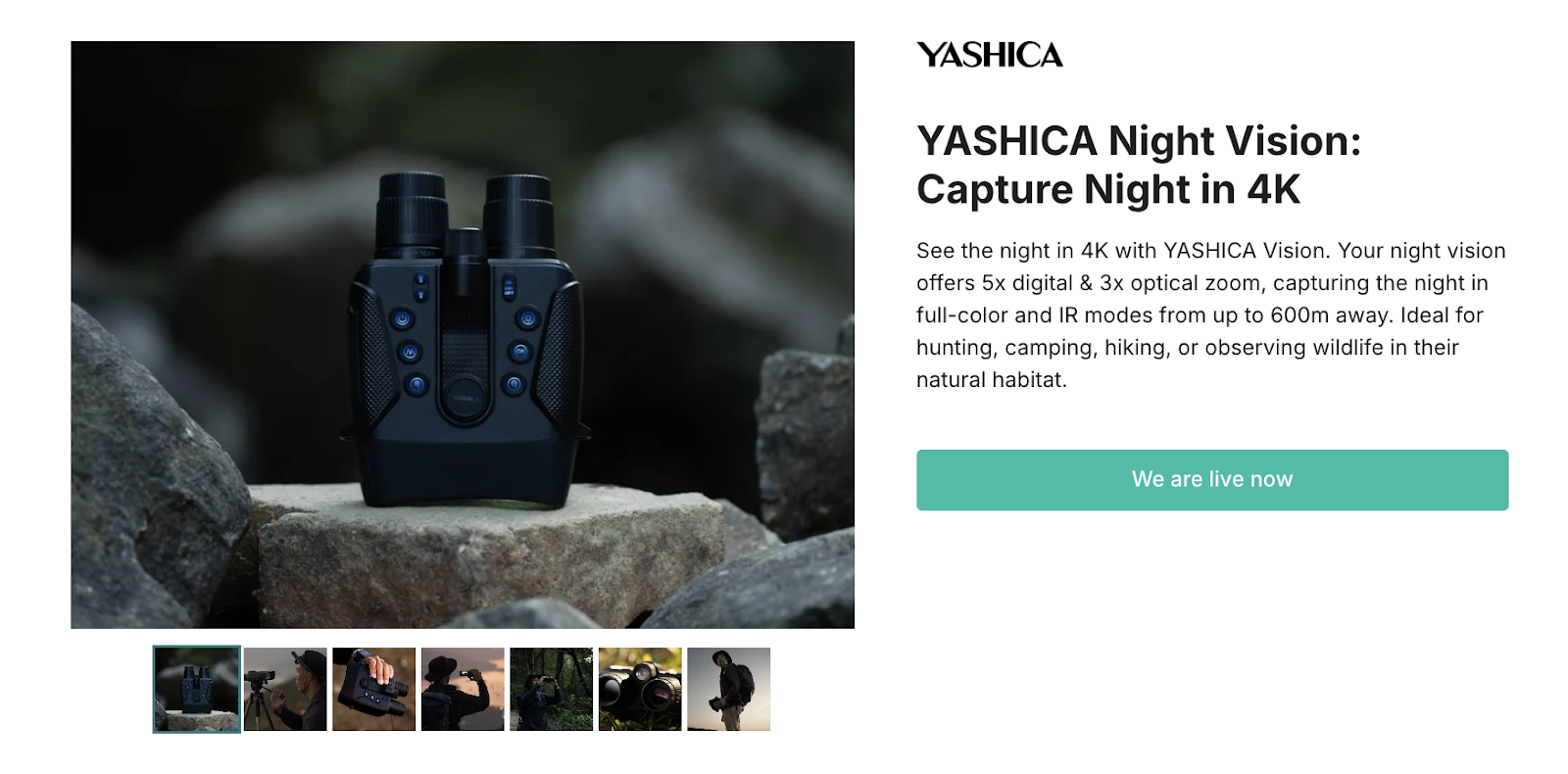
Why it works:
The value prop is clear and quick: “Capture Night in 4K.” Paired with a dramatic product shot and night-to-day visuals, the opening instantly communicates what the product does and who it’s for.
This page shines in proof. Side-by-side comparisons, surveillance-style imagery, and feature icons (color night vision, 4K, built-in screen) drive home the difference YASHICA claims to offer. It shows the tech in action.
The visuals speak directly to use cases: wildlife, security, exploration. There’s a clear through-line from problem to solution, with minimal friction. Specs like “full-color clarity in low-light” and “indoor IR optimization” are well-placed and support the core promise.
The CTA is consistent and doesn’t fight for attention, while the product video and hero use cases do most of the persuading.
Takeaway:
Show the problem your product solves. Visually. This page doesn’t try to dazzle with hype. It puts clarity and utility in the spotlight, and that’s what makes it compelling.
Conclusion
The best pre-launch pages are clear, intentional, and focused. They introduce the product in a way that feels real, get the message across quickly, and guide visitors toward one simple action. Signing up.
Strong visuals, structured layout, and a single clear CTA do the heavy lifting. Every element earns its place. Nothing is there for decoration or filler.
If you're building a pre-launch page, start with the core: what the product is, who it's for, and why it matters. Show the outcome, support it with proof, and make it easy to join. That’s how you build interest that lasts past the click.
[[cta2]]

.avif)

.avif)


.webp)