
You’re scrolling through your own Shopify store, trying to see it like a customer would. It functions. The product images are there. The buttons work. But the whole thing feels... generic.
You didn’t build a brand to blend in with every other store using the same theme and the same layout, with the same stock-looking fonts and filler banners. You want something cleaner. Smarter. Worth showing off.
That doesn’t mean rebuilding from scratch. It means knowing what to change and how to change it without breaking anything or getting buried in code.
In this guide, you’ll learn how to safely plan, set up, and roll out the theme customizations that actually shape how your store looks and feels. From layout fixes to subtle design tweaks, these updates help your storefront look more branded, more polished, and more intentional without a full redesign.
[[cta5]]
How to Safely Plan and Prepare Your Shopify Theme Customization
Before making visual or structural changes, set yourself up for a smooth customization process.
- Pick your path
You can either modify an existing theme or build one from scratch. If you’re looking to build a Shopify store from the ground up, a custom theme gives you full control. Otherwise, Theme Store options are quicker and more budget-friendly. Choose based on your goals, timeline, and tech comfort.
- Duplicate your theme
In your admin, go to Online Store > Themes > Actions > Duplicate. Always work on a backup or unpublished draft theme.
- Use a development store (if needed)
For larger changes or code-heavy edits, work in a dev store or test on an unpublished theme preview. It keeps your live site safe while you experiment.
- Know the rules
Some third-party themes limit what you can safely change. Check support policies before editing files, especially with premium themes. And unless you’re on Shopify Plus, checkout edits are mostly off-limits.
- Understand the structure
Here’s where your changes live:
- layout/ – page shell, includes head and footer
- templates/ – page-specific structure (e.g. product, collection)
- sections/ – customizable blocks
- snippets/ – reusable code fragments
- assets/ – CSS, JS, icons
- config/ – settings schema
- locales/ – translation files
Set up your workflow
For small tweaks, Shopify’s Theme Editor works fine. For deeper edits, use Shopify CLI or Theme Kit locally, and add version control with Git if you’re collaborating or want to track changes.
Essential Tools for Shopify Theme Development
Before you start tweaking buttons or writing Liquid, set yourself up with the right tools. The ones that keep your workflow smooth, your theme safe, and your sanity intact.
- Theme Editor
Shopify’s built-in editor lets you tweak fonts, colors, and layouts with no code. Use it to preview templates, reorder sections, and test on mobile before publishing. Ideal for light edits.
- Shopify CLI
The go-to tool for developers. Set up local development, live preview your edits, and push changes to Shopify with a few commands. It’s fast, flexible, and built for deeper customizations.
- Code Editor (like VS Code)
A proper IDE gives you Liquid syntax highlighting, file search, and Git integration. Add the Theme Check extension to catch errors before they break your layout.
- Git + GitHub Integration
Track changes, roll back edits, and collaborate safely. Shopify’s GitHub integration syncs your live theme with your repo, so every change is versioned and reversible.
- Browser DevTools
Use Chrome or Firefox DevTools to test CSS changes, simulate screen sizes, and debug layout issues in real time.
- Docs & Community
Bookmark Shopify.dev and the Shopify Help Center. Forums like r/shopify and Stack Overflow are great for quick fixes and best practices.
How to Customize Each Part of Your Shopify Theme
Each part of your store plays a role in how it looks and feels. Let’s walk through the main sections you can customize to make everything cleaner, clearer, and more on-brand.
1. Layout, Header, and Navigation Customization
Your layout, header, and navigation shape how people move through your store. A clean, well-structured setup builds trust and helps shoppers find what they need faster.
Header Setup
Most Shopify themes let you customize the header using the Theme Editor. You can upload a logo, tweak the size, change background colors, and toggle options like sticky headers or announcement bars. For advanced tweaks (like adding icons or rearranging layout), head to sections/header.liquid in the code.
Navigation Menus
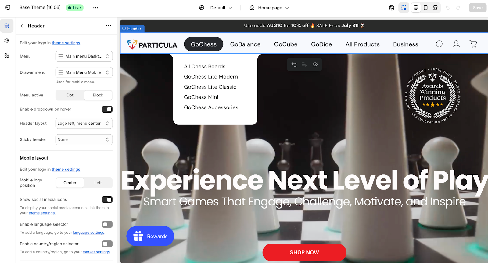
Your actual menu items are managed in Online Store > Navigation, but how they appear depends on the theme. Most support dropdowns. If you want a mega menu (great for stores with lots of categories), you can:
- Check if your theme includes a mega menu option
- Build one with HTML/CSS in the header section
- Use an app or third-party library that adds mega menus without coding
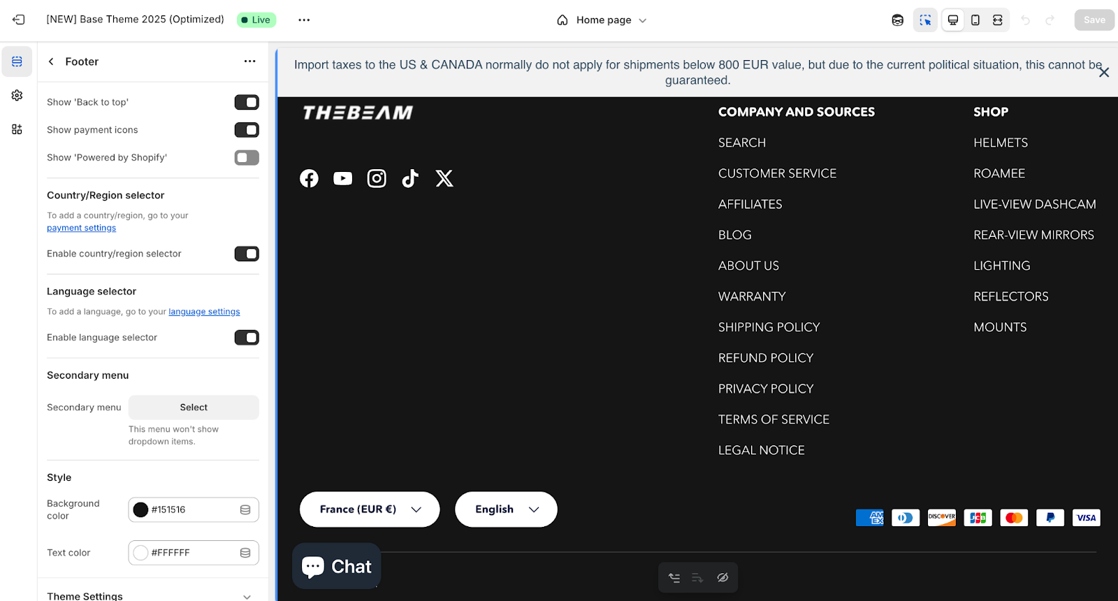
Footer Setup
The footer works similarly. Use the Theme Editor to add or remove blocks like quick links, newsletter signups, or social media icons. If you want to add trust badges, extra columns, or embedded forms, edit sections/footer.liquid.
Layout File (theme.liquid)
This file holds your global structure, including the <head> (for scripts, meta tags, fonts) and <body> with header, footer, and page content. It’s also where you’d insert analytics or chat widgets before </body>.
Tips for Layout & Navigation:
- Keep it clear: Use logical categories and avoid clutter. Mega menus or structured footers can help organize large catalogs.
- Make it responsive: Test everything on mobile. Header menus often switch to hamburger-style on smaller screens.
- Highlight active pages: Show visitors where they are by styling the active menu item. Many themes support this out of the box.
- Polish the branding: Use a crisp logo, consistent colors, and readable fonts across your layout to keep things cohesive.
2. Homepage Customization (Sections on the Front Page)
Your homepage is the welcome mat of your Shopify store. It’s usually packed with sections (hero banners, featured collections, testimonials, blogs) all working together to tell your brand’s story and drive clicks.
Using Sections and Blocks (No Code Needed)
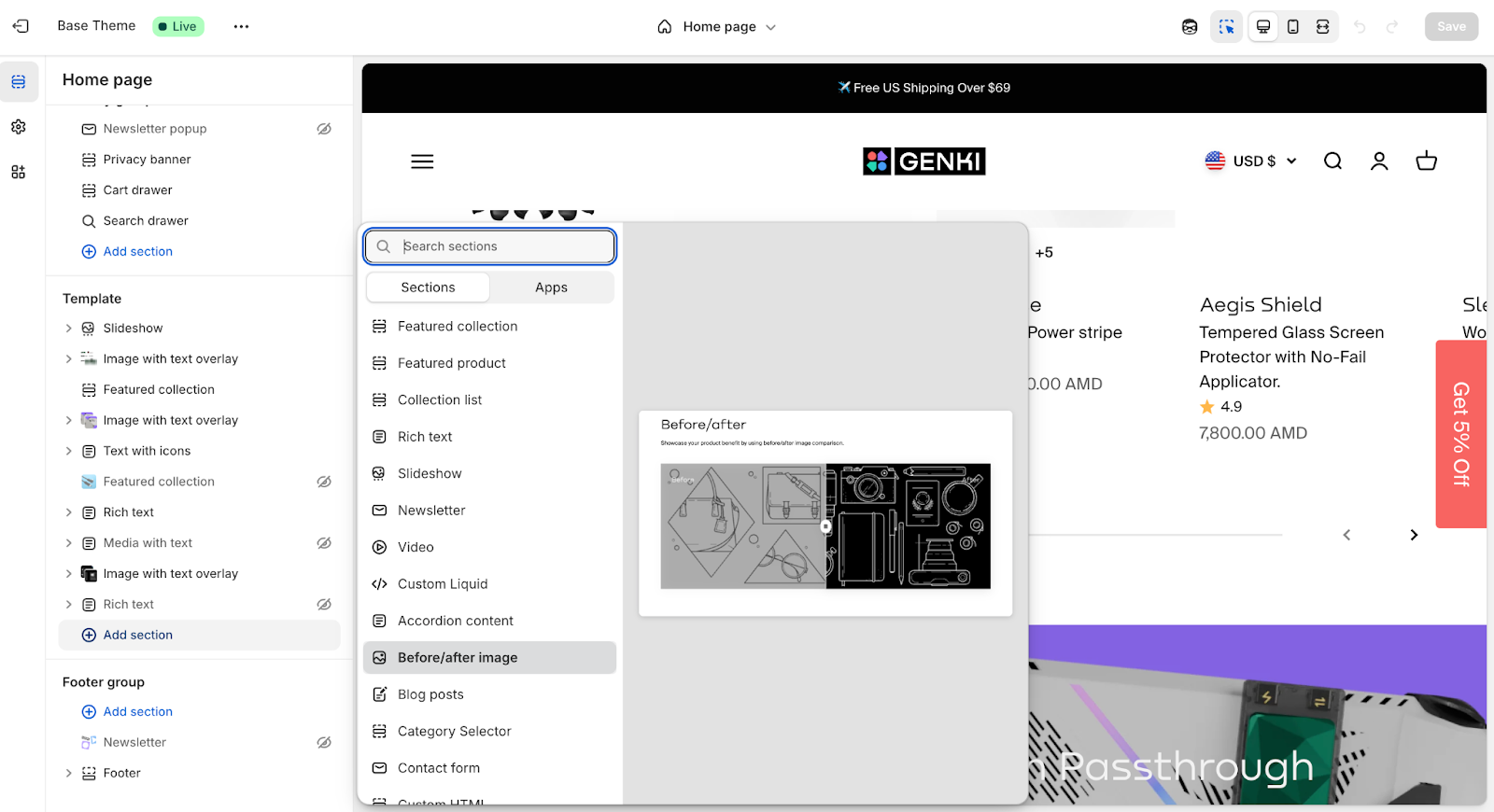
In the Theme Editor, select “Home Page” from the top dropdown. From there:
- Click “Add section” to choose from pre-built options like slideshows, featured products, image banners, etc.
- Drag and drop sections to reorder them.
- Use built-in settings to change images, text, buttons, and colors.
- Add or remove blocks inside a section (like extra links in the footer or images in a gallery).
No code, no stress. Save and preview your layout on desktop and mobile.
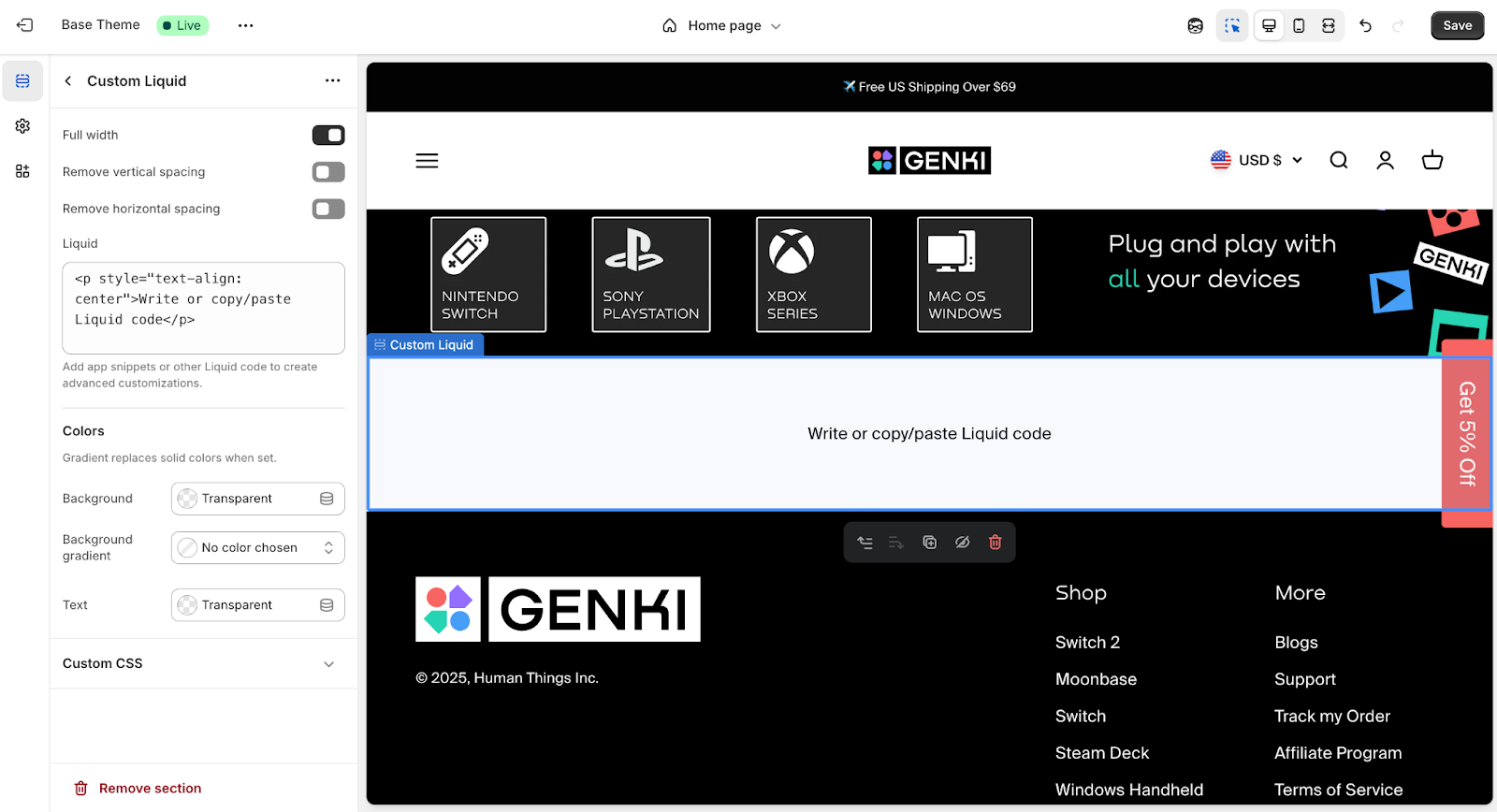
Creating Custom Sections (With Code)
Want something that your theme doesn’t offer? You can build your own:
- Create a new .liquid file in the Sections folder (e.g., featured-blog.liquid).
- Add a schema at the bottom to define what content can be added in the editor.
- In the Liquid markup, structure the HTML and loop in dynamic content (like latest blog posts or promo banners).
- Your custom section will now appear in the “Add section” list inside the Theme Editor.
You can also edit templates/index.json to control which sections appear by default on the homepage. This is useful if you’re building a theme from scratch or want to define a preset layout.
Homepage Best Practices
- Start Strong: Use a bold hero image or banner that instantly communicates what you’re about.
- Guide Visitors: Feature top products or collections with sections like “Featured Collection” or “Product Recommendations.”
- Keep It Focused: Don’t clutter the homepage. Stick to what moves the customer forward.
- Check Mobile: Preview on mobile to make sure the stacked layout still flows well. Hide or resize large sections if needed.
- Use CTAs: Add clear buttons like “Shop Now” or “Explore Collection” throughout to move users deeper into the site.
3. Product Page Customization
Product pages are where decisions get made, so customizing them for clarity, trust, and ease of use is time well spent. You want to guide customers through the details without overwhelming them and give every product the best possible chance to convert.
Basic Customizations (No Code Required)
Start in the Theme Editor:
- Use the top dropdown to select Products > Default Product.
- In the sidebar, you’ll see all the blocks and sections that make up your product page like title, price, image gallery, description, and add-to-cart button.
- Many themes let you:
- Enable or disable elements like SKU, quantity selector, or dynamic checkout buttons.
- Rearrange blocks like description, reviews, or materials.
- Add new sections above or below the main product info like a lifestyle banner or a text block for shipping info.
You can get surprisingly far without touching any code, especially if your theme is built for Online Store 2.0.
Advanced Product Page Customizations (Code)
If you need more flexibility, head into the code.
Find the Template:
- Go to Online Store > Edit Code, then open product.json or product.liquid, depending on your theme.
- OS 2.0 themes use product.json to reference modular sections like main-product.liquid.
Customize the Layout:
- In Liquid templates, you can move the description above the form, change the gallery placement, or add new HTML blocks.
- In section files like main-product.liquid, you can adjust the order of internal blocks or wrap content in new containers.
Add Custom Content:
Want to show a custom message on all product pages? Add it directly to the section or template:
<div class="shipping-note">Free shipping on orders over $50</div>
- For per-product content, use metafields so you can change the message from the admin panel.
Add Custom Fields:
- Need to collect engraving text, notes, or uploads? Use line item properties. These are custom inputs inside the {% form 'product' %}.
- Shopify’s UI Elements Generator helps you create the code for common fields like:
- Text boxes
- Drop-downs
- File uploads (remember to add enctype="multipart/form-data" to the form).
Alternate Product Templates
Want different layouts for different products?
- In the Templates folder, click “Add new template”, choose “product,” and name it.
- Shopify will generate a new product.custom.json or .liquid file.
- Edit it freely: remove sections, add unique elements, or create an entirely different flow.
- Then assign the template in the Product admin panel via the Theme Template dropdown.
This is perfect for one-off products, limited editions, or landing page–style layouts.
Best Practices for Product Pages
- Prioritize Clarity: Price, title, and CTA should be obvious at a glance.
- Use High-Quality Media: Crisp images, video, or 3D models build trust and reduce returns.
- Guide with Trust Signals: Add review blocks, guarantees, icons, or FAQs to support buying decisions.
- Don’t Overcrowd: Use spacing and hierarchy to keep the page digestible.
- Always Test Mobile: Product pages often break with long titles, many variants, or zoom-heavy galleries. Stress-test every layout.
- Use Metafields for Flexibility: Store product-specific info (like ingredients or size charts) in metafields and surface them via Liquid.
4. Collection Page Customization
Collection pages help shoppers explore your catalog. A good layout makes discovery easy, and the right design choices can highlight promos, guide filtering, and keep everything feeling cohesive.
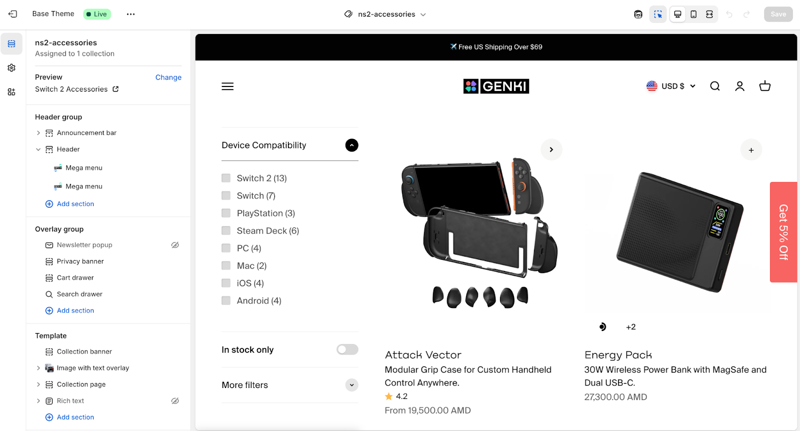
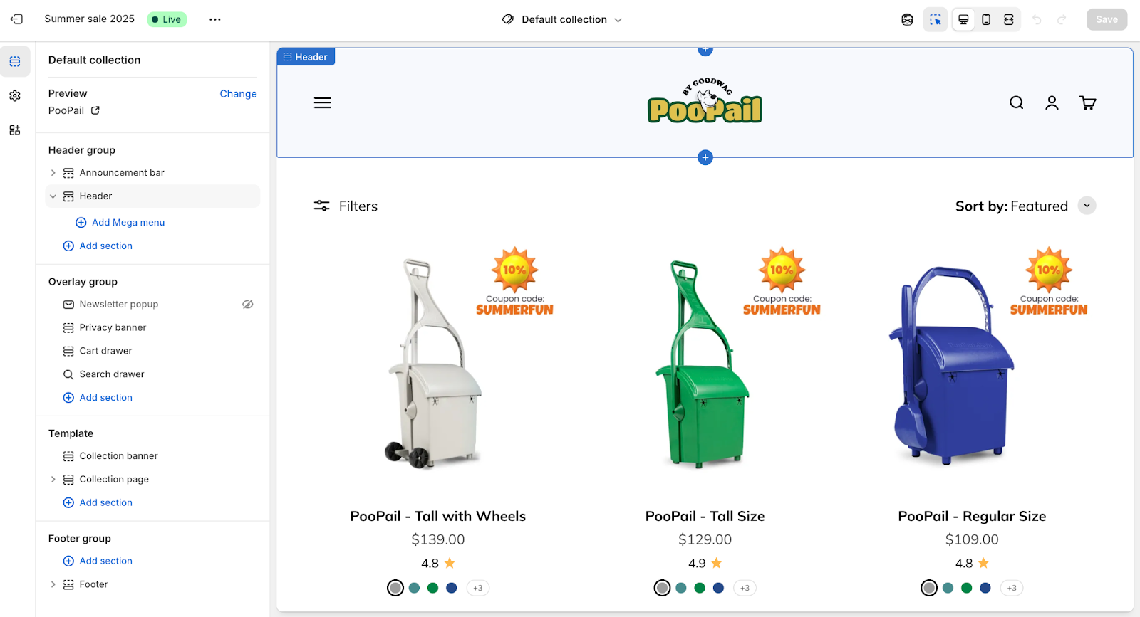
Collection Page Settings (No Code)
Open the Theme Editor and select Collections > Default Collection to customize the layout and elements.
What you can usually control:
- Product Grid Settings: Adjust the number of products per row (like 3 or 4 on desktop), toggle hover image, quick add-to-cart, stock indicators, and more.
- Collection Description: Choose to show it at the top or bottom. This is pulled from the collection’s admin description field.
- Filters & Sorting:
- Most modern themes support Shopify’s native filters when paired with the Search & Discovery app. You can turn on a sidebar or horizontal filter bar via theme settings.
- Sorting dropdowns (like price low to high) are often included by default. You can reposition or restyle them through the theme’s settings or code.
Collection Template Customization (Code)
To go further, edit collection.liquid or collection.json.
- Grid Customization:
- Themes usually include {% section 'main-collection-product-grid' %} or a {% for product in collection.products %} loop that pulls in snippets like product-card.liquid.
- To adjust the layout (e.g., 4 products per row), edit the grid CSS classes so product cards occupy 25% width on desktop.
- Add a Banner or Section:
- For seasonal or themed collections, add a hero image or styled title. You can create a custom section like collection-hero.liquid and include it above the product grid.
- For seasonal or themed collections, add a hero image or styled title. You can create a custom section like collection-hero.liquid and include it above the product grid.
- Collection-Specific Content:
- Use alternate collection templates if you want unique layouts per collection.
- Or add HTML to the collection description field (e.g., a promo message, embedded image) and style it via CSS.
- Filters and Sorting:
- If filters don’t appear by default, make sure your theme supports them and that you’ve configured filters in the Search & Discovery app.
- If your theme doesn’t support filtering, consider switching to an Online Store 2.0 theme or using a dedicated app.
- For sorting, most themes render a built-in dropdown. You can tweak its placement in the template or section file.
- Pagination or Infinite Scroll:
- Default pagination appears as page numbers or “next” links. You can edit how it looks via pagination.liquid.
- Infinite scroll or “load more” buttons require custom JavaScript or an app. If you go this route, test performance and user flow carefully.
Best Practices for Collection Pages
- Make Products Easy to Scan: Product cards should clearly show the name and price. Add review stars if you use a review app (you may need to embed a code snippet).
- Keep the Grid Neat: Use uniform image ratios or enable cropping to avoid a messy layout.
- Use the Description Strategically:
- For strong category page SEO, place a short description at the top for clarity or branding, and a longer, keyword-rich version at the bottom.
- Make sure the template renders {{ collection.description }} in both spots to support both UX and search visibility.
- Support Navigation: Show breadcrumbs and keep pagination or load buttons obvious so users don’t get lost.
5. Cart and Checkout Customization
The cart and checkout stages are where buying decisions get finalized, so smart customizations here can boost both trust and conversion. Shopify gives you full control over the cart but limits what you can touch in checkout unless you're on Shopify Plus.
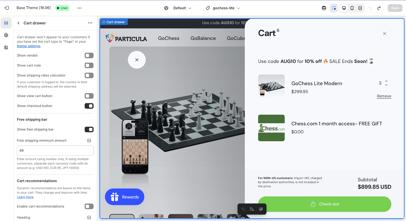
Cart Page (Theme Controlled)
Shopify themes handle both full-page carts and AJAX cart drawers (slide-ins).
To edit:
- Look for cart.liquid (full-page), cart-drawer.liquid, or similar snippets/sections in your theme files.
Common edits:
- Cart note field: To collect order notes, add <textarea name="note"> inside the cart form. Some themes let you toggle this on in the settings.
- Urgency or low-stock messages: Loop through cart.items and show alerts like “Only 2 left!” based on quantity or a metafield.
- Upsells and progress bars: Add a free shipping progress bar or a “Customers also bought” block with links. You’ll need Liquid, optional JS, or apps like ReConvert or Slide Cart.
- Trust badges: Add payment icons or satisfaction guarantees below the checkout button. These can be added directly in Liquid or uploaded as an image.
If you’re using an AJAX cart drawer, visual tweaks are handled with CSS. Adding features (like timers or upsells) requires JavaScript or an app integration.
Checkout Page
Standard Shopify plans (Basic, Shopify, Advanced) do not allow code-level checkout edits. You can’t access checkout.liquid, but you can update styling and branding:
- Go to Settings > Checkout
- Add your logo
- Set button and background colors
- Pick a font
These changes apply to all checkout steps, including contact, shipping, and payment pages. You can also toggle non-design settings like tipping, contact field options, or express checkout preferences, but structural changes are off-limits.
Shopify Plus stores get full access to:
- checkout.liquid for layout changes (e.g., trust badges, custom copy, reorder elements)
- Shopify Scripts (Script Editor app) to run dynamic logic like BOGO deals or payment-based discounts
- Checkout Extensions, Shopify’s newer system that adds upsells, survey fields, or custom messages through apps (instead of editing the checkout file directly). This is safer and works with Shop Pay.
Post-Purchase Page
Available to all plans via Shopify marketing apps, post-purchase pages sit between the checkout and thank-you page. They’re a great place to add upsells or feedback requests without altering the checkout itself.
Best Practices
- Test everything: Use a test gateway and preview flows on desktop and mobile.
- Keep it clean: Highlight totals, use clear CTAs, and reduce visual clutter.
- Extend cart functionality smartly: If you're not on Plus, apps are your best bet for anything advanced.
- Match your branding: Update colors, typography, and logos so the checkout feels consistent and trustworthy.
6. Typography and Color Customization (Design Settings)
Your store’s fonts and colors shape the customer experience. Most Shopify themes let you customize these design settings without touching code, though you can go further with CSS if needed.
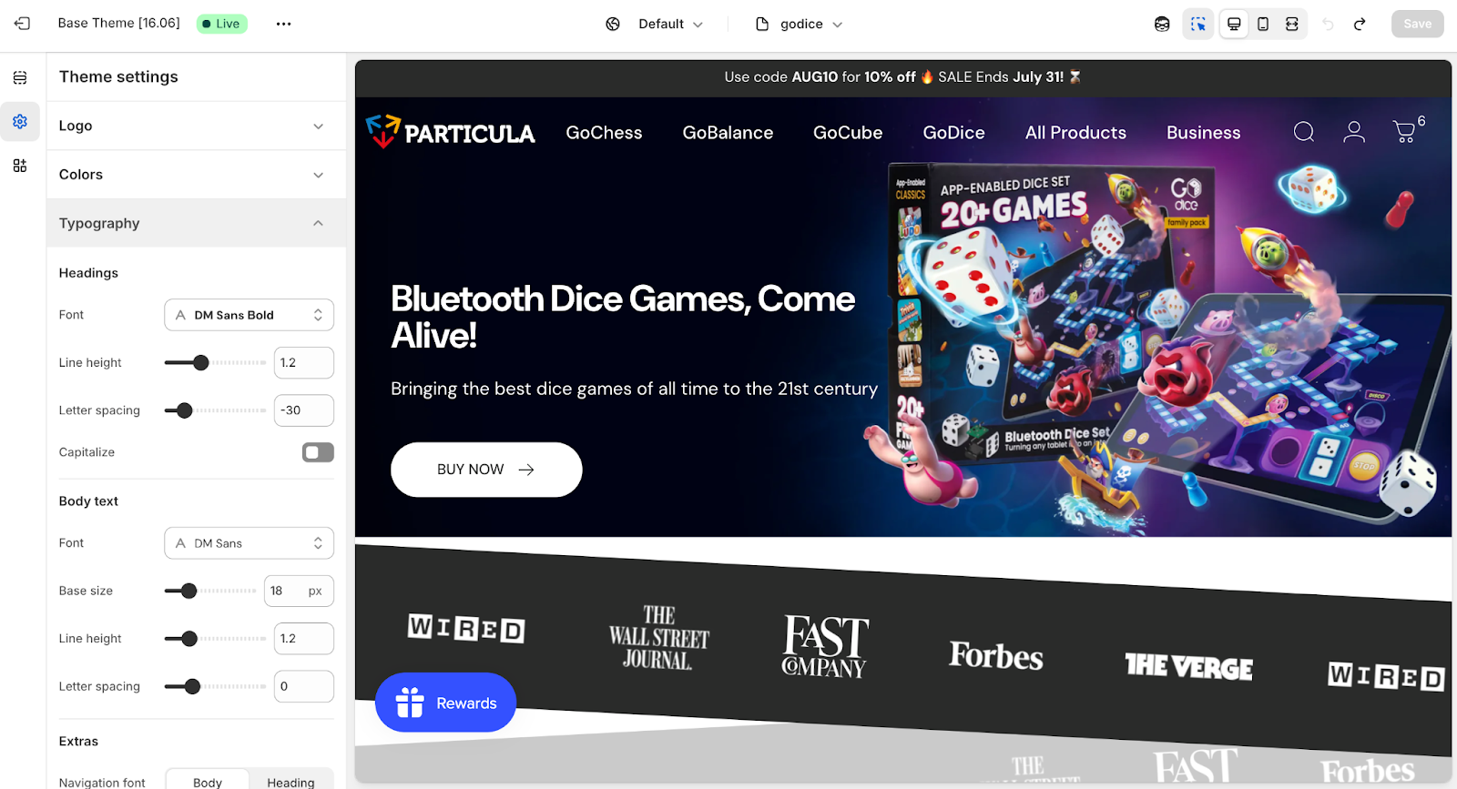
Using Theme Settings
In your Theme Editor, open the Theme Settings panel (often found in the sidebar or top bar). You’ll find sections for Colors, Typography, and sometimes buttons, borders, or other design elements.
Colors: You’ll see labeled color pickers for background, text, accents, buttons, links, and headings. Changing these updates your store’s palette globally. For example, updating the “Accent” color applies it to all buttons, CTAs, and links.
Typography: Most themes let you pick fonts for headings and body text. Options typically come from Google Fonts, and you can preview changes in real time. You may also be able to adjust base font sizes or heading weights depending on the theme.
Other Style Controls: Some themes offer additional options like rounded vs square buttons, grayscale image filters, or form field styling. Always click Save to apply your updates.
Under the hood, these settings translate into CSS variables (like --color-accent or --font-heading) used throughout the theme.
Adding Custom CSS
For design changes not covered in settings, like tweaking the product title size or adding a gradient to your header, you have two options:
- Custom CSS box: Many Online Store 2.0 themes include a “Custom CSS” field in Theme Settings. This is the easiest way to add scoped styles without editing theme files.
- Edit CSS files: Go to Assets > base.css or theme.css and add your custom rules at the bottom. Avoid changing core classes directly so you can easily track your overrides.
If you're doing large-scale restyling, consider using a CSS framework like Tailwind CSS. This is more common in headless builds or full custom themes.
Adding Custom Fonts
Want to use a brand font that’s not in the dropdown?
- For Google Fonts: Add the @import line to your CSS or theme.liquid, then override font-family in your CSS.
- For custom font files: Upload them to Assets and use @font-face in your CSS to load and apply them.
Stick to 1–2 font families to avoid performance issues and test font readability on all screen sizes.
Keep Accessibility in Mind
Maintain strong color contrast for text on background, especially for buttons, links, and pricing. Light-on-light text can hurt readability and conversion. Tools like WebAIM’s contrast checker can help you meet accessibility standards.
Pro Tip: When writing custom CSS, use existing color variables like var(--color-accent) where possible. That way, if you ever update your theme’s palette, your custom styles stay consistent too.
7. Mobile Responsiveness and Responsive Design
Most Shopify themes are responsive by default, but customizations can accidentally break that. Since the majority of your customers will be browsing on phones, keeping things mobile-friendly is essential.
Always Test on Mobile
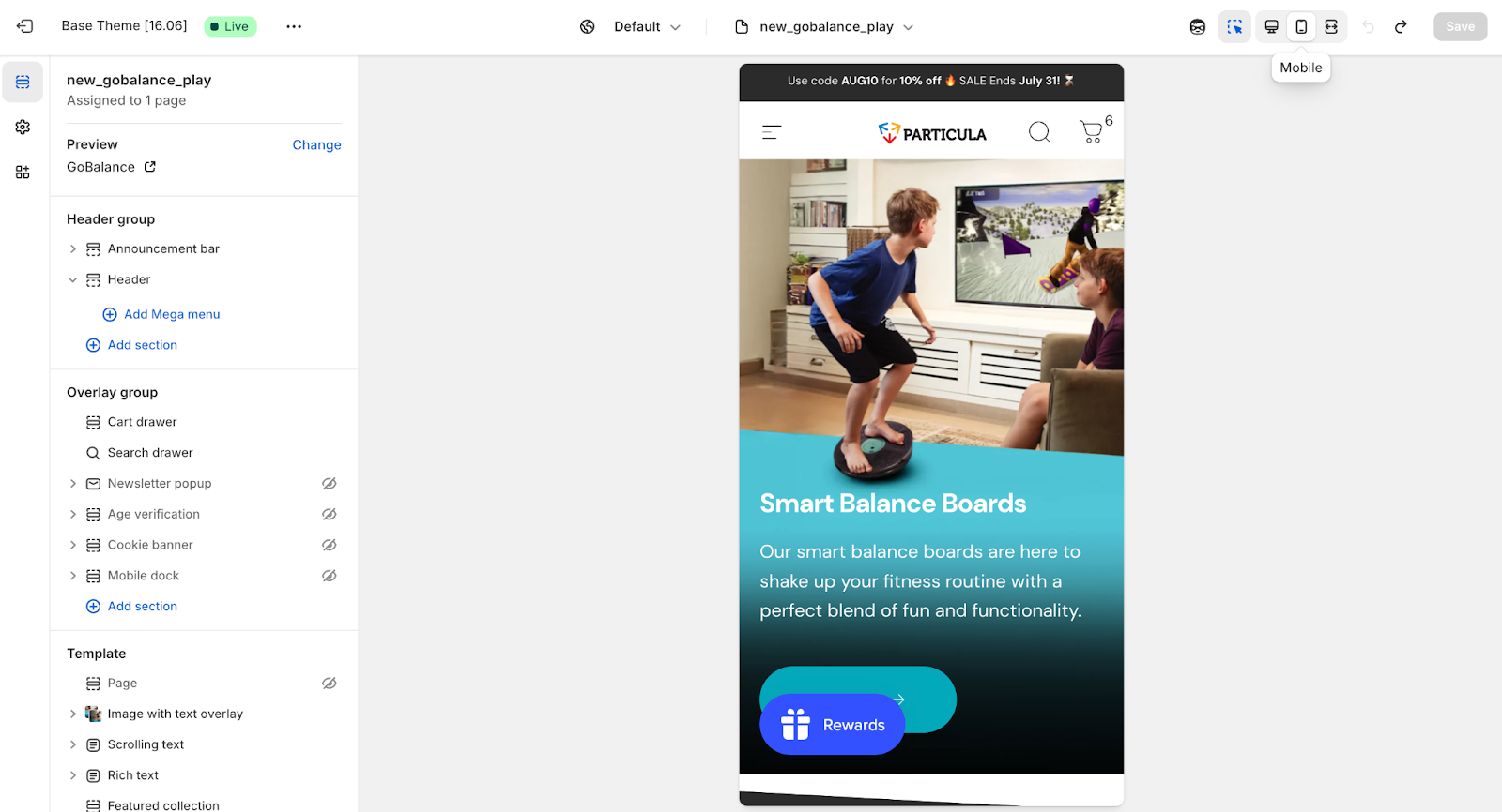
Use the mobile preview in the Theme Editor or check your store on a real device as you customize. Key things to look out for:
- Navigation: Does the menu open properly? Are buttons and links large enough to tap without zooming?
- Images: Do they scale properly on smaller screens? They should use max-width: 100% to avoid overflow.
- Text: Are long headlines or product titles breaking in odd ways? You may need mobile-specific font sizes or line breaks.
- Section stacking: Check how homepage or product page sections stack vertically. If the order feels off, consider rearranging blocks or using CSS flexbox to reorder elements.
Use Media Queries for Mobile Styling
When adding custom CSS, use media queries to adapt your layout across screen sizes. For example:
@media screen and (max-width: 600px) {
.promo-banner {
display: none;
}
}
This approach lets you hide, resize, or rearrange content for small screens without affecting the desktop version.
Make All Elements Mobile-Ready
- Videos and tables: Wrap them in a scrollable container like <div style="overflow-x: auto;"> or use responsive embed techniques.
- Image grids: Stack product cards on mobile and switch to multi-column layouts on desktop using a min-width breakpoint.
- Touch vs hover: Replace hover-only features with click/tap actions on mobile. For example, a hover-to-reveal image should also respond to taps.
Mobile-First CSS Approach
When writing your own styles, start with mobile defaults. Then layer on desktop-specific styles with media queries. Example:
.product-grid-item {
width: 100%;
}
@media (min-width: 768px) {
.product-grid-item {
width: 33.33%;
}
}
This ensures your layout works on smaller screens by default, then enhances the experience for larger devices.
Optimize Images and Speed
- Use Shopify’s image filters (| image_width: 600) to load smaller files on mobile.
- Enable lazy loading (<img loading="lazy">) to reduce initial page size and improve performance.
- Avoid loading large background images or autoplay videos on mobile unless they’re essential.
Final Checks
Use Chrome DevTools’ device emulator for quick checks, but always test on real phones. Look for issues like horizontal scrolling (caused by oversized elements) or broken layouts. Fix with max-width: 100%, flexible containers, or adjusted padding/margins.
Best Practices and Final Tips
You’ve made it through the core customizations. Now it’s time to keep your theme fast, flexible, and future-proof. These best practices will help you avoid headaches down the road.
- Keep Performance in Mind
A slow site kills conversions. Optimize images, minimize CSS and JS where you can, and use lazy loading for media. Shopify’s backend handles a lot, but your customizations should still respect performance best practices.
- Don’t Break SEO or Accessibility
Preserve your HTML structure: proper heading hierarchy, one <h1> per page, meta tags, and descriptive alt text. Use semantic elements (<button>, <nav>, etc.) and maintain color contrast for readability. If you add custom components, make sure they’re accessible via keyboard and screen readers.
- Customize Responsibly
Avoid hardcoding things like promo messages or shipping thresholds. Use metafields or theme settings so content can be updated without editing code. This keeps the store flexible for non-devs and easier to maintain.
- Track Changes with Git
Version control lets you track exactly what changed, when, and why. It’s especially useful when troubleshooting or syncing work with a team. Even for solo projects, it acts as a safety net.
- Test Across Devices and Browsers
Use Chrome’s device emulator for a quick check, but always test on actual devices. Touch behavior, layout quirks, and performance can vary across iOS, Android, Safari, and Edge. Make sure your design and interactions hold up everywhere.
- Use a Duplicate Theme for Major Changes
Before making big edits, duplicate your theme. After launch, keep a clean backup unpublished. This way, if anything breaks, you’re one click away from recovery.
- Don’t Reinvent the Wheel
If you’re stuck, Shopify’s forums, documentation, and community threads often have the answer. From filtering collections to adding hover effects, chances are someone’s already solved the problem.
- Share a Preview, Then Publish
Use Shopify’s preview links to test your changes or share with team members. Only hit publish once you’ve done a full check on performance, mobile, SEO, and visuals. Ideally, launch during low-traffic hours so you can catch issues fast.
- Leave Notes and Documentation
If you’re handing off the project or want to save your future self time, leave comments in your code and create a quick guide that explains how to update common elements like banners or size guides.
- Stay Up to Date
Shopify frequently introduces new features like metaobjects, built-in filtering, or expanded section support. Keeping up means you can phase out old workarounds and lean into native functionality for better performance and compatibility.
Conclusion
Customizing your Shopify theme doesn’t have to mean diving into code chaos or reinventing the homepage. With a few smart tweaks, you can turn your store from “default demo vibes” to something that actually looks and feels like your brand.
Whether you’re changing up fonts, fine-tuning your product pages, or finally tackling that mobile layout issue, every improvement makes your storefront sharper, smoother, and more you.
Stick to best practices, keep performance in mind, and don’t forget to test on actual devices (yes, even that ancient iPhone in your drawer). A great-looking store is good, but a great-looking store that is you? That’s the sweet spot.
[[cta5]]


.avif)


.avif)