

.jpg)
You check your store’s analytics, and the numbers look fine at first. Traffic’s steady, bounce rate’s tolerable, maybe even a few decent add-to-cart spikes. But the sales line? Barely moving.
Conversion rate, meanwhile, keeps acting like it’s personally trying to get you fired.
So you search for CRO ideas, and suddenly you’re knee-deep in the same recycled advice. Swap your hero image. Add more testimonials. Tweak your CTA copy again.
It all sounds easy, yet somehow nothing changes.
The truth is, conversion issues rarely come down to one big problem. They’re usually a pile of small ones stacking up quietly in your funnel. Tiny moments of friction that stop people from clicking “Buy.”
This article is about clearing those roadblocks.
Here you’ll find 21 CRO wins built for growing ecommerce brands that don’t have a developer on standby. Each one is practical, quick to implement, and proven to make shopping smoother.
If you’re ready to spot the small things holding your store back and actually fix them, start here.
[[cta5]]
CRO Fixes for Stronger Product and Homepage Performance
Before diving deep into checkout tweaks or testing tools, start where shoppers actually decide to stay or leave.
Your product and homepage. Correct.
These are the pages that shape first impressions and quietly influence every conversion metric that follows. If they’re clunky, confusing, or missing trust cues, no amount of email follow-ups will save the sale.
Here are the easiest, no-dev ways to make those pages feel sharper, faster, and more trustworthy today.
1. Show Trust Badges Where It Actually Matters
Trust badges work because they soothe hesitation. In ecommerce CRO, these tiny visual cues act like micro reassurances that stop people from backing out at the last second.
Seeing familiar payment logos, security seals, or “30-Day Returns” reassurance reminds people they’re buying from a legitimate store.
Most stores bury their trust signals in the footer where no one looks. Bring them up to near “Add to Cart” and checkout buttons, where decisions happen.
Baymard Institute found that 19% of shoppers abandon carts because they don’t trust the site with their credit card info. A few visual cues at the right moment can stop that spiral instantly.
How to do it:
Use your platform’s image block or checkout editor to drop badges near the final CTA: SSL lock icons, secure payment methods, satisfaction guarantees.
If you’re on Shopify, most free apps or your theme’s footer icons can be dragged higher on the page without coding and support tickets.
2. Highlight Best-Sellers First
When new visitors land on your site, too many options can paralyze them. A clear “Best-Sellers” or “Trending Now” section shortcuts the decision-making.
It works because people trust collective behavior. If a product is popular, it feels safer. It’s social proof without the popup.
Best-sellers usually have higher conversion rates already, so showing them upfront compounds results. Your best performers get even more visibility.
How to do it:
Create a “Best-Sellers” collection and feature it near the top of your homepage. Shopify lets you auto-sort by sales volume, so it updates itself. Add the same section to your product pages under “Customers Also Bought” for double exposure.
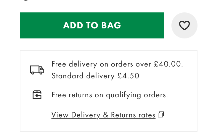
3. Highlight Your Free Shipping Threshold (and Make It Feel Achievable)
Nothing ruins the checkout experience faster than a surprise shipping fee. Showing your free-shipping threshold early gives shoppers a target and a sense of progress before they even hit the cart.
People love seeing a reward they can reach, especially if it’s framed as a mini goal. It’s part psychology, part gamification. “Spend $12 more to get free shipping” feels better than “Shipping $5.99.”
How to do it:
If you offer free shipping above a certain amount, don’t hide it in the footer. Add a simple banner at the top of your site (“Free shipping on orders over $50”) or use a dynamic progress bar that fills as the cart grows.
Shopify and WooCommerce both have free apps that handle this automatically. It’s quick to set up and instantly improves average order value.
4. Add Product Videos or 360° Views
Static photos do half the job. A short video or 360-degree view helps customers imagine owning the product. It also strengthens how you optimize product pages because the media answers questions photos cannot, translating it directly to conversion.
According to Invesp, shoppers are 64-85% more likely to buy after watching a product video. It’s about showing features and bridging that “I wonder what it’s really like” gap that stops people from buying.
How to do it:
Record a 15-30-second clip of your product in use or being unboxed. Upload it to YouTube or Vimeo, then embed it directly in your product media gallery.
Most Shopify and WooCommerce themes support video uploads or embeds out of the box. Keep it simple, no need for full studio lighting. A clear, honest clip of the product in real life does the job.
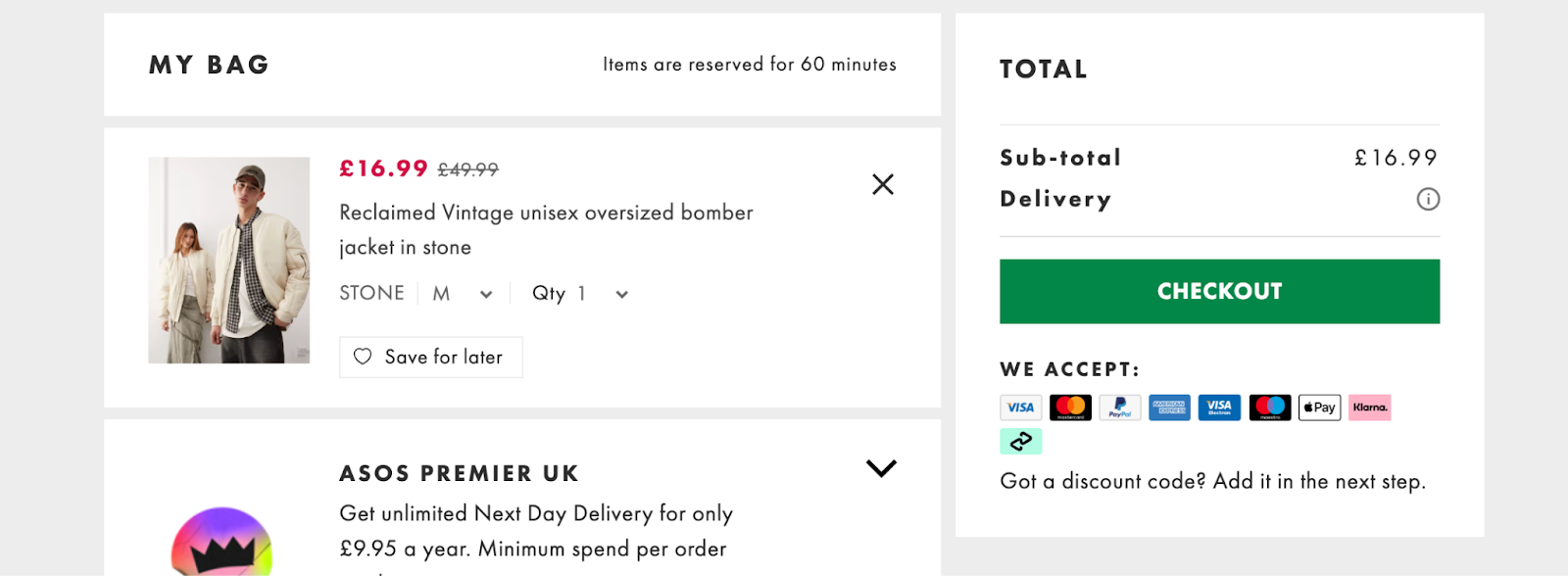
5. Simplify Checkout Forms (Fewer Fields, More Orders)
Every extra field in your checkout is another chance for a customer to give up. I know it sounds dramatic, but 18% of users leave because the checkout feels too long or complicated. The average checkout contains 11.3 form fields, even though most sites only need about eight.
People want to buy, not fill out forms. A long checkout feels like homework, and no one wants homework when they’re chasing that online-shopping dopamine hit.
How to do it:
Audit your checkout and remove anything nonessential: company name, extra address lines, phone number if you don’t actually need it. Enable guest checkout so customers aren’t forced to create an account.
In Shopify, this takes two minutes in your checkout settings. On WooCommerce, most of it is just toggles under “Accounts & Privacy.” Trim the fat, and watch your checkout completion rate climb.
6. Show Delivery Time Estimates (Kill the “When Will It Arrive?” Anxiety)
People buy based on timing. “Arrives by Tuesday” converts better than “Standard shipping.” The clarity alone lowers hesitation.
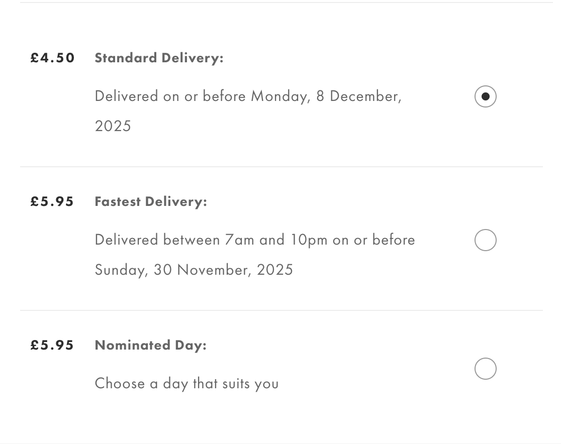
Shoppers hate uncertainty, especially post-pandemic. A delivery window removes one more question mark from their decision.
How to do it:
Add an estimated delivery note near the Add to Cart or checkout button: “Arrives in 3-5 business days” or “Order within 2 hours to ship today.”
Many themes have a built-in block for this, and apps like Estimated Delivery Date for Shopify do the math for you. It takes minutes to set up and saves customers from guessing (or worse, leaving to check a competitor’s policy).
CRO Fixes That Improve Cart and Checkout Completion
Here’s where most stores quietly lose money.
A product can be perfect, your copy persuasive but if checkout feels clunky or uncertain, the sale slips. These fixes target that last stretch between “I like it” and “I got it,” where even a two-second delay or unclear policy can cost you a conversion.
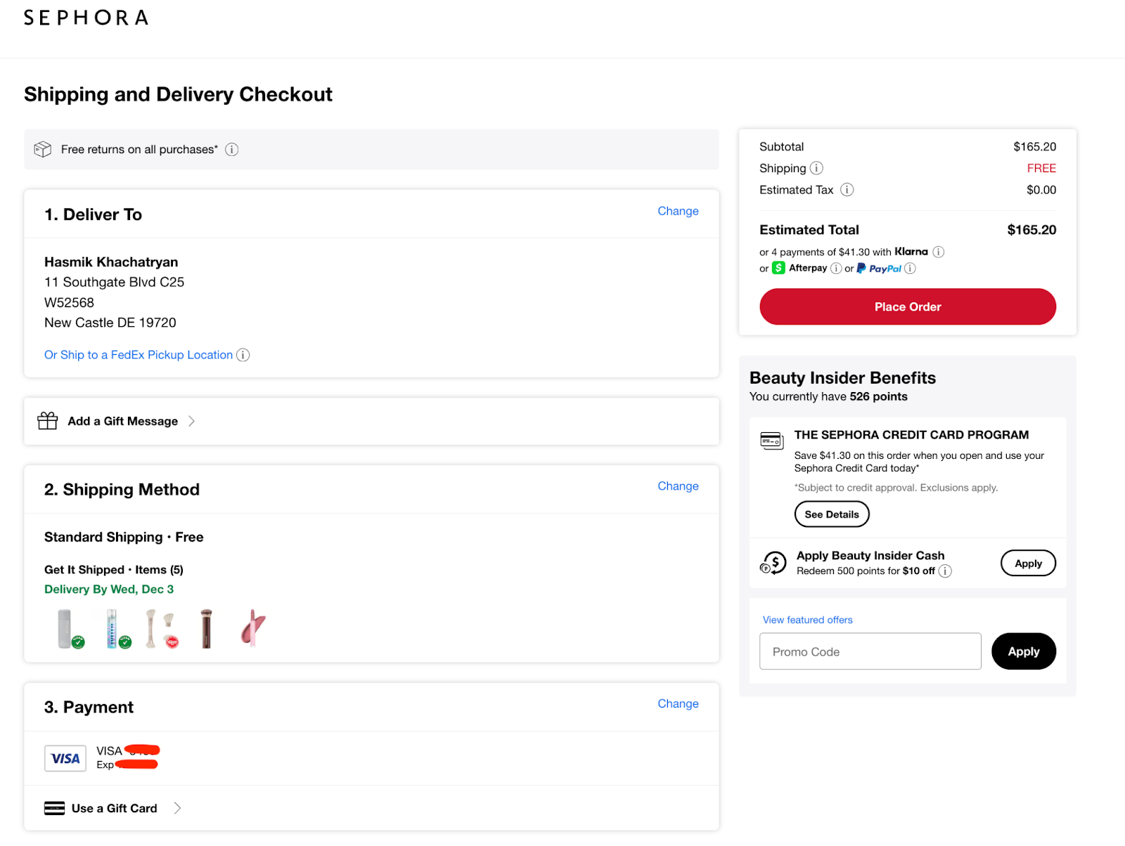
8. Offer Multiple Payment Options (and Make Them Visible Early)
Shoppers have preferences, and forcing one payment flow is a fast way to lose them. According to Monext, adding more payment methods can lift conversions by around 7%, while Apple Pay alone can raise them by more than 22% thanks to instant authentication and zero typing.
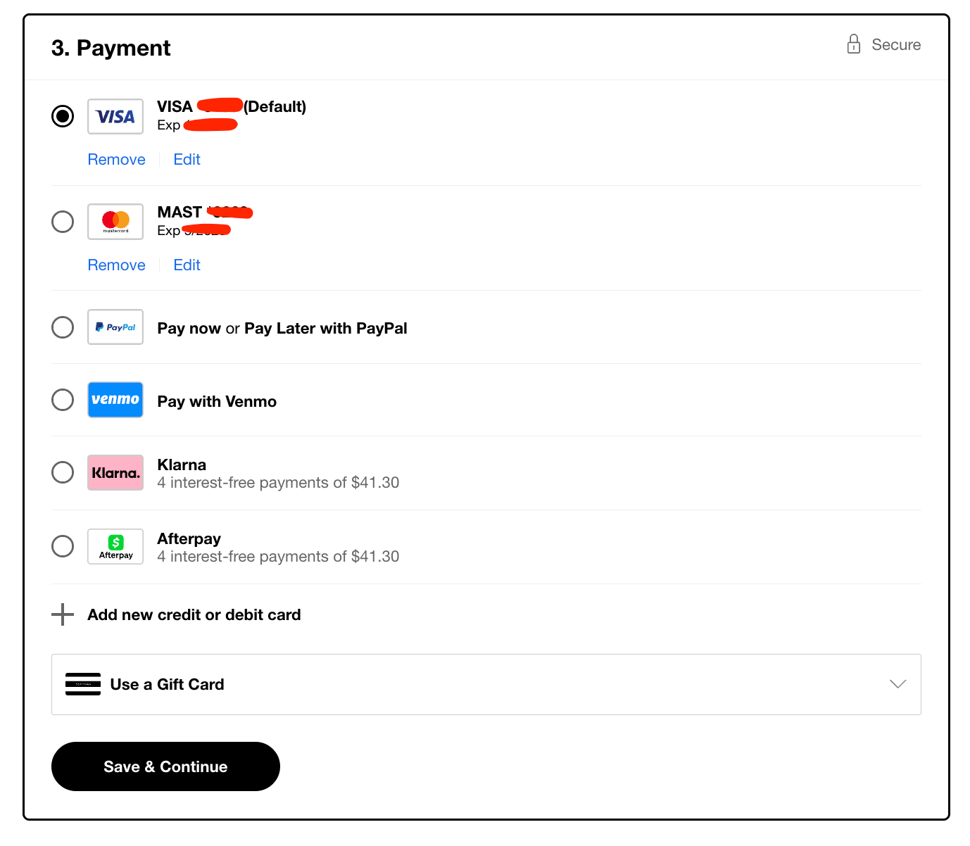
Digital wallets now account for over half of global ecommerce payments, fueled by the rise of mobile and contactless checkout.
Expanding payment methods is a textbook move for reducing cart abandonment, especially for mobile shoppers who want one-tap checkout.
How to do it:
Go to your payment settings and toggle on every major method your platform allows. Shopify Payments already includes Apple Pay and Google Pay. Adding PayPal or Afterpay takes a few clicks.
Display those logos near “Add to Cart” or in the footer so shoppers know what’s available before checkout.
9. Add a Clear, Friendly Return Policy Reminder
Shoppers worry about being stuck with something they cannot send back. When your return policy feels hidden or complicated, hesitation grows. A clear promise removes that friction and builds confidence in the purchase.
Shoppers check return info before buying. When it’s easy to spot and sounds reasonable (“Free 30-day returns” beats “Subject to conditions”), conversions rise.
How to do it:
Add a short line under the Add to Cart button: “Free 30-Day Returns” or “Hassle-Free Exchanges.” Use an icon if your theme supports it.
Link to your detailed policy in the footer, but keep the reassurance visible where the decision happens. You don’t need fancy legal wording. Friendly and human reads best.
10. Use Exit-Intent Popups That Actually Help
When the shopper’s mouse heads for the tab’s close button, you’ve got one last shot. Exit-intent popups, when done right, can save 5-10% of abandoned sessions.
Try not to seem desperate. The trick here is value. A small incentive (“Wait, get 10% off your first order”) or a helpful option (“Need sizing help?”) feels supportive instead of pushy.
How to do it:
Tools like OptiMonk, Wisepops, or Klaviyo’s built-in forms can trigger on exit. Set yours to appear only once per session and write like a human.
Offer a code, free shipping, or a quick link to live chat. You can install and configure everything in under an hour.
11. Make Cart Summaries Crystal Clear
Hidden costs or confusing totals are instant deal-breakers. Shoppers should see exactly what they’re paying for, with taxes and shipping estimates upfront. Transparency prevents that “surprise at checkout” moment.
How to do it:
Check that your cart summary shows item images, quantities, subtotal, shipping, and taxes clearly. Many themes let you toggle “show tax estimate” or “calculate shipping” before checkout.
If not, add a simple note like “Shipping calculated at checkout” to set expectations.
12. Add Live Chat (or a Chatbot) to Checkout Pages
People often drop off because of small doubts: delivery timing, sizing, payment options. Live chat lets you clear those up in seconds.
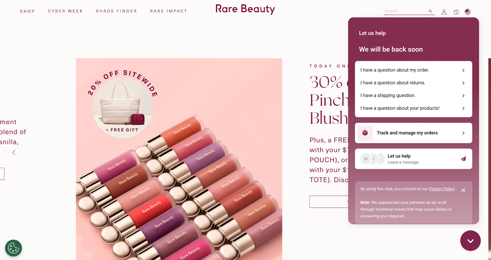
According to LiveChat’s data, adding chat on checkout pages can raise conversions by around 20%. It’s the online version of a sales associate who steps in just before you leave the store.
How to do it:
Install a tool like Tidio, Zendesk Chat, or Facebook Messenger plugin. Keep your default greeting short (“Questions before checkout? We’re here.”).
If you can't chat all the time, set an autoresponse that says when you’ll reply or routes to an FAQ bot. Quick reassurance beats silence every time.
CRO Tactics That Use Psychology and Behavioral Nudges
This is the psychology layer of CRO, the subtle stuff that shapes how shoppers feel while browsing your site. These tweaks quietly guide users toward the checkout button and make every click feel smoother, more intentional, and a little more rewarding.
13. Add Real-Time Social Proof Popups
You’ve seen them: “Someone in Chicago just bought this” or “5 people are viewing this product.” Done well, these create movement and trust. They tell visitors, hey, real people are shopping here.
It’s the digital version of walking into a busy store. We trust activity. We join the crowd.
How to do it:
Install a social proof tool like Fomo, Proof, or TrustPulse. Set it to show real customer actions like recent purchases or reviews. No fake scarcity, please. We’re way past that.
Keep it small, bottom-corner, and friendly. You can customize timing so it doesn’t annoy repeat visitors. It’s plug-and-play, and the lift in trust is often immediate.
14. Create Honest Urgency
Countdown timers and “Only 2 left!” messages still work, but only when they’re real. False urgency screams “cheap marketing trick.” Real deadlines, on the other hand, help customers decide faster.

Urgency converts because it fights hesitation, not because it tricks people. “Order in the next 2 hours for same-day shipping” feels service-oriented. “Sale ends tonight” feels clear. Both work because they tell shoppers when to act.
How to do it:
If you run promos, add a small banner countdown tied to your actual sale end time.
Shopify apps like Hurrify or Countdown Timer Bar handle this easily.
For stock scarcity, set messages to appear automatically when inventory drops below five. Keep the tone factual and less dramatic.
15. Offer a First-Time Buyer Incentive
Sometimes all it takes is a small nudge for a new visitor to take that leap of faith. A one-time discount or free shipping offer is a classic CRO win for a reason. It easily breaks the hesitation barrier.

It also starts your relationship on the right foot: they save a little, you get a first-time customer who’s now in your email flow.
How to do it:
Add a welcome popup or sticky bar with a clear offer: “Get 10% off your first order” or “Free shipping for new customers.” Use a short code like WELCOME10 and connect it to your email tool (Klaviyo, Mailchimp, etc.) so you can deliver the code automatically.
16. Personalize Product Recommendations
Personalization feels like luxury, even when it’s automated. Showing “You might also like” or “Customers also bought” keeps people exploring instead of exiting.
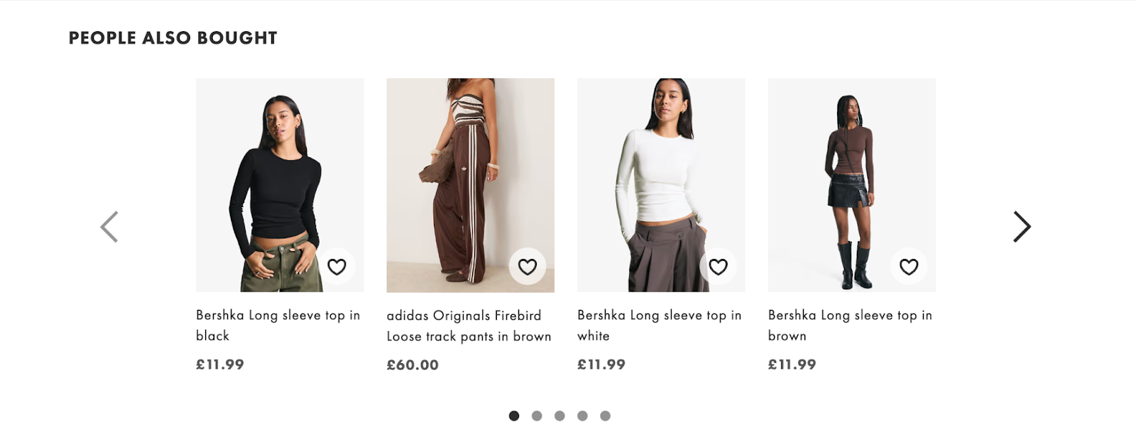
It works because it mimics a good in-store experience. When someone’s browsing a shirt, recommending matching pants is helpful.
How to do it:
Most platforms have built-in recommendation blocks. On Shopify, enable the “Related Products” section or use an app like ReConvert or LimeSpot for smarter suggestions.
Place it below the product details or in the mini-cart. Remember that the goal is discovery.
17. Use Popups to Collect Emails Without Annoying People
Popups are those misunderstood villains. The difference between “Ugh, go away” and “That’s actually useful” comes down to timing and tone.
Trigger them after intent. Pair them with an offer worth exchanging an email for like a discount, early access, or a helpful guide.
How to do it:
Set your popup to trigger after 15-20 seconds on-page or when someone scrolls halfway down.
Use tools like Privy, OptiMonk, or Klaviyo forms. Keep the copy short (“Stay in the loop and get 10% off your first order”). Don’t ask for more than a name and email.
CRO Improvements for Site Speed and Overall UX
A pretty homepage means nothing if it loads like dial-up. Shoppers have zero patience for lag or layout confusion, and every extra second kills conversions.
These fixes stack up fast and quietly lift your numbers across the board.
18. Boost Mobile Site Speed (Your Silent Conversion Killer)
More than 70% of ecommerce traffic happens on phones. If your site takes more than three seconds to load, half those users are gone. They’ll swipe back to Instagram before your hero image even fades in.
How to do it:
Compress images (TinyIMG or Crush.pics do this automatically). Remove any app or plugin you’re not actively using.
Run your store through Google PageSpeed Insights, focusing on “mobile” results first. Turn on lazy loading for below-the-fold visuals.
If you’re on Shopify, most of this is a few clicks in theme settings.
19. Make Your Search Bar Impossible to Miss
Shoppers who use your site’s search bar are the ones ready to buy. Data from Opensend shows that site search users convert up to 50% higher than average, and they make up only 15% of visitors yet drive 45% of total ecommerce revenue. If they already know what they want, let them find it. Hiding your search bar is like locking the door during business hours.

How to do it:
Move the search bar to your top header and make it full-width on desktop. Add a small magnifying glass icon on mobile that stays visible as they scroll.
Use an autocomplete app like Searchanise or Shopify’s built-in predictive search to speed up discovery. You’ll be surprised how many conversions come from people simply finding stuff faster.
20. Use Heatmaps to See What’s Actually Broken
You don’t need guesswork to understand user behavior. Heatmaps and session recordings show where customers scroll, click, and rage-quit. Sometimes the problem is as simple as a misaligned button or confusing layout.
How to do it:
Set up Hotjar, Microsoft Clarity, or Crazy Egg. Let them run for a few days, then watch recordings of how people move through your site.
If they keep clicking something that isn’t clickable, fix it. If everyone bails halfway down the page, move your CTA higher. These small layout fixes compound faster than any “growth hack.”
21. A/B Test One Thing at a Time
The final CRO win is a habit. Continuous testing is what separates lucky spikes from predictable growth.
And you don’t even need a dev or a data team to do it. Curiosity and one clear variable (a headline, image, or offer) at a time would do.
How to do it:
Use no-code testing tools like Neat A/B Test, VWO, or Convert. Run your test for at least two weeks or until you get 95% confidence.
When a variation wins, lock it in and test the next thing. Over a few cycles, those small lifts add up to a conversion rate that finally stops haunting your analytics dashboard.
Conclusion
Big results start small. Every update, every cleaner layout, every faster load time builds toward a smoother, more trustworthy store. This is how conversion rates grow: quietly, through dozens of practical wins that compound into something real.
Treat your site like something alive. Keep checking how it behaves, where visitors slow down, and what details make them move forward. Update often. Measure everything. Celebrate small lifts instead of waiting for miracles.
Just help people buy without friction, without doubt, without waiting. The rest follows.
Stick with that rhythm and, next time you open your analytics, your conversion rate might finally stop giving you side-eye.
[[cta5]]


.avif)


.avif)