
Toy retail moves quickly. Trends rise and fade, parents shop under pressure, and every season brings new products that need clear, confident visibility. Email is one of the few channels that can keep up with that pace, but finding strong creative inspiration is not always straightforward.
In this article, we’ll look at standout toy store email campaigns for 2026 and break down what makes each one work. You’ll see how brands use visuals, timing, angles, and structure to capture attention and drive purchases. We’ll also outline how to adapt these tactics to your own store so you can build stronger campaigns without adding more to your workload.
Use this as a practical reference any time you need direction, clarity, or inspiration for your next send.
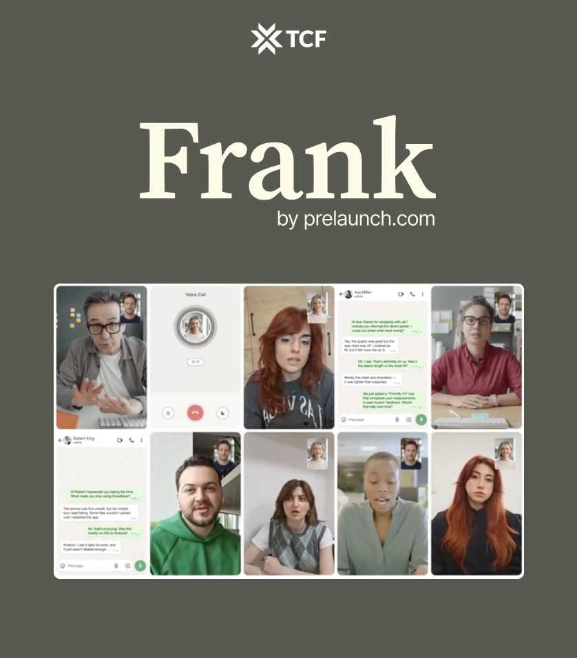
[[cta5]]
What Makes a High-Converting Toy Store Email in 2026
Strong toy store emails share a few core traits that consistently drive attention, clicks, and purchases in a crowded inbox.
The parent shopper mindset
Parents move fast when they shop.
They want products that are clearly age-appropriate, easy to understand, and available without friction.
They respond to emails that help them make quick decisions, highlight benefits at a glance, and remove any uncertainty around safety, durability, or suitability.
Why visuals matter more in toy retail
Most toy purchases are driven by seeing the product.
Clear photos, simple layouts, and color palettes that feel bright but organized help parents understand what the toy looks like, how it works, and why it’s worth buying.
A strong visual instantly communicates value before the copy even starts.
Timing and seasonality rules
Toy shopping follows patterns. Birthdays, holidays, back-to-school, summer play, and trend spikes all influence when parents are ready to buy.
Emails that align with these cycles perform better because they meet people at the exact moment they’re planning gifts, activities, or seasonal updates, and this is also where simple ecommerce personalization kicks in. A quick age filter, a birthday reminder, or a category nudge based on past browsing helps parents find what they need faster without overcomplicating your segmentation.
Best Email Campaign Examples to Inspire Toy Stores in 2026
Strong email inspiration is hard to find in the toy category, so this section brings together ecommerce email marketing examples that show what works right now. Each example highlights a specific tactic, the structure behind it.
1. Funko Pop! Drop Email
This email shows exactly how to sell a collectible without overexplaining anything. The hype hits instantly. Big headline, hero product front and center, drop time impossible to ignore. You open it and immediately feel like a clock just started ticking. That’s the whole point, and it works.
The copy stays sharp and fan-focused. It talks about the drop, the timing, and how this piece fits into a larger universe fans already care about. No long descriptions, no storytelling detours. It taps straight into completion energy, the quiet panic of missing one figure and breaking the set. That emotional trigger does more work than any discount ever could.
The supporting lineup is a smart move. Instead of treating this as a one-off product, the email frames it as part of a broader moment. Multiple Pops, clean layout, individual CTAs. It keeps momentum high while giving readers options, which matters when different fans fixate on different characters.
The “Shop the collection” section acts like a breather without killing the excitement. One bold visual, one clear action, everything pulled together. It resets attention and keeps the scroll from feeling cluttered.
Ending with the flagship store mention rounds it out nicely. It reminds fans this is a brand with a world behind it, not just a product feed. That extra layer strengthens loyalty and keeps engagement going beyond the drop itself.
Overall, this email does one thing extremely well. It creates urgency, feeds collector instincts, and makes being early feel like the win. Fast, focused, and built for fans who love the chase.
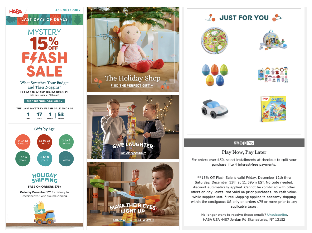
2. HABA Holiday Flash Sale Email
This email hits a rare sweet spot for holiday campaigns. It creates urgency without feeling frantic. The “Mystery 15% Off Flash Sale” headline does exactly what it should. It stops the scroll, sets a clear time limit, and makes the offer feel special rather than desperate. The countdown timer seals it. You know this is a decision-for-today email, not a save-for-later one.
What really elevates it is how quickly the brand switches from selling to helping. The “Gifts by Age” section is a quiet power move. Holiday shoppers are overwhelmed, tired, and short on time. By organizing products around age, HABA removes friction and earns trust in the same breath. It feels like guidance, not pressure, which makes people more willing to keep browsing.
The emotional layer lands nicely after that. Images of kids playing, paired with lines about laughter and joy, reconnect the discount to why people are buying in the first place. That shift matters. It turns a flash sale into a gift moment, which is especially important for brands built around learning, play, and quality.
The “Just For You” section adds momentum without getting creepy. It feels like a nudge, not surveillance, and keeps discovery alive for shoppers who are still undecided.
Closing with shipping deadlines and payment options is clean and confidence-building. No surprises, no fine print hunting.
Overall, this email feels thoughtful and seasonal while still driving action. It proves that flash sales can convert hard without sacrificing brand warmth or long-term trust.
3. LEGO Welcome Email
This welcome email does exactly what a first email should do, it gets to the point and makes joining the list feel like a win. LEGO skips the small talk and leads with value right away. Early access, exclusives, updates on hard to find sets. You instantly know why these emails are worth opening in the future.
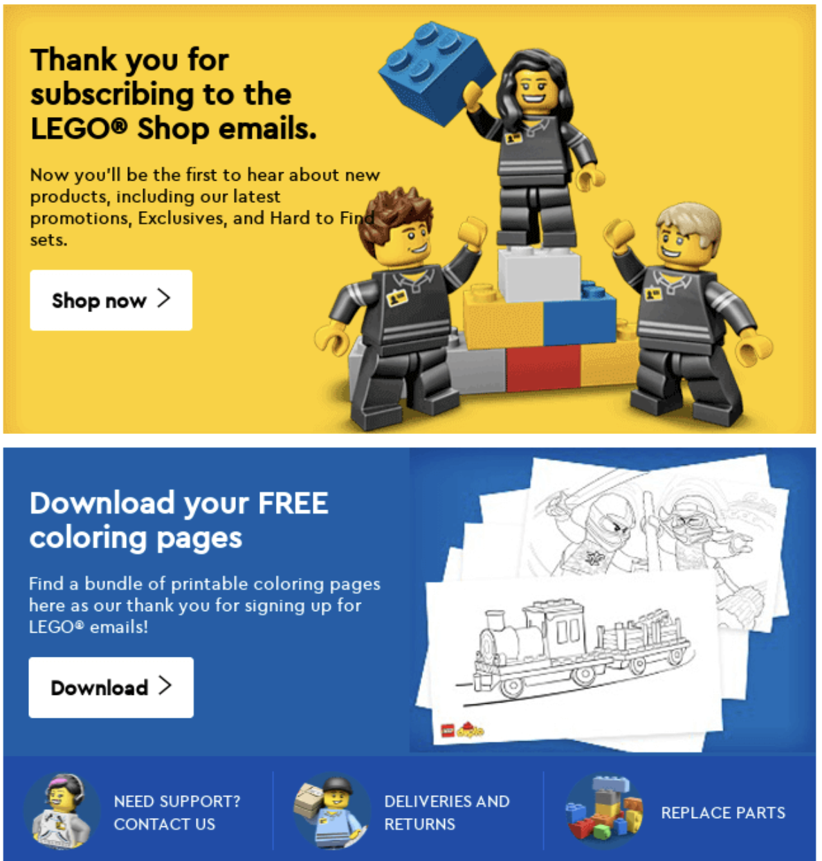
The tone is light and confident. Bright colors, familiar minifigures, and clean sections keep it playful without sliding into “kids only” territory. That balance matters here because LEGO’s audience is broad. Parents, adult fans, collectors, gift buyers. Everyone can see themselves reflected without feeling talked down to.
The free coloring pages are a smart move. They give subscribers something useful immediately. For parents, it is an instant activity. For LEGO, it builds goodwill before asking for a single purchase. That first impression sticks.
What really elevates this email is how practical it feels. The links at the bottom turn the inbox into a mini hub. Store locator, support, order help, account access. It quietly sets expectations that LEGO emails are helpful, not noisy.
There is no hard sell here, and that is the point. This email is about trust, familiarity, and habit building. It teaches subscribers that opening LEGO emails pays off, even when they are not ready to buy.
Overall, it is calm, confident, and brand-perfect. A welcome email that feels more like an invitation than a pitch, which is exactly how long-term relationships start.
4. Maqio Toys 12 Days of Christmas Email
This email feels like the grand finale of a holiday movie, loud, fast, and very clear that the clock is about to hit zero. The subject and hero carry the message. Day 12. Last surprise. One final push. There is no ambiguity about where you are in the campaign or what the reader should do next
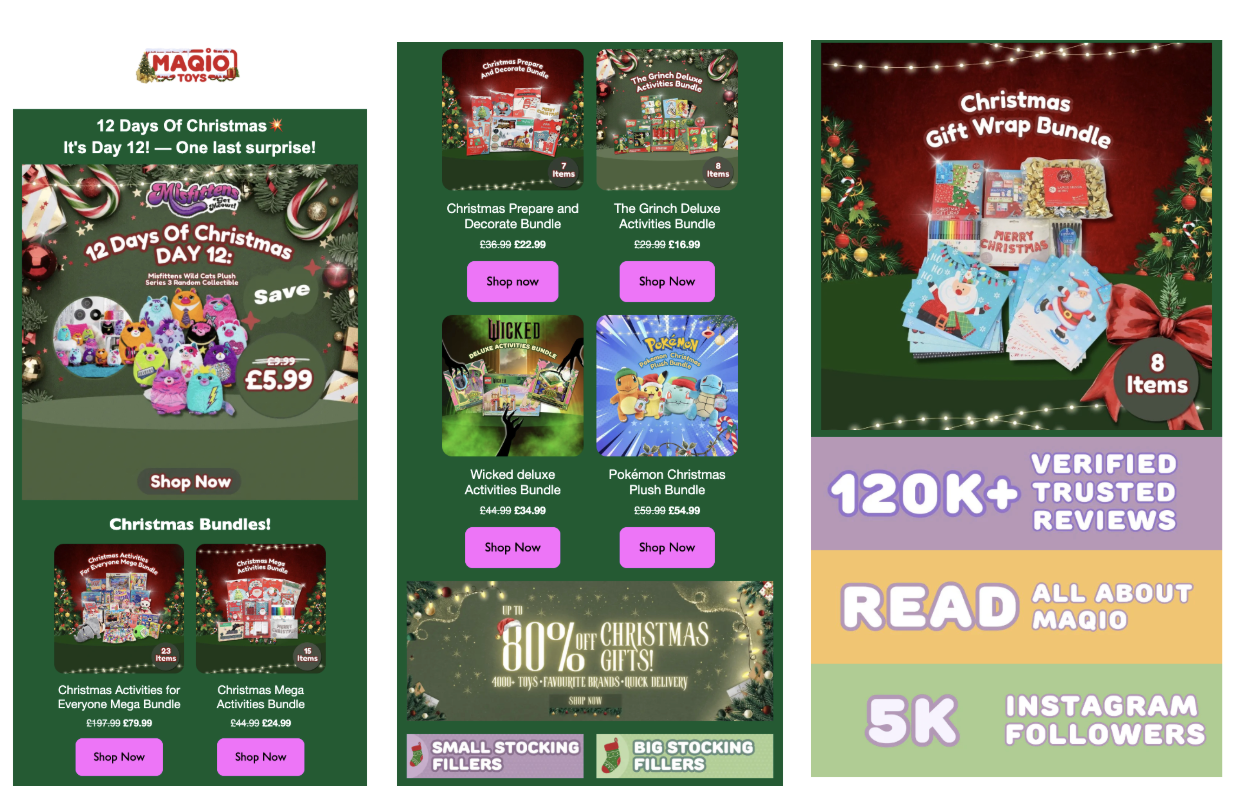
The mystery discount is a smart hook at this stage. Shoppers this late are not researching, they are hunting for wins. The unknown adds a spark of fun, while the visible price drop keeps it grounded in value. Add the countdown, and suddenly waiting feels like a bad idea. It creates pressure without sounding aggressive.
What really works here is how controlled the chaos is. There is a lot going on, but it never turns into noise. Everything is chunked into bundles, franchises, and clear gift types. That structure matters when parents are skimming quickly and thinking in shortcuts like “one big gift” or “a few stocking fillers.” The email helps them self-sort without asking them to think too hard.
The constant CTAs are doing their job. Each section feels like its own exit ramp, which is perfect for shoppers who already know what they want and just need the fastest path there.
Ending with reviews and social proof is a quiet confidence move. After big discounts and urgency, it reassures buyers that this is a trusted store delivering real gifts, not a risky last-minute bet.
Overall, it is bold, crowded, and unapologetically sales-driven. For a final holiday send, that focus pays off.
5. Flycatcher Black Friday Early Access Email
This email knows exactly what game it’s playing, urgency and excitement, no hesitation. From the first glance, it screams Black Friday energy. Big discounts, limited time, VIP access. For toy store owners, this is a reminder that clarity beats cleverness during peak sale moments. You immediately know what’s on offer and why you should care right now.
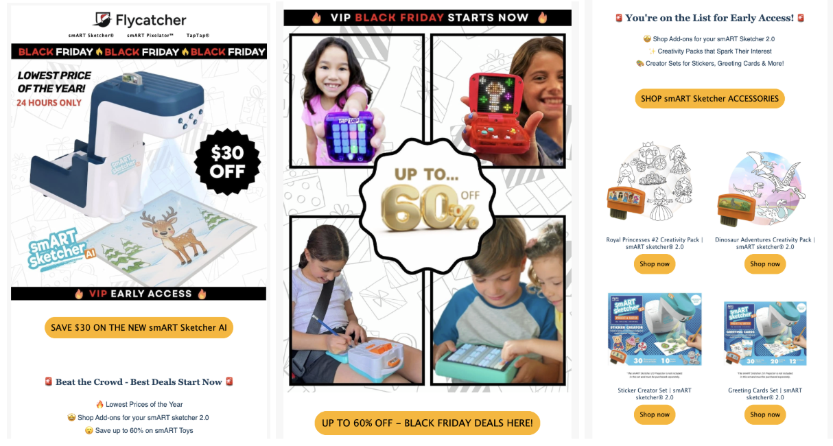
The hero section sets the direction. One product, front and center, with a bold “lowest price of the year” message. No scrolling required to understand the deal. That’s smart. Parents shopping during Black Friday are moving fast, and this email respects that mindset.
What really works here is the layering of value. First, early access. Then, a concrete dollar discount. Then, up to 60% off across other toys. Each section adds another reason to keep reading without feeling repetitive. It keeps momentum instead of stalling it.
The lifestyle images with kids using the products do more than look cute. They quietly answer the biggest buying question, will my child actually use this? For toy brands, that visual reassurance is gold.
The add-ons and accessories section is a strong upsell move. It feels helpful rather than pushy, especially framed as creativity packs and extra ways to play. This is how you increase AOV without killing goodwill.
Overall, this email is loud in the right way. It prioritizes speed, emotion, and easy wins. For toy store marketers, the lesson is simple. During Black Friday, don’t overthink it. Lead with the deal, show the joy, and make the next click feel obvious.
6. Fandom Store Recovery + Upsell Email
This email feels like a friendly nudge that quietly turns into a full shopping session. It starts with a clear intent, finish what you started. The abandoned cart reminder is soft, visual, and non-threatening. One product, one button, no guilt. That makes it easy to re-engage without triggering resistance.
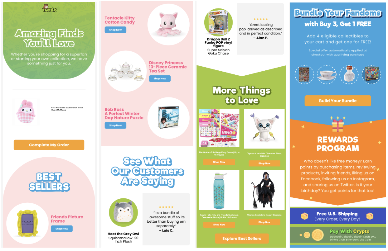
Then the email smartly widens the door. Instead of stopping at recovery, it shifts into discovery mode. “Amazing Finds You’ll Love” and “Best Sellers” act like an in-store endcap, pulling shoppers deeper once they are already paying attention. The product mix takes care of the core message here. Plushies, puzzles, collectibles, home items, fandom merch. It mirrors how toy and fandom shoppers browse in real life, jumping categories based on vibes rather than logic.
The social proof section is short but effective. Real products, real quotes, no fluff. It reassures buyers that people like them are happy, which matters a lot in stores selling licensed and giftable items. Nobody wants to gift something that feels risky.
What really pushes this email from good to strong is the layering of incentives. Buy 3 get 1 free, rewards points, free shipping, and even crypto payments. None of these are overexplained. They are presented as perks, not obstacles. That keeps the tone fun instead of transactional.
Overall, this email understands how toy and fandom shoppers behave. They rarely come in for one item. They browse, bundle, and justify adding “just one more.” This layout supports that behavior perfectly, turning a single unfinished order into a bigger basket without feeling forced.
How to Apply Proven Email Tactics to Your Toy Store Emails
Seeing strong examples is helpful, but the real value comes from turning those ideas into repeatable moves you can use in your own campaigns. Each email above highlights a pattern that works consistently across toy retail, no matter your product catalog or brand style. Here’s how to put those patterns into practice in a way that feels doable:
Lead with clarity
Parents skim fast, so make the main point impossible to miss. Say it upfront: a new launch, a seasonal collection, a back-in-stock alert, a curated gift guide. Every example in this list starts with a clear headline that tells the reader exactly what the email is about before they scroll.
Use visuals to do the heavy lifting
Your images should do more work than your copy. Think consistent angles, bright product shots, clean grids, and lifestyle photos when they add context. The best emails here relied on visuals that made the products instantly appealing.
Basic analytics tools can help you spot which email blocks or visuals get the most engagement, so you know what to bring back next time.
Keep sections tight and intentional
Whether it’s Funko’s drop layout or Fat Brain Toys’ category blocks, each section serves a single purpose. Avoid mixing too much in one place. If your email has multiple ideas, separate them with structure, not more text.
Organize the chaos
Holiday emails can be packed without feeling messy. Bundles, age groups, franchises, best sellers, each section has a reason to exist. This helps shoppers think in shortcuts like “one big gift” or “easy add-on,” which is exactly how real toy buying happens.
Match the vibe to the toy
Collectibles thrive on hype. Educational toys need reassurance. Holiday gifts benefit from warmth. These emails work because the tone fits the product, not because the copy is clever.
Keep clicks effortless
Short, obvious CTAs win. “Shop Now,” “View Collection,” “Build Your Bundle.” No puzzles. No cute phrasing. Just clear next steps that keep momentum going.
Always offer a second path
If the hero product isn’t right, give people somewhere else to land. Best sellers, bundles, categories, rewards. Strong emails never trap the reader, they redirect them.
Give the reader value before you ask for a purchase
A coloring-page download, a quick educational insight, a small fun fact, a simple tip. Tiny touches like these help build trust and make your emails feel less transactional.
Use AI email assistants for the heavy prep work
Tools are getting better at handling the early steps, like drafting product blurbs, generating subject lines, or reorganizing your sections. AI email assistants won’t replace your eye for tone or brand fit, but they can shave hours off the first draft and help you experiment with ideas faster.
If you’re brushing up on email fundamentals in general, we also have a simple breakdown of cold email templates that walks through clean message structure and pacing. It’s not toy-specific, but it’s a good extra resource if you like studying different email formats.
Conclusion
Toy emails work best when they feel focused, easy to skim, and built around what parents need at the moment. The examples in this guide show how much impact you can create with clear headlines, strong visuals, and simple sections that keep shoppers moving. You don’t need complex storytelling or heavy copy, just intentional structure and a tone that matches the products you’re promoting.
Keep these patterns in your back pocket when you plan your next send. They’re straightforward to apply and adaptable to any product lineup, helping you create emails that feel polished, relevant, and ready to move shoppers from browsing to buying.
[[cta5]]


.avif)
.avif)