

Most ecommerce sites look fine. Some even look great. But looking good and performing well are not the same thing.
If your store feels sluggish, confusing, or hard to trust (even a little) it’s leaking sales. And if you’re relying on themes or plugins to “take care of the basics,” you’ve probably missed something important.
This guide skips the filler. No vague suggestions. No bloated checklists. Just the features that actually move people through your site and get them to buy.
You’ll get:
- A breakdown of features grouped by outcome: conversions, trust, or UX
- Clear explanations of what each feature does and why it matters
- A prioritization cheat sheet for teams working with limited time, budget, or patience
Let’s go through what needs to be there, why it matters, and how to build a store that doesn’t slow people down, confuse them, or push them away.
[[cta5]]
Before You Start Auditing Your Site, Read This!
Copying what worked for another brand won’t guarantee it’ll work for yours. And chasing trendy features because “everyone’s doing it” is one of the fastest ways to slow your site down, confuse your users, and spend budget on things that don’t convert.
Most underperforming stores fail because of 20 small decisions that seemed like a good idea at the time:
- Installing too many plugins
- Prioritizing how the site looks over how it works
- Skipping the basics like speed, clarity, and flow
We made sure that every feature in the next sections is included for one reason: it helps your store make more money or makes it easier for people to buy from you. That’s the only metric that matters here.
What Features Boost Ecommerce Conversions
Turning traffic into actual sales starts with removing friction. Every click, scroll, or form field that slows people down chips away at your revenue. These features are designed to guide people toward the buy button with less hesitation, fewer dead ends, and more clarity.
1. Seamless Checkout Flow
The fewer the steps, the fewer the drop-offs. A smooth checkout experience never leaves people guessing or second-guessing.
What to include:
- Guest checkout with autofill for address and card fields
- Progress indicator that shows how close they are to done
- Clear summary of shipping, taxes, and total before payment
- Mobile-friendly layout that doesn’t require zooming or pinching
What to avoid:
- Forcing account creation
- Surprising fees after step three
- Long forms with unnecessary fields (nobody wants to enter their fax number)
The checkout isn’t the place to experiment. Make it short, stable, and predictable. Your goal is to get out of the way and let people finish what they came to do.
2. Sticky CTAs and Easy Cart Access
The add-to-cart button shouldn’t disappear once someone starts scrolling. Neither should the cart itself.
What to include:
- A sticky add-to-cart bar on product pages (especially on mobile)
- A cart icon that’s always visible with a live item count
- A mini cart or drawer that lets users view, edit, and check out without leaving the page
What to avoid:
- Hiding the cart inside a hamburger menu
- Making users scroll all the way back up to take action
- Overcomplicating the cart with upsells that block the path to checkout
Buying should feel effortless. If someone wants to check out, give them the fastest possible way to do it. Please.
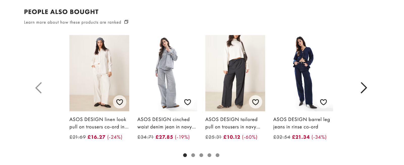
3. Personalized Recommendations
Recommending the right product at the right time boosts average order value without pushing people away.
What to include:
- “You might also like” suggestions below the main product
- Cross-sells on the cart page (“Complete the look,” “Goes well with”)
- Dynamic product recommendations based on browsing or purchase history
What to avoid:
- Irrelevant items that confuse the buyer
- Recommendation widgets that slow down the page
- Popups that interrupt the flow with random products
Just remember that showing more products doesn’t guarantee relevance. When the suggestions feel smart, shoppers feel seen and more likely to buy again, or buy more.
4. Wishlist and Save-for-Later
Not everyone’s ready to buy right now. Give them a way to keep what they’re eyeing without starting over next time.
What to include:
- Wishlist buttons on product pages that don’t require login
- “Save for later” options inside the cart
- Visual cues or reminders when saved items are in stock or on sale
What to avoid:
- Forcing account creation to save items
- Burying the wishlist behind menus or account pages
- Ignoring the data: saved items can fuel retargeting and email flows
Wishlists help you hold onto purchase intent. They also give buyers a low-pressure way to keep exploring without losing track of what they liked.
5. Email Capture That Doesn’t Annoy
Nobody wants to be hit with a popup five seconds into their first visit. Getting emails is important. Losing trust in the process costs more.
What to include:
- Exit-intent popups or triggers based on scroll depth or time on site
- Clear value in the incentive: discount, early access, something that feels worth it
- Simple forms with one or two fields max

What to avoid:
- Popups that appear too early or too often
- Vague language like “Join our newsletter”
- Email traps that don’t deliver on the promised incentive
Effective capture timing respects the user. When the offer is relevant and well-timed, people are more likely to hand over their inbox and keep opening what you send later.
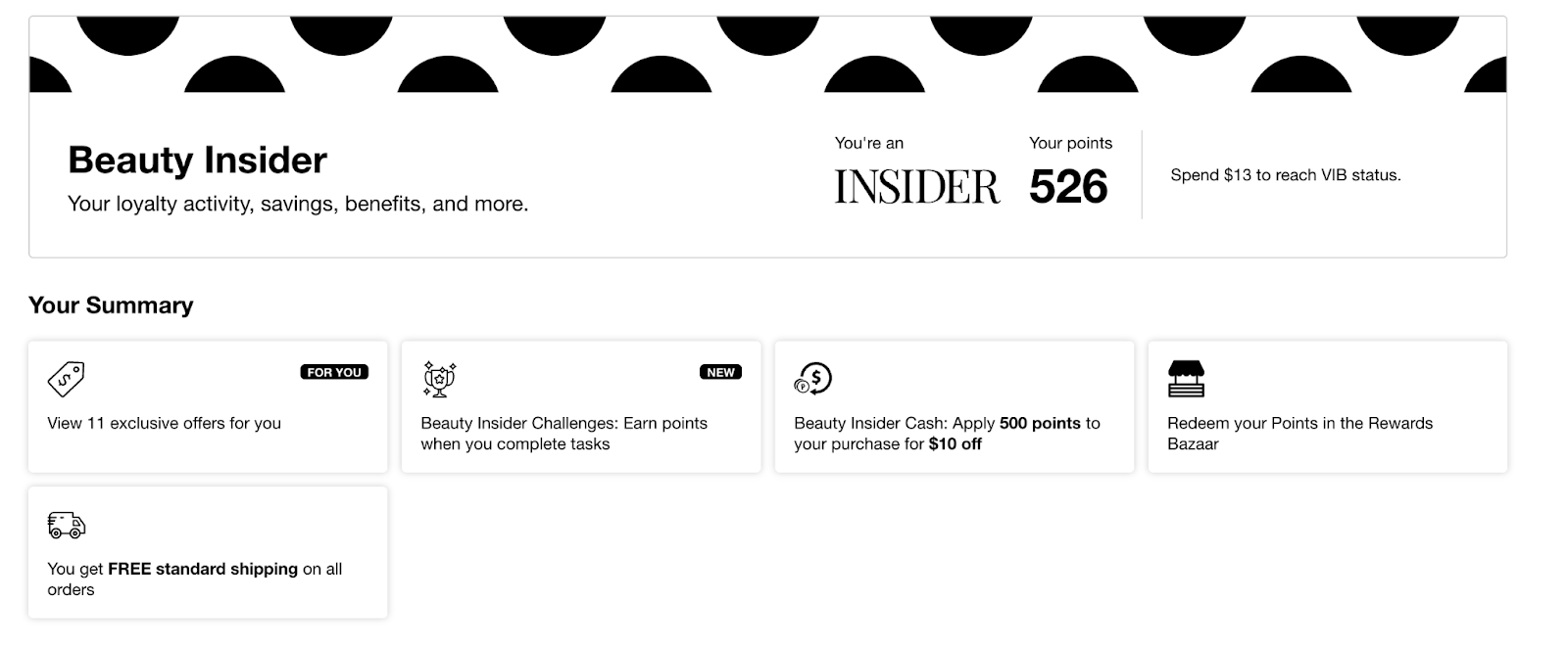
6. Loyalty Programs and Promotions
First-time buyers need a reason to act now. Returning customers need a reason to come back. Loyalty programs and smart promotions give both.
What to include:
- Points or rewards that apply to the next purchase
- Tiered benefits that build over time
- Limited-time offers that are clearly explained and easy to apply
What to avoid:
- Discounts with strings attached buried in fine print
- Overcomplicated rules that confuse people more than they motivate
- Loyalty programs that require an app download or separate sign-up flow
A simple, transparent reward system can be enough to nudge a hesitant buyer or keep a regular one coming back for more.
7. Post-Purchase Personalization
The moment after a successful checkout is one of the few times you have a customer’s full attention and goodwill. Post-purchase personalization uses that moment to strengthen the relationship, guide their next action, and even plant the seed for another purchase.
What to include:
- Tailored product recommendations based on what they just bought
- Loyalty program invitations with clear benefits
- Quick-start guides, care instructions, or style tips relevant to their order
- Referral or review prompts while excitement is still high
What to avoid:
- Aggressive upsells that feel like a sales trap
- Generic thank-you pages with no next step
- Delaying follow-up emails until the order arrives (momentum fades fast)
When post-purchase personalization feels helpful and relevant, it creates a smoother customer journey, shortens the gap between orders, and boosts both satisfaction and lifetime value.
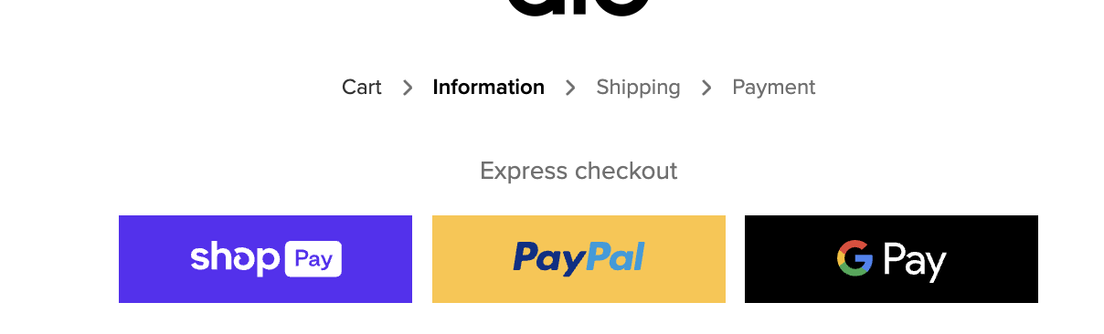
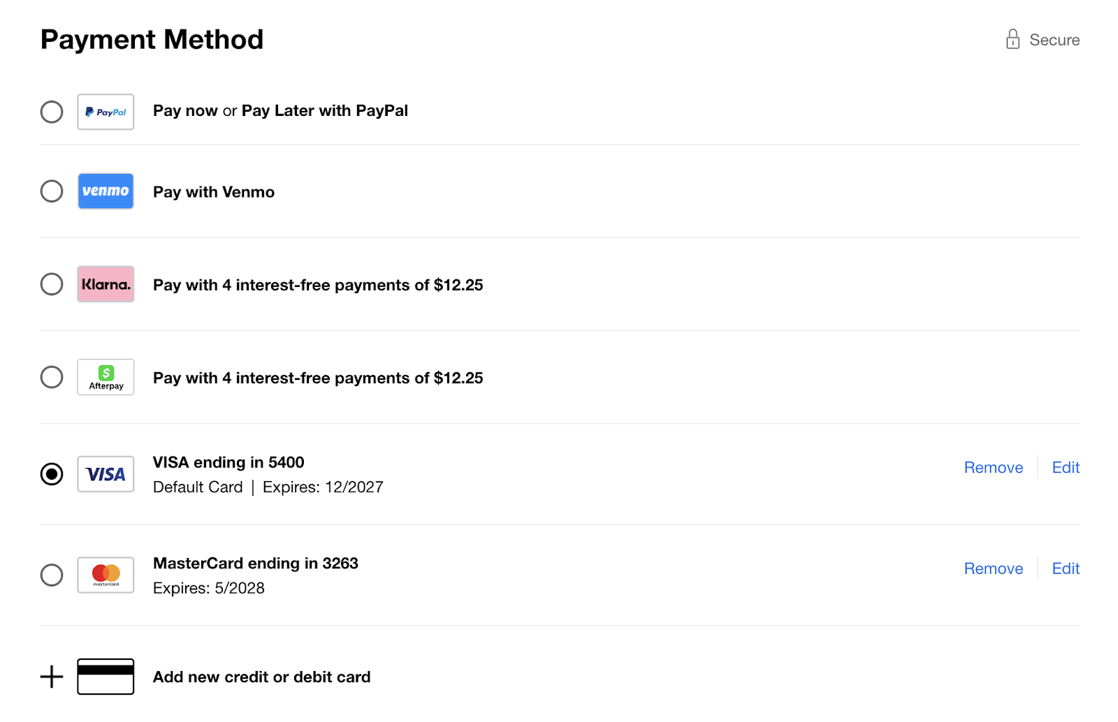
8. Flexible Payment Options (Installments and Pay Later)
Not everyone wants to pay all at once. Offering familiar installment options makes big purchases feel smaller and easier to say yes to.
What to include:
- Pay later services like Klarna, Afterpay, Shop Pay Installments
- Clear messaging about payment breakdowns on product and cart pages
- Mobile-optimized UI that makes the choice feel seamless
What to avoid:
- Hiding pay-later options behind too many steps
- Showing options that aren’t available in the user’s region
- Making the user guess what “installments” really means
When people see payment flexibility early, they’re more likely to commit, especially for bigger carts or new-to-you customers.
9. Multi-Currency Support
If someone has to open a currency converter to shop, you've already added friction.
What to include:
- Automatic currency detection based on location
- Manual currency switcher in the header or cart
- Rounded prices that look native, not converted
What to avoid:
- Showing only your default currency for international users
- Switching currencies mid-checkout
- Adding surprise fees at the end for “international processing”
Let people shop in a format that feels familiar. Clear pricing builds confidence, removes hesitation, and keeps them focused on the purchase.
What Features Make a Website Trustworthy
A trustworthy store answers questions before they’re asked. It explains how shipping works, what happens if something goes wrong, and who’s behind the product. It shows real feedback from real buyers. It makes support easy to reach.
These features help people feel in control of their decision.
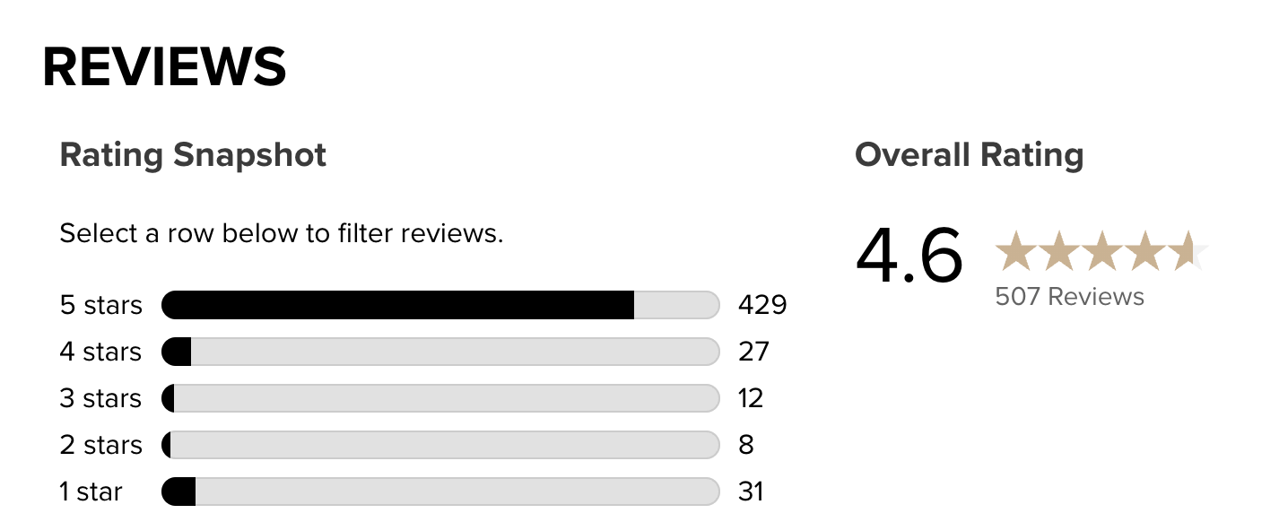
10. Customer Reviews and Ratings
Buyers trust each other more than they trust you (no hard feelings). Reviews show that your product works, that people are happy with it, and that the experience after checkout wasn’t a letdown.
What to include:
- Verified star ratings with written reviews
- Review filters and photo uploads
- A visible form to leave a review or ask a question
What to avoid:
- Moderating out anything remotely negative
- Burying reviews below endless product copy
- Fake-sounding testimonials with no detail
A strong review section proves quality and gives people the answers, reassurance, and confidence they need to hit buy without hesitating.
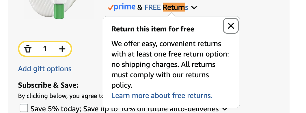
11. Returns and Shipping Clarity
People want to know how long it takes, how much it costs, and what happens if it doesn’t work out. When those answers are clear, it’s easier to commit.
What to include:
- Delivery estimates on product pages
- A link to shipping and return info in the cart and at checkout
- Plain language policies with zero legal jargon
What to avoid:
- Surprise fees at checkout
- Hidden return windows or unclear conditions
- “Policy pages” that require a magnifying glass to find
Shipping and returns set the tone for the entire purchase. Get them right, and buyers stop second-guessing the decision.
12. Secure Payments and Trust Signals
If the checkout page feels sketchy, buyers walk. Payment should feel safe, quick, and familiar.
What to include:
- SSL encryption (HTTPS) across the entire site
- Recognizable payment options like Visa, PayPal, Apple Pay
- Trust badges or icons placed near the payment form
What to avoid:
- Missing or outdated security indicators
- Payment forms that feel homemade or unstyled
- Trust badges stacked like stickers with no context
Payment is the moment of truth. A clean, secure setup gives people the confidence to follow through.
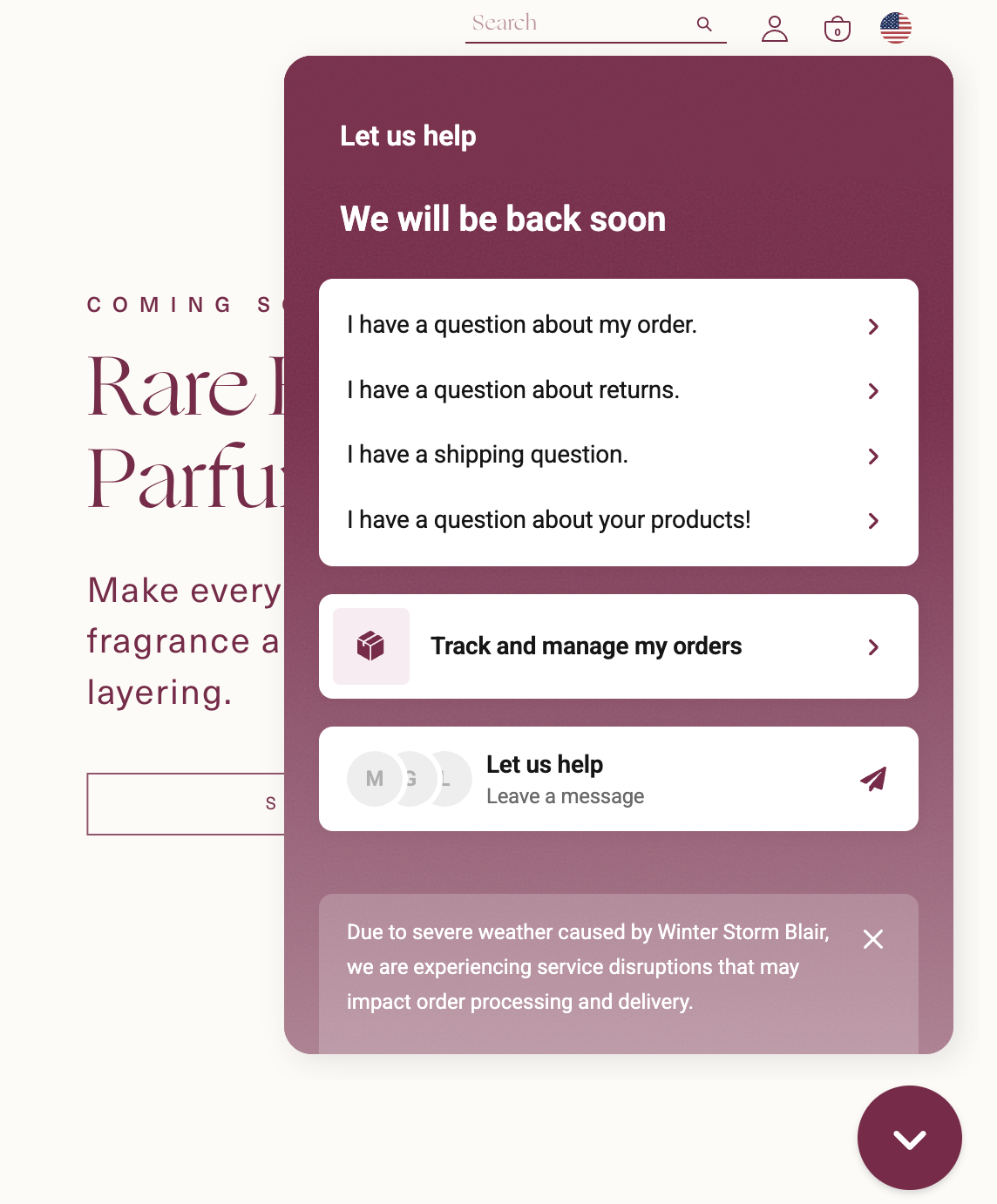
13. Live Chat or AI Chatbots
Some buyers need a quick answer before they buy. A well-placed chat solves that without making them leave the page or dig through FAQs.
What to include:
- Live chat or AI that covers common pre-purchase questions
- Clear chat triggers based on page or time spent
- Mobile-friendly layout that doesn’t block the screen
What to avoid:
- Bots that pretend to be people
- Chat bubbles that pop up too soon or never close
- Support that's only available after login
Chat is a safety net. When it’s fast and useful, it keeps people from bailing over small questions or doubts.
14. Real-Time Order Tracking
Once someone buys, they want updates, without having to ask (or even beg) for them.
What to include:
- Order confirmation with a live tracking link
- Email or SMS updates for each stage of delivery
- A customer account section with full order history and tracking
What to avoid:
- Silent gaps between checkout and delivery
- Tracking pages that redirect to third-party sites with no branding
- Confusing status messages like “In Transit” with no context
Clear tracking keeps customers in the loop and off your support queue. It also shows you’re still taking care of them after the sale.
What Features Improve Ecommerce UX
A store that’s hard to use doesn’t get second chances. If navigation feels clunky, if load times drag, if mobile users have to pinch and zoom, people kiss you goodbye.
These features make the shopping experience smoother, faster, and easier to navigate. They help buyers move through the site without effort, frustration, or confusion.
15. Accessibility UX
If someone can’t use your site with a keyboard or screen reader, they can’t buy from you. Accessibility is part of good UX, not a bonus feature.
What to include:
- Keyboard-friendly navigation
- Clear focus states and high-contrast design
- Proper use of headings, alt text, and ARIA labels
What to avoid:
- Relying only on hover or color to show information
- Skipping alt text or misusing it with keyword stuffing
- Over-customized components that break native functionality
Accessible sites work better for everyone. Clean structure, clear language, and proper labeling make the experience easier to navigate on every device, for every user.
16. Intuitive Navigation and Smart Filtering
Shoppers don’t have time to guess where things are. Navigation should feel obvious. Filtering should feel effortless.
What to include:
- A clear menu structure with logical categories
- Breadcrumbs that show where users are and how to backtrack
- Product filters for size, color, price, and availability, especially on mobile
What to avoid:
- Dropdown menus packed with too many choices
- Filters that reset after every page load
- Search bars that return nothing for common terms
Good navigation removes the need to think. It makes the entire store feel smaller, faster, and easier to shop.
17. Mobile-First UX
Most of your traffic is on mobile. If your site feels slow, crowded, or broken on a phone, you’re losing sales before the page even loads.
What to include:
- Tap-friendly buttons with plenty of spacing
- Vertical layouts built for scrolling
- Compressed images, lazy loading, and mobile-optimized fonts
What to avoid:
- Popups that take over the screen
- Horizontal scrolling sections that don’t swipe cleanly
- Desktop layouts awkwardly shrunk to fit a smaller screen
A mobile-first site respects how people actually shop. Everything should be easy to tap, fast to load, and simple to read on the go.
18. On-Site Content Modules
People decide faster when they can picture the product in their life. Extra content on the product page answers questions, builds confidence, and keeps them moving toward checkout. It also gives you an SEO edge and turns your product page into more than a static catalog entry.
What to include:
- “How to use” or “Style it with” sections for visual inspiration
- UGC carousels from Instagram, TikTok, or customer reviews showing the product in real life
- Interactive fit finders, shade matchers, or quizzes that point people toward their best match
What to avoid:
- Embedding videos or widgets that slow load times
- Layouts that push the buy button out of sight
- Generic stock images that don’t match your brand style
When these modules are relevant and well-placed, they remove the last bit of hesitation before the buy button.
19. Product Page UX That Helps People Decide
A good product page makes it easy to understand what you’re buying and take action without hunting for details or fighting the layout.
What to include:
- A responsive photo gallery with zoom or multiple angles
- Scannable layout with headings, sections, and expandable details
- A size guide or spec sheet that’s visible without extra clicks
- Navigation elements like breadcrumbs or “Back to results” for smoother flow
What to avoid:
- Walls of text without visual structure
- Layouts that hide essential info behind tabs or modal windows
- Product pages that behave differently on desktop vs mobile
Everything on the page should make the decision easier without dead ends and digging around.
20. Site Speed and Core Web Vitals
Slow pages don’t sell. Lag makes people bounce, scroll past, or give up completely.
What to include:
- Image compression without losing quality
- Lazy loading for off-screen content
- A performance-focused theme or framework that doesn’t drag under pressure
What to avoid:
- Unused apps or scripts that load on every page
- Hero images that take five seconds to render
- Metrics that look fine on desktop but tank on mobile
Fast sites feel better to use. They load cleanly, respond quickly, and make the entire store feel more reliable.
21. SEO-Friendly Content Structure
Clean structure helps users find what they’re looking for, both on the site and in search engines. It’s essential for clarity.
What to include:
- Logical page hierarchy with one H1, followed by clear H2s and H3s
- Descriptive URLs that match the page topic
- Internal links that guide users through related content or categories
- Alt text that describes visuals, not crams in keywords
What to avoid:
- Duplicate content across product pages or collections
- Unclear or generic headings like “More Info”
- Walls of text with no structure or visual breaks
When the structure is clean, the site feels easier to read, easier to scan, and easier to trust. Search engines notice. So do your customers.
22. Microcopy That Converts
The small bits of text around buttons, forms, and errors shape how people move through your site. When microcopy is clear, people don’t get stuck or confused.
What to include:
- Button labels that describe the action (“Add to Cart,” “Continue to Shipping”)
- Inline form hints like “Enter a valid email” or “MM/YY” for card expiry
- Friendly, helpful error messages that explain what went wrong and how to fix it
What to avoid:
- Vague buttons like “Submit” or “Continue” with no context
- Placeholder text doing the job of labels
- Errors that blame the user or don’t explain the fix
Good microcopy makes the site feel smarter and easier to use. It reduces friction, clears up hesitation, and keeps people moving without questions.
23. Dark Mode and Visual Theme Options
Some users prefer a darker interface. Others just want a site that doesn’t strain their eyes at night. Visual flexibility makes the experience more comfortable without changing the content.
What to include:
- A toggle for dark mode or system-based auto detection
- Consistent design in both themes, no broken buttons or unreadable text
- Contrast levels that meet accessibility standards
What to avoid:
- Dark modes that feel like an afterthought
- Color palettes that clash or hide important elements
- Inconsistent spacing, icons, or styles between modes
Theme options need to work cleanly and quietly, giving users more control over how they view your store.
24. Multi-Language Support
Language switching is part of navigation. It should be simple to use, easy to find, and stable across every step of the shopping experience.
What to include:
- A visible toggle in the header or footer
- Seamless transitions between languages with no lost progress
- Identical layout and structure across every version
What to avoid:
- Broken or partial translations
- Language switches that reset the cart or page
- Auto-detection that forces a version without giving the user control
When language support is done well, international users move through the store with the same clarity and speed as everyone else.
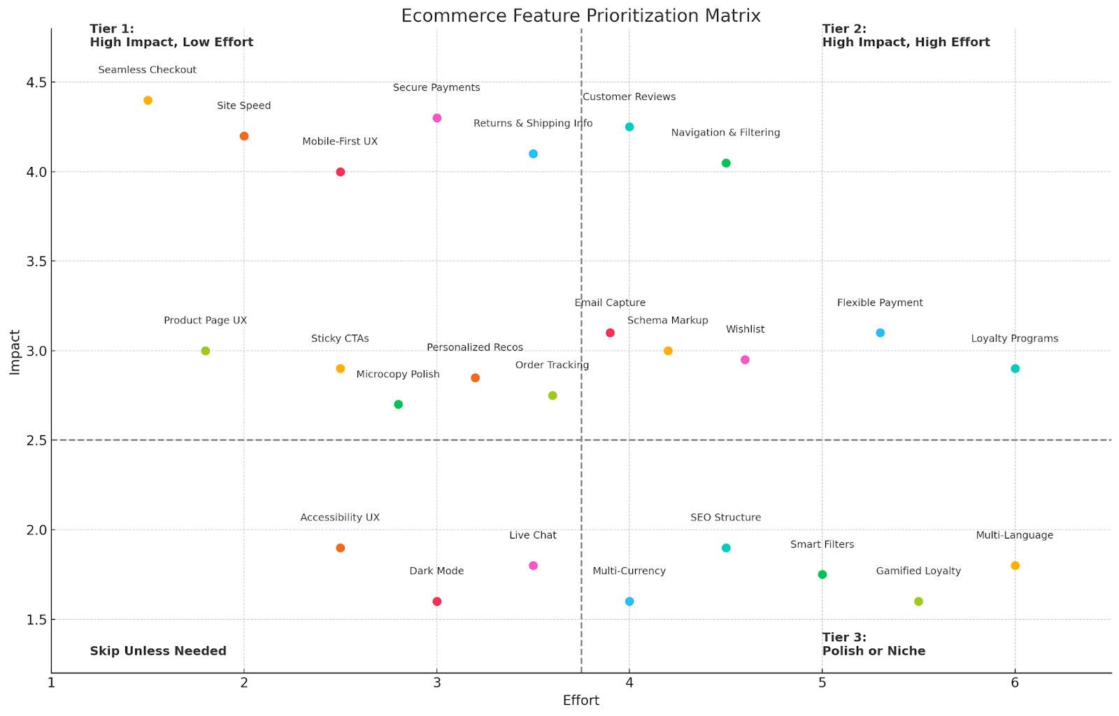
How to Prioritize Ecommerce Features: A Cheatsheet
Too many stores chase flashy features before getting the basics right. Use this framework to make smart calls whether you’re building your store from scratch or auditing an existing site.
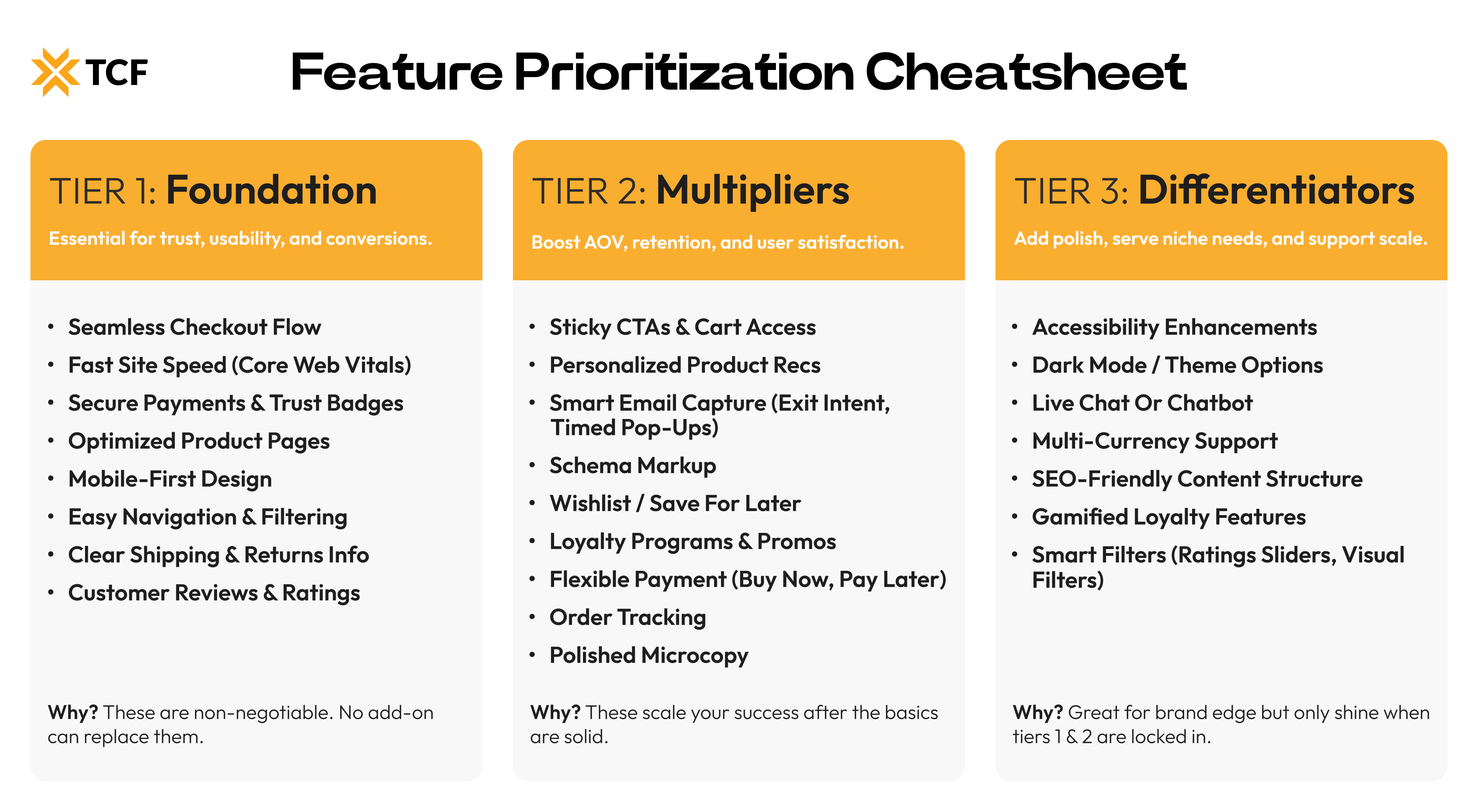
Tier 1: Foundation (Build these first, always)
These are the must-haves. Without them, your site can’t convert, build trust, or function well.
- Seamless Checkout Flow
- Site Speed and Core Web Vitals
- Secure Payments and Trust Signals
- Product Page UX
- Mobile-First UX
- Intuitive Navigation and Filtering
- Clear Returns and Shipping Info
- Customer Reviews and Ratings
Why? These directly impact usability, trust, and conversions on every visit. No fancy add-on replaces them.
Tier 2: Multipliers (Boost performance once the foundation’s solid)
These features enhance good UX and scale what’s working.
- Sticky CTAs and Cart Access
- Personalized Recommendations
- Email Capture (Exit Intent, Smart Timing)
- Schema Markup
- Wishlist and Save for Later
- Loyalty Programs and Promos
- Flexible Payment Options (Pay Later)
- Order Tracking
- Microcopy Polish
Why? They increase AOV, retention, and user satisfaction if your core flow is already smooth.
Tier 3: Differentiators (Nice-to-haves that add polish or edge)
These will help you stand out, support long-term UX, or serve niche audiences.
- Accessibility UX
- Dark Mode / Theme Options
- Live Chat or Chatbot
- Multi-Currency Support
- SEO-Friendly Content Structure
- Loyalty Gamification
- Smart Filtering Add-ons (e.g. ratings sliders, visual filters)
Why? These show maturity. They support scale and improve experience but they only shine if the rest works.
Conclusion
Great ecommerce sites are built on clarity, speed, and trust. That doesn’t come from guessing or stacking trendy plugins. It comes from the right features, placed with intention.
You’ve now got a list that covers the essentials:
- Conversion features that remove friction.
- Trust features that answer questions before they’re asked.
- UX features that make every part of the experience feel smooth.
You also have a prioritization framework to help you focus on what matters first. Start with the foundation, then layer on the tools that improve performance and scale what’s already working.
No need to do everything at once. But no excuse to keep shipping a site that holds you back.
Make smart upgrades. Track what improves. And keep building a store that actually helps people buy.
[[cta5]]


.avif)


.avif)