Most Shopify homepages do not fail quietly.
Traffic lands. Visitors scroll. A few sections look familiar. The copy sounds fine. Then people leave. No obvious mistakes. But no clear win either. Conversion rates stall and the homepage keeps existing in that uncomfortable middle zone.
That usually triggers small tweaks. A headline rewrite. A new hero image. Another featured collection. Sometimes a full Shopify theme change. The page looks different, the numbers barely react, and the cycle repeats.
What’s missing is direction?
A high-converting Shopify homepage gives visitors orientation fast. It tells them they’re in the right place, shows why they should trust the brand, and makes the next step feel easy. That outcome comes from structure, hierarchy, and intentional sequencing.
In this guide, we’ll break down Shopify homepage design through the lens of intent and behavior. You’ll see how strong homepages guide different types of visitors, which sections actually earn their space, and how to improve performance without blowing up your entire site.
[[cta5]]
What a Shopify Homepage Needs to
A Shopify homepage has a short window to earn attention. People arrive with context, expectations, and varying levels of intent. The homepage’s job is to meet them there and guide them forward with confidence.
Shopify Homepage needs to:
- Orient
Visitors should understand what the brand sells, who it’s for, and why it matters within seconds. Clear messaging beats clever phrasing every time here. If someone has to scroll or decode the offer, momentum drops.
- Build trust early
New visitors look for reassurance before they look for products. Social proof, shipping clarity, returns, guarantees, and brand credibility matter more than another product row. Trust removes hesitation. Without it, everything else struggles.Early trust
- Guide action
A good homepage makes decisions for the visitor. It highlights the most relevant paths, reduces noise, and nudges people toward the next logical step, browsing a collection, exploring a product, or learning more when needed.
- Respect intent
Different visitors arrive for different reasons. Some are discovering the brand for the first time. Others are returning to buy. The homepage should feel deliberate, not generic. When structure and sequencing are intentional, the page feels calm, confident, and easy to move through.
When these pieces work together, the homepage starts functioning like a clear entry point into the store.
Why Most Shopify Homepages Underperform
Most Shopify homepages struggle for the same reasons.
- They try to serve every visitor at the same time.
New visitors, repeat customers, ad traffic, and high-intent shoppers all see the same layout, the same sections, and the same priorities. The result is a page that feels busy, familiar, and oddly unconvincing. Nothing stands out because everything is asking for attention.
- Overproduction.
More sections get added with good intentions. Best sellers. New arrivals. Brand story. Reviews. Press logos. FAQs. By the time a visitor scrolls halfway down, the page has lost its sense of direction. The message gets diluted, even if every section looks polished on its own.
- Generic copy.
Copy also tends to blur together. Many homepages sound interchangeable because they borrow language from other brands in the same category. Safe phrases replace clear ones. The brand stops sounding specific, and specificity is what builds confidence.
- Blaming Shopify themes in everything.
Teams switch Shopify themes hoping performance will follow. The layout changes, the visuals improve, and conversion stays flat. Most Shopify themes offer similar structural building blocks. They do not fix unclear hierarchy, weak messaging, or misaligned intent. A theme can support a strong strategy, but it cannot create one.
- Insubstantial design changes
Visual refreshes happen without addressing what the visitor needs to see first. Layout changes lead the thinking instead of supporting the underlying Shopify marketing strategy. When structure and intent stay unclear, improvements remain cosmetic and performance stays flat.
Designing a Shopify Homepage Around Visitor Intent
Many Shopify homepages are built like catalogs. Rows of products, featured collections, and carousels stacked one after another. Everything is technically correct. Everything is also asking the visitor to figure things out on their own.
High-converting homepages start by predicting intent.
• A first-time visitor usually wants reassurance.
They are scanning for clarity, credibility, and relevance. They want to understand what the brand stands for, who it’s for, and why it deserves attention. Leading with proof, positioning, and an approachable product path works better here than dropping them into a dense grid of SKUs.
• A returning visitor wants efficiency.
They already trust the brand. They are looking for what’s new, what’s relevant now, or what changed since last time. Showing the same hero and best sellers again slows them down and wastes attention. New arrivals, limited drops, or curated updates work better here.
• Visitors coming from paid ads arrive with expectations shaped by the ad itself.
The homepage needs to confirm that promise immediately. The hero message, visuals, and primary CTA should feel like a continuation of the ad, not a reset. When the message shifts or feels generic, confidence drops fast.
• Organic search visitors tend to arrive curious rather than urgent.
They are validating, comparing, or learning. The homepage should feel informative and credible without becoming heavy. Clear positioning, light education, and well-placed trust signals help this group move forward at their own pace.
• High-intent and retargeted visitors sit closest to conversion.
They have browsed before. Some added to cart. For them, the homepage should reduce friction and reinforce value. Proof, bundles, premium lines, or tightly curated collections help close the gap.
This is where many homepages lose ground. They treat inventory as the story instead of using products to support a story. When sections are organized around meaning, use cases, or outcomes, the page feels curated. It feels intentional. It feels easier to move through.
Think in terms of guidance. Fewer products with clearer framing outperform long lists with no context. The goal is to help visitors recognize themselves in what they’re seeing, then give them a clear path forward.
When intent leads and inventory follows, the homepage starts doing real work.
High-Converting Shopify Homepage Framework
Once intent is clear, structure does the heavy lifting. That’s where a simple homepage framework helps. It keeps the page focused and calm. Each section earns its place and moves the visitor forward instead of competing for attention.
1. Hero section: instant orientation
The hero section answers three questions fast. What is this brand? Who is it for? What should I do next?
Strong heroes use plain language. They lead with a clear value, supported by one short line of context and a single primary action. Visuals support the message instead of distracting from it. When the hero leans on abstraction or vague phrasing, visitors pause. When it’s clear, they move.
If someone cannot explain your offer after seeing the hero once, orientation is missing.
2. Trust signals: reassurance before commitment
Trust should appear early. New visitors scan for reassurance before they invest attention.
Baymard Institute’s research on checkout abandonment consistently shows that unclear shipping costs, return policies, or perceived lack of credibility increase abandonment. While that data is measured at checkout, the hesitation often starts much earlier in the journey.
This can include reviews, press mentions, guarantees, shipping clarity, or recognizable proof points. Format matters less than placement. Trust works best when it removes doubt before the visitor has to question it.
The goal is confidence that feels natural.
3. Product sections: guided choices over volume
When everything is highlighted, nothing stands out.
Product sections perform best when they are selective and intentional. Usability research consistently shows that increasing the number of choices increases cognitive load and decision time, a principle known as Hick’s Law. In ecommerce testing, this often translates into higher engagement when product groups are curated rather than presented as large, undifferentiated grids.
Group products around meaning. Giftable pieces. Everyday essentials. Most loved. New this season. These cues help visitors decide without friction.
To validate in your own store, test: 3-5 curated products with contextual framing vs. a larger 12+ product grid without framing.
Measure:
- Homepage to PDP click-through rate
- Time to first product click
- Scroll depth
- Conversion rate segmented by traffic source
4. Social proof: credibility at the moment of hesitation
Social proof carries weight when it feels specific and human. Short quotes, real names, and concrete outcomes resonate more than long testimonials.
Place proof where hesitation naturally shows up. Near CTAs. After product highlights. Before commitment moments. Social proof should reinforce a decision already forming.
One strong signal in the right spot does more work than many scattered ones.
5. CTAs: direction without pressure
Not every visitor arrives ready to buy. CTAs need to reflect that reality.
Primary CTAs guide decisive users forward. Secondary CTAs support exploration. Visual hierarchy matters. When CTAs compete, progress slows.
Each action should feel like the obvious next step.
6. Navigation: friction-free movement
Navigation sets the rhythm of the experience. Clean menus help visitors orient themselves quickly and move with confidence.
Limit choices. Use familiar labels. Make search easy to find. On mobile, prioritize tap-friendly spacing and clear paths.
Navigation should support momentum, not interrupt it.
Real Shopify Homepage Examples and Why They Work
This section is about pattern recognition. Each example below solves a specific homepage problem and makes clear decisions that support conversion.
1. Rhode Skin

Rhode’s homepage succeeds because it prioritizes controlled clarity over volume.
- The hero announces a launch with a single CTA.
- The first product section highlights three focused entries rather than a 12-product grid.
- Each product card shows ratings, review count, and price before the click.
- The CTA embeds pricing directly, reducing uncertainty.
- Social proof appears visually through curated user imagery, and brand credibility is layered through sustainability messaging before the footer.
- The structure guides, it does not overwhelm.
Why it works
1. It reduces decision friction for cold traffic. Visitors are not forced to scan 20 products at once. The homepage narrows attention to a few intentional choices, which shortens time to first click.
2. It removes price ambiguity early. Prices and ratings appear before the PDP. That filters unqualified clicks and improves intent quality.
3. It separates announcement from utility. The hero builds momentum around the launch. Mid-page sections explain benefits and usage. The page moves from excitement to explanation in a controlled sequence.
4. Social proof feels native, not forced. UGC is visual and identity-driven, not testimonial-heavy. It reinforces belonging without interrupting flow.
5. Trust signals are layered, not stacked. Sustainability, mission, and compliance appear later in the scroll, where skeptical users look for reassurance. They are present without competing with the buying path.
2. Huel
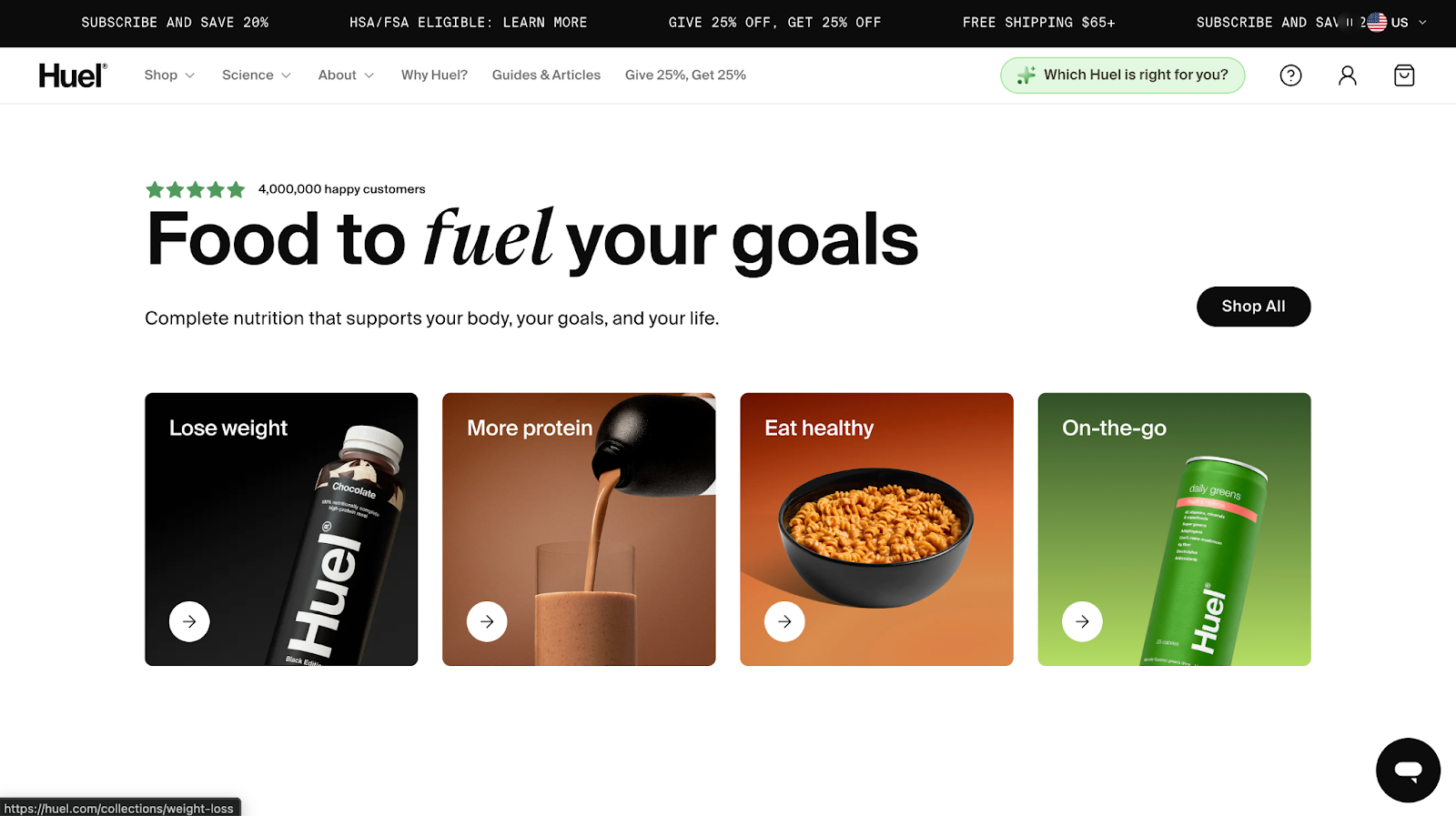
Huel’s homepage is built to handle complexity without feeling chaotic.
- The hero opens with quantified social proof and a benefit-led headline, followed by a single primary CTA.
- Instead of pushing individual SKUs immediately, the first interaction layer is goal-based navigation, Lose weight, More protein, Eat healthy, On-the-go. Category tiles precede product grids.
- Scientific credibility is reinforced through “100+ peer-reviewed studies” and visible macro callouts.
- Celebrity endorsements and major media logos appear mid-scroll, followed by bestseller grids that show protein grams, calories, price per meal, and starting price before the click.
- Risk reducers, 30-day taste guarantee and free t-shirt offer, appear before the footer, reinforcing conversion momentum.
Why it works
1. It anchors trust before selling. The first scroll layers customer volume, quantified benefits, and scientific validation before heavy product exposure. Authority is established early.
2. It is organized by intent. Goal-based entry points reduce cognitive load. Visitors choose a need first, then products.
3. Claims are specific. 35g protein. 400 calories. 27 vitamins. $1.52 per meal. Quantification increases credibility and comparison clarity.
4. It stacks multiple trust layers. Scientific studies, expert endorsements, celebrity faces, press logos, B-Corp badge, and money-back guarantee. Different persuasion triggers for different buyer types.
5. It repeats CTAs without visual chaos. “Shop now” and “Shop all” appear consistently across sections, but the visual hierarchy stays stable. Buttons do not compete with each other.
6. It reduces risk late in the scroll. The 30-day guarantee and discount incentive appear after authority is built, reinforcing action rather than interrupting exploration.
3. Nomad Goods
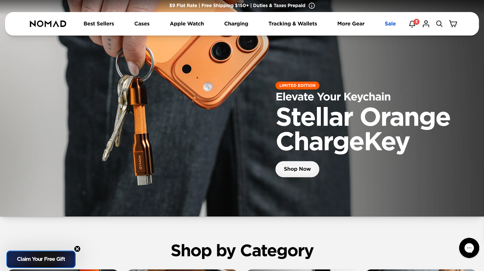
Nomad’s homepage is structured around layered merchandising and brand authority.
- The first interaction prioritizes list growth with a $25 gift email incentive before browsing begins.
- The hero promotes a limited-edition product with a single “Shop Now” CTA, anchoring urgency early.
- Instead of pushing one dense product grid, the page transitions into large “Shop by Category” tiles that narrow exploration by product family.
- Featured collections and curated grids follow, with pricing visible before the click.
- Mid-scroll, the structure shifts from selling to storytelling through a Horween Leather craftsmanship section and lifestyle imagery.
- Community imagery and tagged user content appear before the footer, while sustainability commitments and climate-neutral messaging reinforce credibility near the end.
- The homepage blends direct-response tactics with premium positioning without feeling chaotic.
Why it works
1. It monetizes traffic early. The email incentive captures non-buyers. Even if the first session does not convert, the brand keeps the relationship.
2. It uses scarcity strategically. Limited edition framing at the top increases urgency without turning the entire page into a sale event.
3. It organizes complexity with modular sections. Nomad sells across multiple device categories. The homepage breaks exploration into digestible layers: category > featured products > materials > community > brand.
4. It blends performance and premium cues. Direct CTAs like “Shop Now” coexist with craftsmanship storytelling and founder quotes. This widens appeal across buyer types.
5. It reinforces brand durability visually. Rugged imagery, dark palettes, metal textures, leather close-ups. The visuals support product claims without heavy copy.
6. Trust signals are distributed, not clustered. Climate-neutral badge, shipping messaging in top bar, founder credibility, sustainability blocks, and customer imagery appear throughout the scroll.
4. Blunt Umbrellas

Blunt’s homepage is structured around engineered durability and controlled minimalism.
- The hero uses oversized typography and restrained motion to anchor attention on a single idea, design-led strength.
- Navigation remains simple, with clear product segmentation rather than promotional clutter.
- Product sections emphasize construction details, internal mechanics, and material integrity, showing the umbrella from multiple angles to support premium positioning.
- Limited editions and collaborations are framed editorially rather than discount-driven.
- Mid-scroll, the “Blunt difference” section visually explains the structural innovation, reinforcing why the product costs more.
- Trust signals are layered throughout the page, including warranty messaging, repairability, B Corp certification, and press features.
- The structure educates before it asks for purchase.
Why it works
1. It anchors everything to one core value. Engineering and durability are reinforced visually and structurally across the entire scroll.
2. It justifies premium pricing through transparency. Mechanism breakdowns and construction visuals reduce skepticism.
3. It removes promotional noise. The absence of aggressive discounting reinforces product confidence.
4. It layers trust across multiple touchpoints. Warranty, sustainability credentials, and press validation appear before hesitation peaks.
5. It builds authority before conversion. Education and explanation come first, positioning the product as long-term ownership rather than impulse purchase.
SEO, Speed, and Technical Choices That Affect Conversion
These elements do not create conversion on their own, but they quietly decide how much conversion your homepage can support. When they’re ignored, even strong structure struggles to perform.
Speed comes first.
On Shopify, speed issues usually come from accumulation. Multiple apps inject scripts. Themes carry unused sections. Hero images are uploaded at excessive resolutions. Third-party tools load before the primary content renders.
Google’s Web Vitals initiative defines clear thresholds for what qualifies as a good user experience.
Largest Contentful Paint, LCP, should occur within 2.5 seconds.
Cumulative Layout Shift, CLS, should stay under 0.1.
Interaction to Next Paint, INP, should remain under 200 milliseconds.
These are measured at the 75th percentile of real users across devices.
On most Shopify homepages, the LCP element is the hero image or headline block. That element deserves priority optimization.
Shopify-specific diagnostic steps:
- Audit installed apps and identify which inject scripts sitewide.
- Review theme section image dimensions and compress oversized assets.
- Run Lighthouse or PageSpeed Insights to identify the LCP element and optimize it first.
- Defer non-critical third-party scripts such as chat, A/B testing tools, heatmaps, and popups.
- Remove unused apps and clean residual theme code where necessary.
Use Lighthouse, PageSpeed Insights, and Shopify’s Web Performance reporting to measure impact. Always test mobile explicitly.
Mobile experience matters more than most teams admit.
Most Shopify traffic arrives from paid channels on phones. Text should be readable without zooming. CTAs should sit within thumb reach. Vertical spacing should prevent visual crowding. Autoplay media should load responsibly.
Theme flexibility introduces tradeoffs. Each additional app or dynamic widget increases script weight and rendering complexity. Teams should evaluate each addition against performance impact.
SEO structure plays a supporting role.
Maintain one clear H1. Use logical H2s. Ensure primary collections are crawlable through navigation. Surface important categories directly in menus. Link internally from the homepage to high-value collections intentionally.
FAQs and structured data deserve a mention when used intentionally.
FAQ content should appear visibly on the page and answer real objections, shipping timelines, returns, warranties, and product quality questions.
Structured data should reflect accurate product availability, review counts, and organization details. Review outputs from Shopify apps to confirm schema accuracy.
The homepage functions as infrastructure. When speed, script discipline, and structural clarity are maintained, the rest of the page performs more effectively.
Common Shopify Store Homepage Mistakes
Most homepage mistakes don’t look like mistakes. They look reasonable. Polished. Familiar. That’s why they stick around.
1. Trying to say everything at once
Multiple messages above the fold create hesitation. When value props, promos, products, and CTAs all compete for attention, visitors slow down. Clear hierarchy beats completeness every time.
2. Sliders and carousels
They look flexible and perform poorly. Most visitors only see the first slide. The message changes before it lands, which weakens clarity and trust.
This isn’t theoretical. In a widely cited homepage study by Erik Runyon at the University of Notre Dame, only about 1% of visitors clicked on a carousel, and nearly 89% of those clicks went to the first slide. Everything after slide one was largely ignored.
Beyond low interaction, sliders contribute to banner blindness, stack multiple messages at once, slow down load times, and frequently break the mobile experience. If a message is important, it should not depend on rotation to be seen.
3. Competing CTAs
Primary and secondary actions often get equal visual weight. “Shop now,” “Learn more,” and “Take the quiz” fighting for attention forces decisions too early. Strong pages guide one clear next step.
4. Safe, interchangeable copy
Pleasant language that could belong to any brand reduces confidence. Vague promises sound polished and forgettable. Specific language builds trust faster and sticks longer.
5. Oversized product grids
Large grids ask visitors to browse before they understand context. Without framing, choice feels heavy. Curated selections with clear reasons convert better.
6. Sections kept out of habit
Brand stories that belong on the About page. Press strips no one reads. Features added because the best Shopify stores have them. If a section does not help someone decide or move forward, it creates friction.
7. Overdoing it
More apps, more widgets, more features rarely improve performance. Technical choices shouldn’t add complexity.
These mistakes rarely look broken. They look normal. That’s why they’re dangerous. Over time, they soften the homepage and quietly drain conversion.
Shopify Store Homepage Optimization Checklist by Priority
Fix these first. Do not skip ahead.
1. Above the fold
- One clear message that states what you sell and who it’s for
- One primary CTA with visual priority
- No sliders, no competing headlines, no stacked offers
2. Early trust
- Social proof visible without scrolling far
- Clear shipping and returns signals
- Proof placed near the first CTA
3. Primary path
- One main journey highlighted, collection, product type, or use case
- Secondary paths exist but stay visually quieter
- No more than one major decision per section
4. Product framing
- Curated groups with context instead of raw grids
- Three to five products per section
- Framing based on use, outcome, or relevance
5. CTA hierarchy
- One dominant action repeated consistently
- Supporting CTAs feel optional, not competitive
- No mixed signals at decision points
6. Navigation
- Simple labels, familiar structure
- Search easy to find
- Mobile navigation tested with one hand
7. Mobile pass
- Text readable without zoom
- Buttons easy to tap
- Sections breathe, nothing feels cramped
8. Section audit
- Every section answers one question or drives one action
- Anything that does neither gets removed
- Fewer sections with clearer roles outperform long pages
9. Speed check
- Images optimized
- Unused apps removed
- No heavy elements above the fold
10. Final sanity check
- Can someone explain your offer after five seconds
- Is the next step obvious
- Does the page feel calm, not busy
When to Hire a Shopify Marketing Agency
Some homepage issues come from strategy. Others come from capacity.
When teams know what needs to change but cannot execute it cleanly, that’s usually when they start looking for the best marketing agencies to hire.
The right agency connects intent to execution. That means aligning homepage structure with traffic sources, positioning, and conversion goals, then removing friction that internal teams often stop noticing. This is especially relevant for brands with steady traffic and stalled performance.
At TCF, homepage strategy is treated as part of a larger growth system. The focus stays on clarity, hierarchy, and how the homepage supports paid traffic, email, and launch momentum, not surface-level redesigns.
Conclusion
Everything we covered points back to one shift in mindset.
A Shopify homepage works best when it’s built around how people arrive and decide, not around what the store happens to sell. Traffic source matters. Intent matters. Order matters. The page either guides someone forward or asks them to think too hard.
We talked about why busy homepages stall, why copying layouts rarely fixes conversion, and why structure does more heavy lifting than visuals. We looked at how different visitors need different signals, how good examples make clear choices, and how technical decisions quietly shape performance in the background. We also called out the habits that soften a homepage over time, even when everything looks “fine.”
The thread running through all of it is focus.
When a homepage prioritizes clarity, trust, and direction, the rest gets simpler. Decisions feel easier. Sections earn their space. Conversion starts to feel intentional.
If your homepage feels crowded, flat, or strangely quiet, that’s useful feedback. It means the page needs fewer assumptions and stronger choices. Start there. Let intent lead. Let structure support it.
That’s how Shopify homepages stop spinning their wheels and start doing their job.
[[cta5]]
FAQ
What should a Shopify homepage include?
A high-converting Shopify homepage should include:
- A clear value proposition above the fold
- One primary CTA with visual priority
- Early trust signals, reviews, guarantees, shipping clarity
- A guided product path, not a raw product dump
- Social proof placed near hesitation points
- Clean navigation and mobile-friendly layout
Every section should either reduce doubt or guide action. If it does neither, it adds friction.
How long should a Shopify homepage be?
Length depends on complexity.
Simple single-product or tightly focused brands often convert with shorter, highly curated homepages. Stores with multiple product categories or higher price points usually need more space for education and trust building.
The better question is structure, not length. If the page flows logically and each section has a clear role, length rarely hurts. If sections repeat or compete, even a short page feels heavy.
Should I show all my products on the homepage?
No.
Homepages perform better when they narrow choices. Curated groups of three to five products with clear framing consistently outperform large undifferentiated grids for cold traffic.
Do sliders hurt Shopify homepage conversion?
In most cases, yes.
Data from Erik Runyon’s homepage carousel study showed that only about 1% of users clicked on sliders, and nearly all clicks went to the first slide. Additional slides received minimal interaction.
How do I optimize my Shopify homepage for mobile?
Start with behavior, not layout.
- Test thumb reach for primary CTAs
- Ensure text is readable without zooming
- Reduce section density
- Avoid autoplay-heavy hero media
- Check spacing between interactive elements
How often should I redesign my Shopify homepage?
Redesign only when structure needs to change.
Small, intentional optimizations outperform frequent visual refreshes. Test messaging, product framing, and CTA hierarchy before changing themes or rebuilding layouts.
If traffic is stable and performance is flat, focus on clarity and sequencing first.
Do I need a Shopify marketing agency to fix my homepage?
Not always.
If your team understands visitor intent and can implement structural changes cleanly, optimization can be done internally.
If traffic is strong but performance stalls, messaging feels vague, or paid traffic is misaligned with homepage structure, outside perspective often accelerates progress.
The homepage is part of a larger system. Strategy matters more than design alone.





.avif)


.avif)


