
Beauty ecommerce is dangerous in the best way. One minute you’re “just browsing,” the next you’re broke with three different serums on the way and zero regrets. That’s the power of a site that knows exactly how to pull you in.
Shoppers expect speed, personality, and perks every time they land on a beauty site. Slow load times? Bye. Clunky menus? Close tab. A loyalty program that actually feels rewarding? Suddenly we’re adding another lipstick we didn’t plan on, because points make it feel free even when the bank account says otherwise.
This article dives into the beauty brands that are absolutely owning ecommerce right now. From AR tools that keep you from wasting cash on the wrong shade to checkout flows that make hitting “place order” weirdly satisfying, here’s what’s working, and how you can make it work for your own store.
[[cta5]]
What Makes a Great Beauty Ecommerce Experience Today?
Before we get into which brands are slaying the beauty ecommerce game, let’s talk about what actually makes a beauty site worth spending half your paycheck on. Spoiler: it’s not fancy fonts or a homepage that looks like a Vogue cover that makes you stay, click, and convince yourself that yes, you really do need another cream blush.
1. Personalization and AI
Beauty shoppers want to feel like the site knows them. Smart recommendations, shade-matching quizzes, and AI-driven “your skin, your rules” tools are table stakes. When a site nails ecommerce personalization, it feels less like shopping and more like having a friend who knows exactly which serum your tired face is begging for.
2. Seamless Checkout and Payment Flexibility
Nothing beats a Jet2 holiday and kills the vibe faster than a 10-step checkout. Beauty ecommerce flows in 2025 need to be fast, mobile-friendly, and stacked with flexible payment options. Apple Pay, Klarna, Afterpay: all the excuses to hit purchase. Because if it feels like free money, we’re absolutely adding more.
3. Loyalty, Retention, and Community
Loyalty programs are mini fan clubs now. The best ones keep you coming back with perks, points, and early drops that feel exclusive. These programs sit at the core of the modern beauty and cosmetics customer experience, blending rewards with emotional connection. And yes, we’ll happily buy one more highlighter because the app promised double points this weekend. Girl math.
4. Performance and UX
A gorgeous site means nothing if the shoppers have already left by the time loads. If your site lags, they’re already back on TikTok. Speed matters. Mobile matters. Clean navigation matters. If the experience feels clunky or confusing, people bounce and your cart sits empty. The best beauty sites run smooth, look good on any screen, and make it effortless to keep browsing instead of rage-quitting.
Which Beauty Brands Have the Best Ecommerce Experience?
The internet is full of beauty brands, but only a handful have figured out how to make shopping online feel addictive in the best way (for them). Let’s look at the best of them.
1. Sephora
Sephora has its site and app running as full-on beauty ecosystems. They keep you swiping, trying, and buying with:
- Interactive personalization
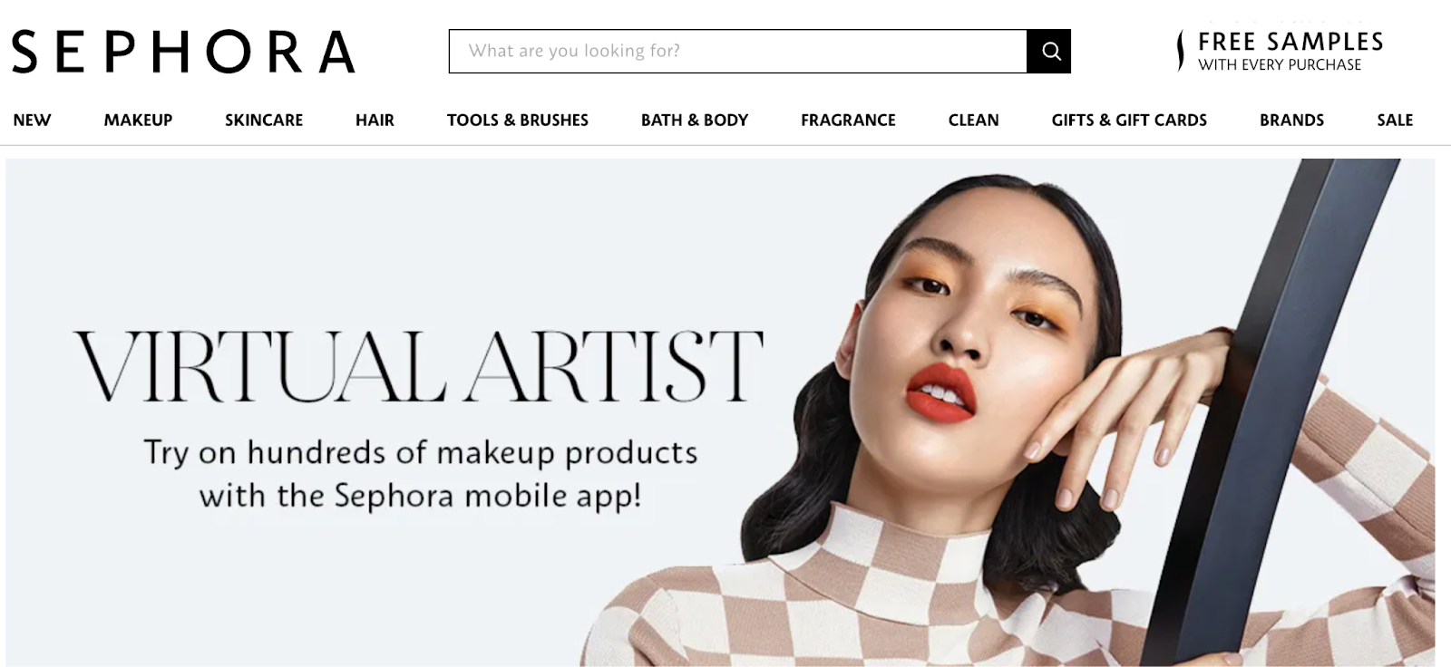
Quizzes, AI recs, and the AR-powered Virtual Artist tool (used over 200 million times) make the shopping flow feel like a personal consultation. Shoppers who use the AR try-ons are three times more likely to buy, and Sephora reports makeup returns drop by 30% when people test shades virtually, guaranteeing no more foundation mistakes in your bathroom lighting.
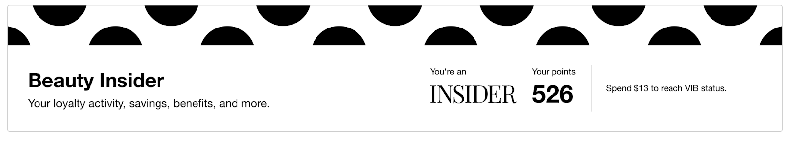
- Massive Loyalty Program
Beauty Insider, with over 34 million members, drives 80% of Sephora’s North American sales. The hook is its tiered setup: Insider, VIB, and Rouge. The more you spend, the bigger the perks: birthday gifts, deluxe samples, exclusive product drops, early access to sales, and invite-only events. It’s gamified beauty shopping. People are chasing status, and Sephora turns that into repeat business like clockwork.
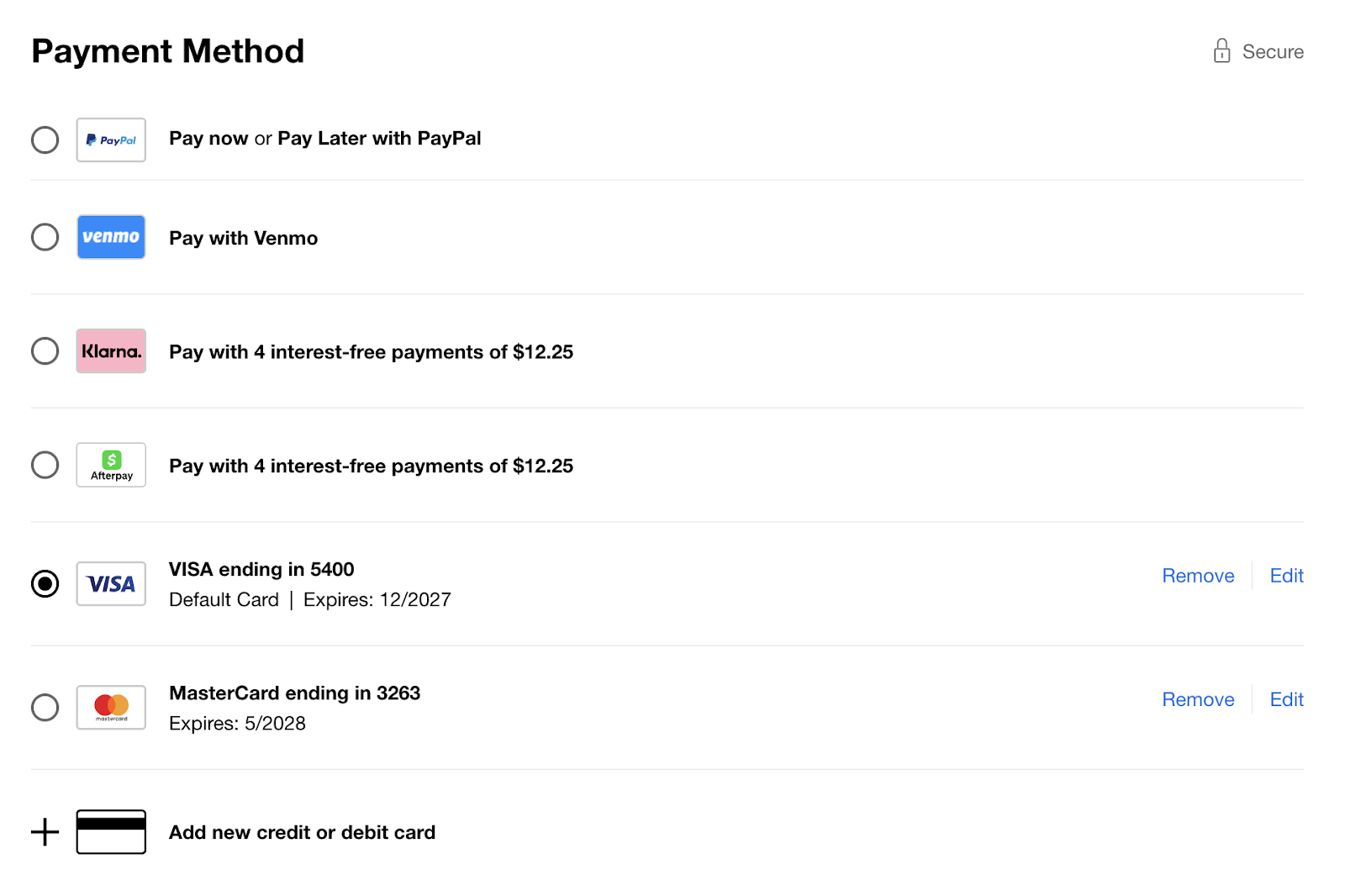
- Checkout that makes overspending effortless
Mobile-first, lightning fast, and stacked with options: Apple Pay, Google Pay, Venmo, Klarna, Afterpay PayPal. Add saved addresses and cards, and you’ve got checkout so smooth it makes splurging feel casual.
- Inclusivity and community as a feature
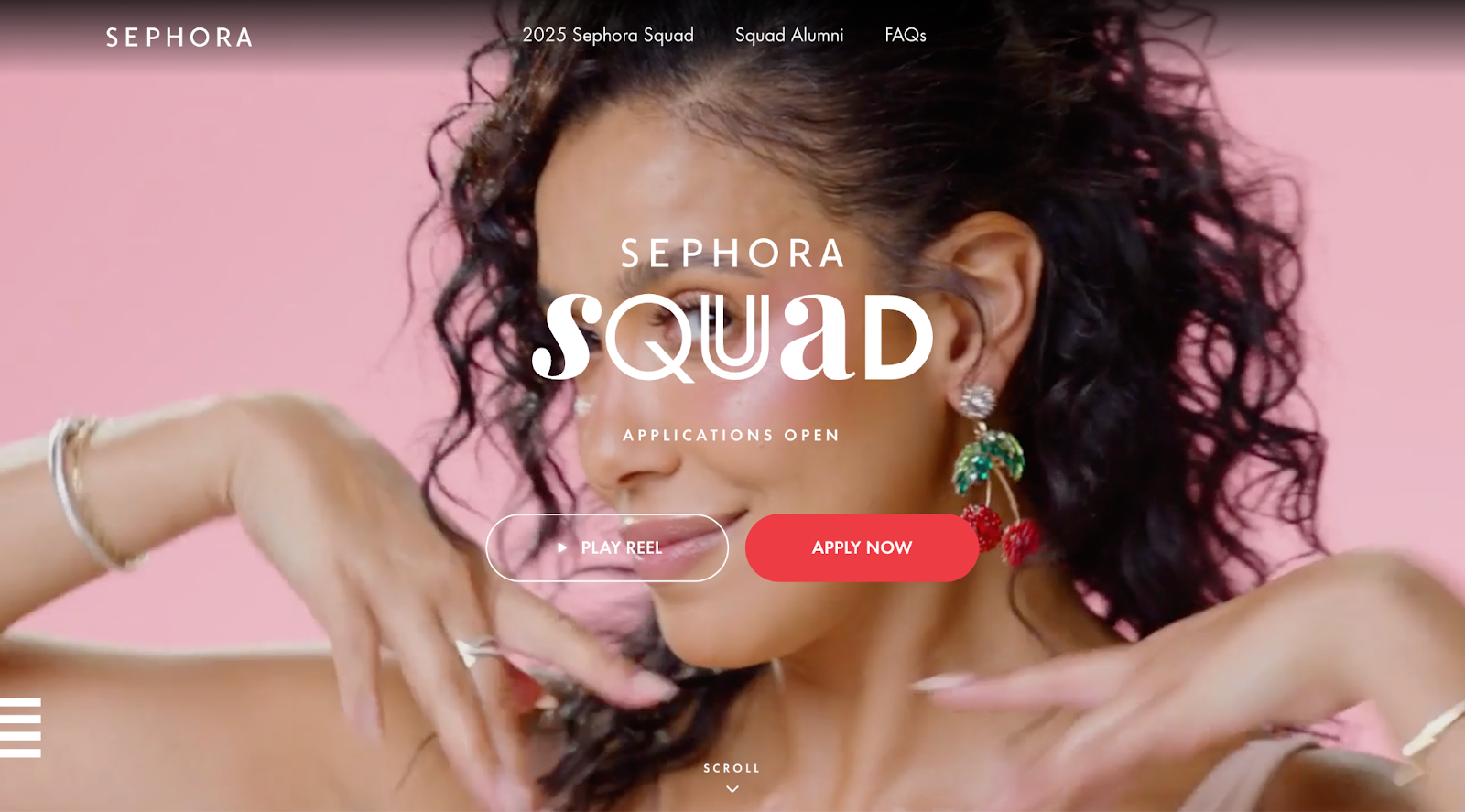
Sephora makes shopping feel like joining a crew. The SephoraSquad program highlights creators of every size, so the content feels relatable. Product pages are stacked with thousands of reviews and real customer photos, turning them into beauty forums that guide purchase decisions. On top of that, Sephora’s commitment to inclusivity (one of the broadest complexion shade ranges and spotlighting minority-owned brands) means more people see themselves reflected. The result is an online space that feels like a beauty community you want to be part of.
2. Ulta
Ulta knows how to blur the lines between online and offline shopping. Their ecommerce experience feels like a natural extension of their stores, and it’s loaded with features that keep people coming back.
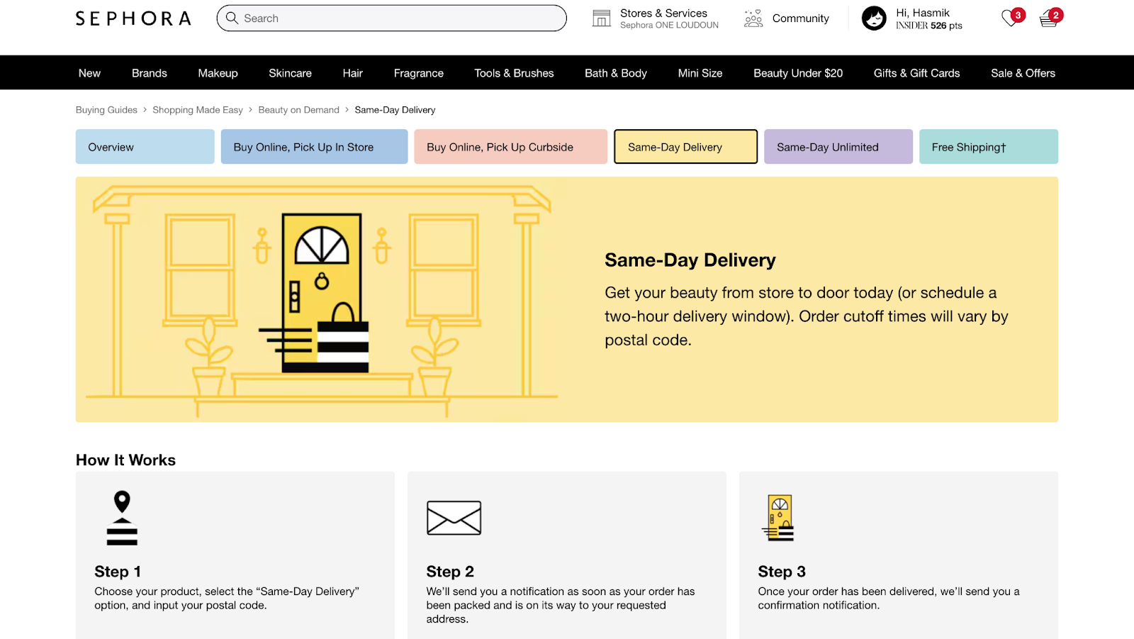
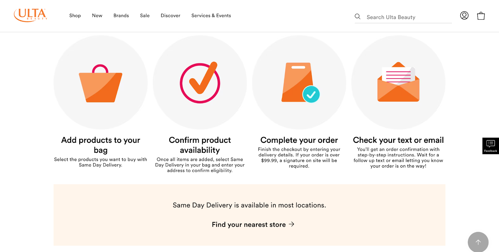
- Omnichannel convenience
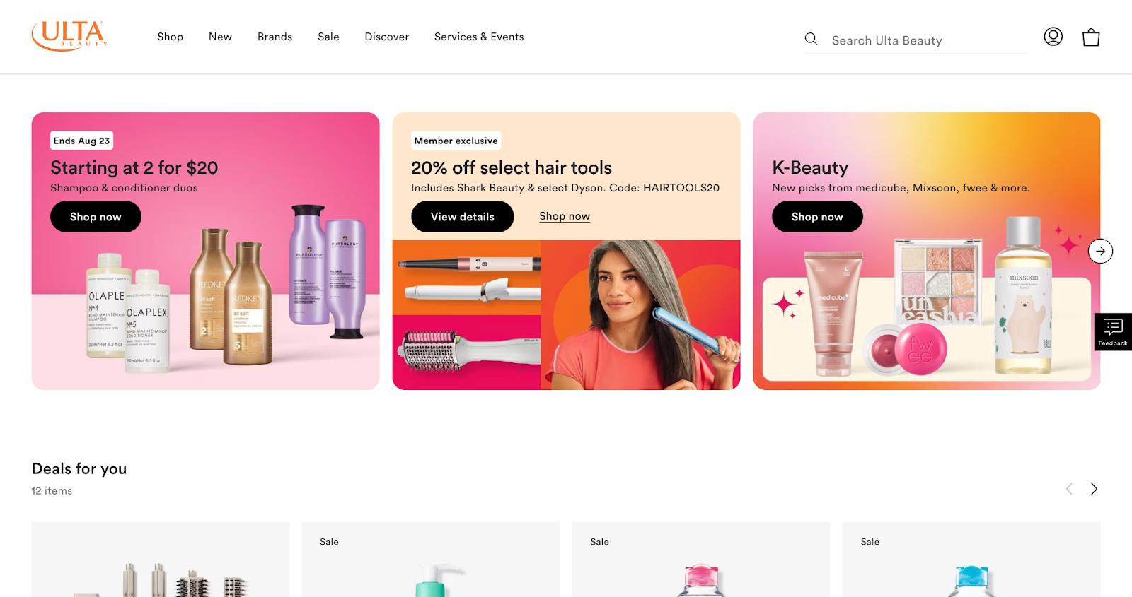
Ulta’s “Shop My Store” shows real-time local inventory online, so you know exactly what’s sitting on the shelf near you. Add curbside pickup, same-day delivery partnerships, and “split cart” checkout (ship some, pick up some), and Ulta makes shopping feel tailored to your schedule.
- Mobile-first design
Over 60% of Ulta’s ecommerce sales now happen on their app. The design is clean, responsive, and built to make scrolling addictive without the clutter. Search is smart too: auto-suggests, typo forgiveness, and strong filters help you find products fast.
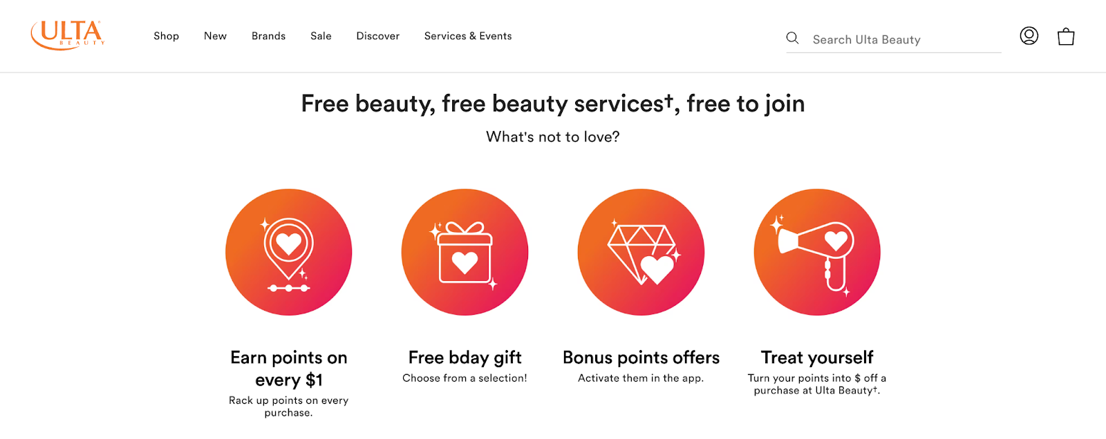
- Rewards that feel rewarding
Ulta Beauty Rewards® is 42 million members strong as of 2025. Points convert directly into dollars off (a perk shoppers rave about), and the program syncs across in-store and online. Data from this ecosystem powers personalized homepage blocks like “Deals for You” and “We Think You’ll Like,” making the site feel alive and custom to each shopper.
- Performance that converts
Ulta recently re-platformed to a modern web architecture, which cut page load times significantly. That speed boost helped drive high single-digit growth in online sales and a 30% jump in mobile app usage in 2024. Their team actively A/B tests everything to keep nudging conversion rates upward. Ulta treats UX like a living product, and the numbers show it, the main strength being how seamlessly it ties everything together: online discovery, app shopping, loyalty perks, and in-store fulfillment.
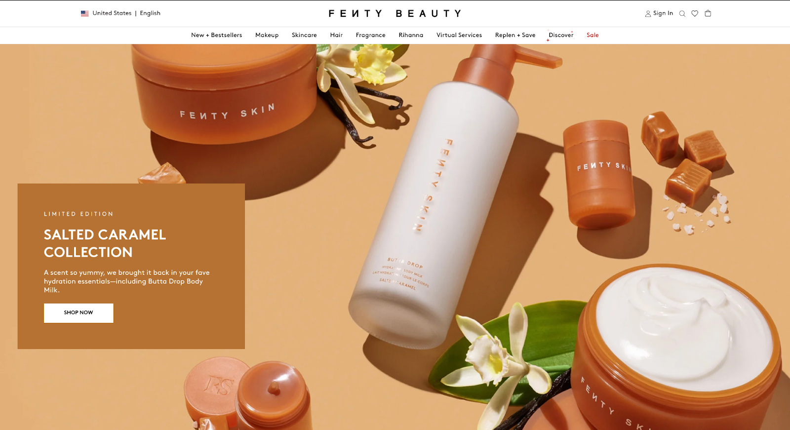
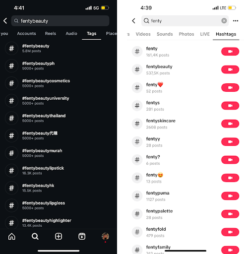
3. Fenty Beauty
Fenty flipped the beauty industry with its focus on inclusivity, and that energy carries into its ecommerce experience. The site and social-driven store feel built for today’s shoppers.
- Inclusivity as UX
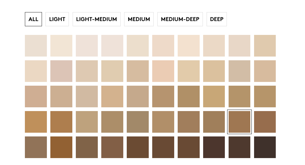
Fenty set the standard with its 40+ foundation shades, and it keeps building on that with gender-neutral skincare and campaigns featuring real people across identities, ages, and skin tones. This representation is baked into the shopping journey, making every customer feel seen. And none of it feels performative.
- Virtual try-on that actually works
AR tools let shoppers swipe on lipsticks or match foundations through their phone cameras in real time. It removes the uncertainty of shade-matching online, lowers return rates, and feels playful, while quietly boosting conversions by giving shoppers confidence before buying.
- Social-first shopping
Fenty thrives on TikTok and Instagram, where micro-influencer collabs and hashtag challenges fuel endless user-generated content. These posts often link directly to product pages, blending entertainment with commerce. It turns hype into a steady traffic engine, funneling community-driven buzz straight into purchases.
- Loyalty and subscriptions
Fenty’s loyalty setup blends subscriptions and perks. Replen + Save delivers essentials on autopilot with 10% off every order and 15% off the fourth, plus free shipping and early access to drops. Paired with Fenty Rewards, it locks in convenience while gamifying loyalty.
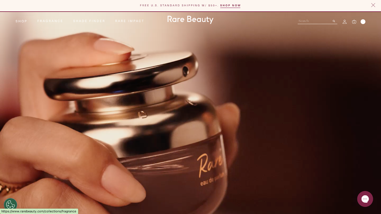
Rare Beauty’s site is a lesson in blending sleek ecommerce with emotional storytelling. The design keeps navigation simple and fast, while layering on tools that make shopping feel like joining a movement. It’s polished but approachable, with digital features that enhance trust and community.
- Optimized product pages
Each product page goes beyond basic specs. They include multiple high-quality images, tutorial videos, and swatches across skin tones. The layout balances storytelling with fast load speeds, so shoppers can explore deeply without friction or information overload—keeping the path to checkout smooth.
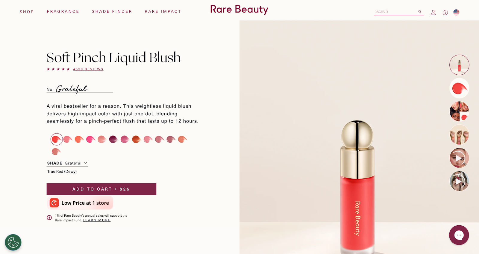
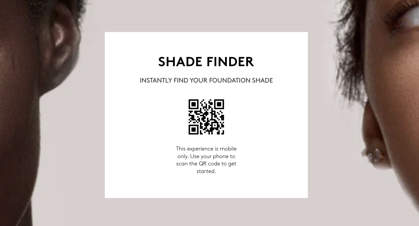
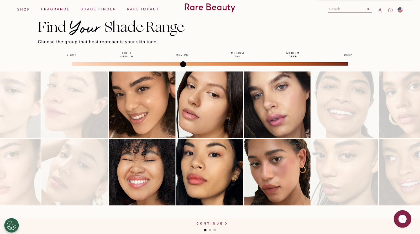
- Interactive shade matching
Rare Beauty makes finding your shade intuitive with clear swatches, comparison visuals, and try-on prompts. This feature reduces doubt at the point of purchase and lowers return risk, while giving customers a seamless digital alternative to in-store testing.
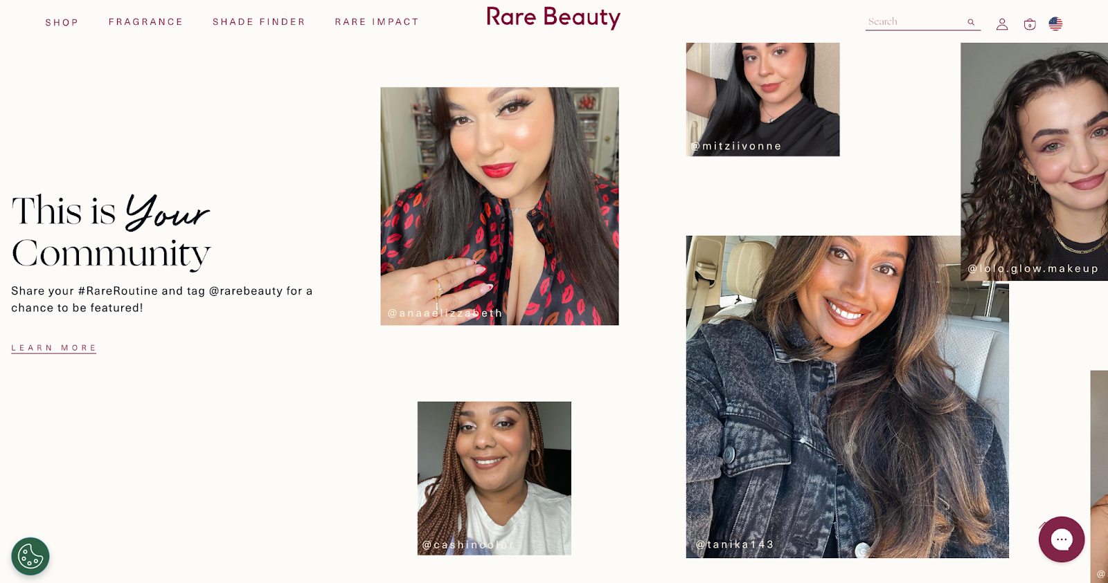
- Integrated community content
Reviews and UGC are displayed prominently, with photos and authentic commentary from real shoppers. This turns the site into a peer-backed recommendation engine. Customers see how products look on real people, which increases confidence and drives faster conversions.
- Clean checkout and mobile design
Checkout flows are stripped of clutter, with clear CTAs, multiple payment options, and fast mobile responsiveness. The site adapts beautifully to small screens, ensuring Rare’s mostly Gen Z audience can shop easily from TikTok links or Instagram swipe-ups.

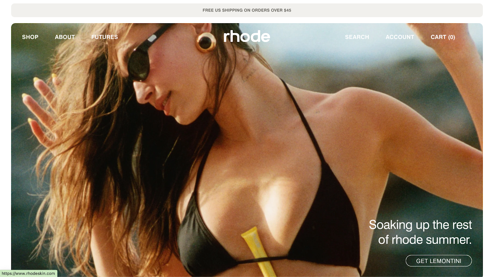
Hailey Bieber’s Rhode nails the minimalist aesthetic online, and that simplicity is intentional. The site is fast, mobile-first, and visually cohesive, keeping focus locked on products without distractions. Every feature from waitlist drops to checkout is built to drive hype while keeping the shopping journey clean.
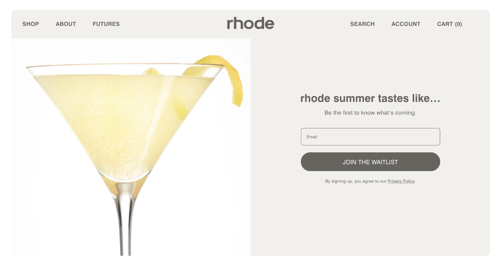
- Drop-driven ecommerce flow
Rhode leans on limited drops and waitlists, and the site is designed to support that. Email/SMS capture is integrated seamlessly into product pages, converting hype into leads. This structure fuels scarcity while keeping the experience smooth instead of chaotic.
- High-clarity product pages
Rhode’s product pages are stripped down but smart. Large visuals, clear ingredients, and direct benefits dominate. There’s no unnecessary copy clutter, which aligns with the brand’s clean identity while making it easy for customers to quickly evaluate and purchase.
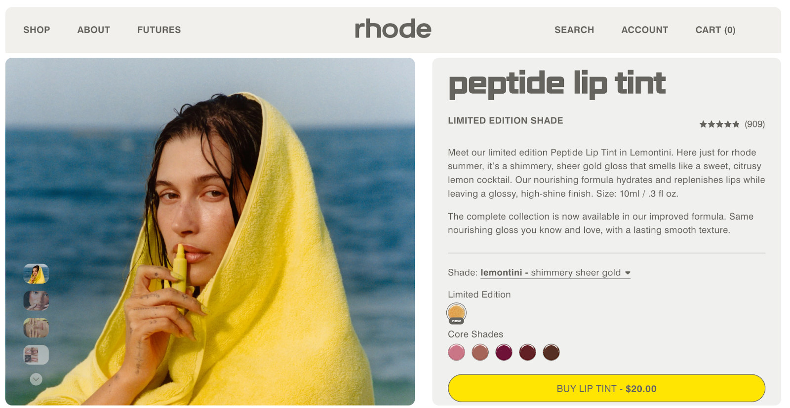
- Streamlined checkout
Checkout emphasizes speed and convenience. With Shop Pay, PayPal, and Google Pay placed front and center, customers can complete a purchase in seconds. Combined with clean design and a straightforward flow, Rhode makes conversion effortless, especially for mobile-first, impulse-driven shoppers.

- Hype-meets-UX email integration
Back-in-stock alerts, waitlist confirmations, and replenishment reminders are handled with polished, branded emails. The system feels personal yet automated, tying site experience directly into retention workflows without needing a massive loyalty program to keep customers engaged.
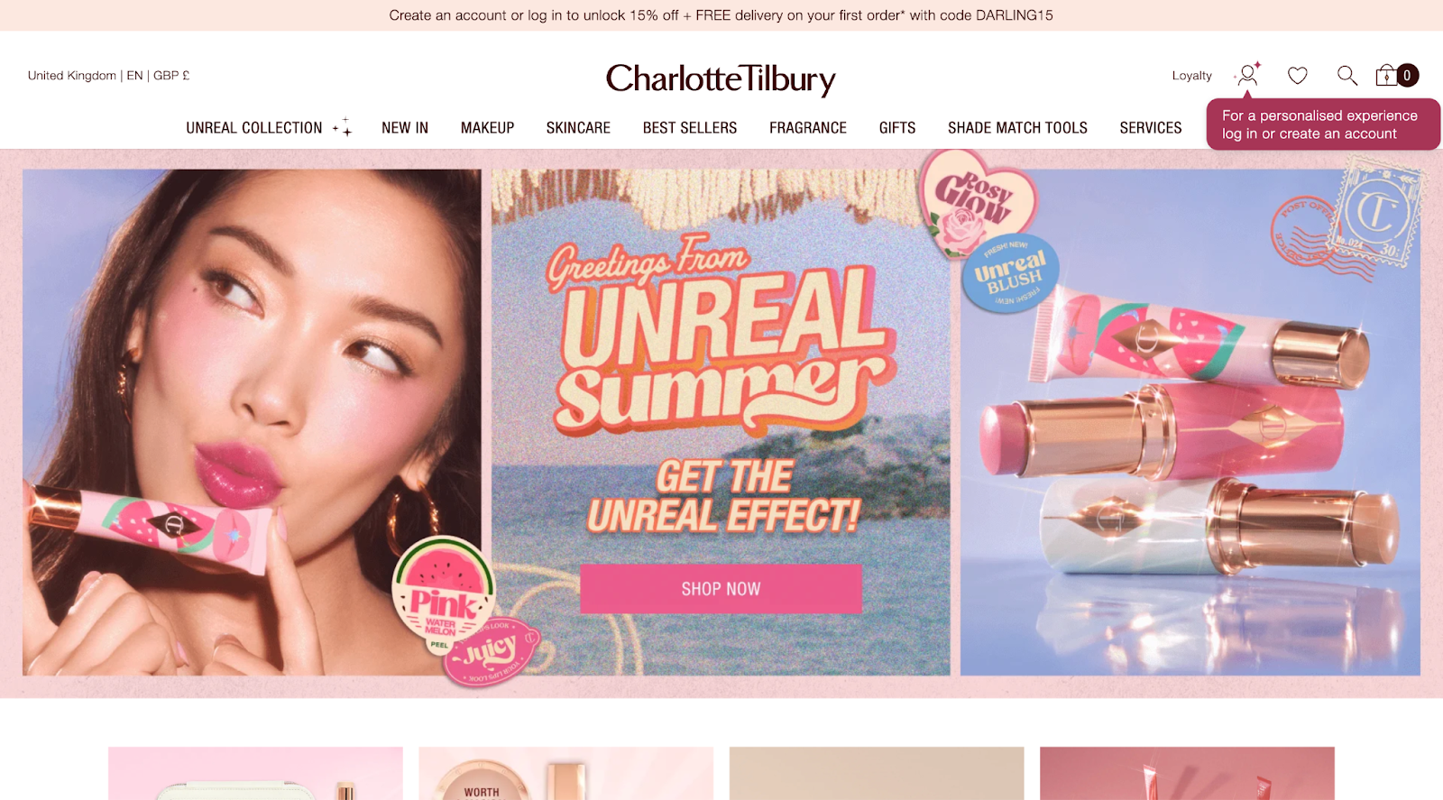
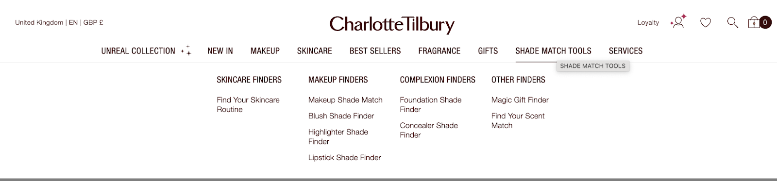
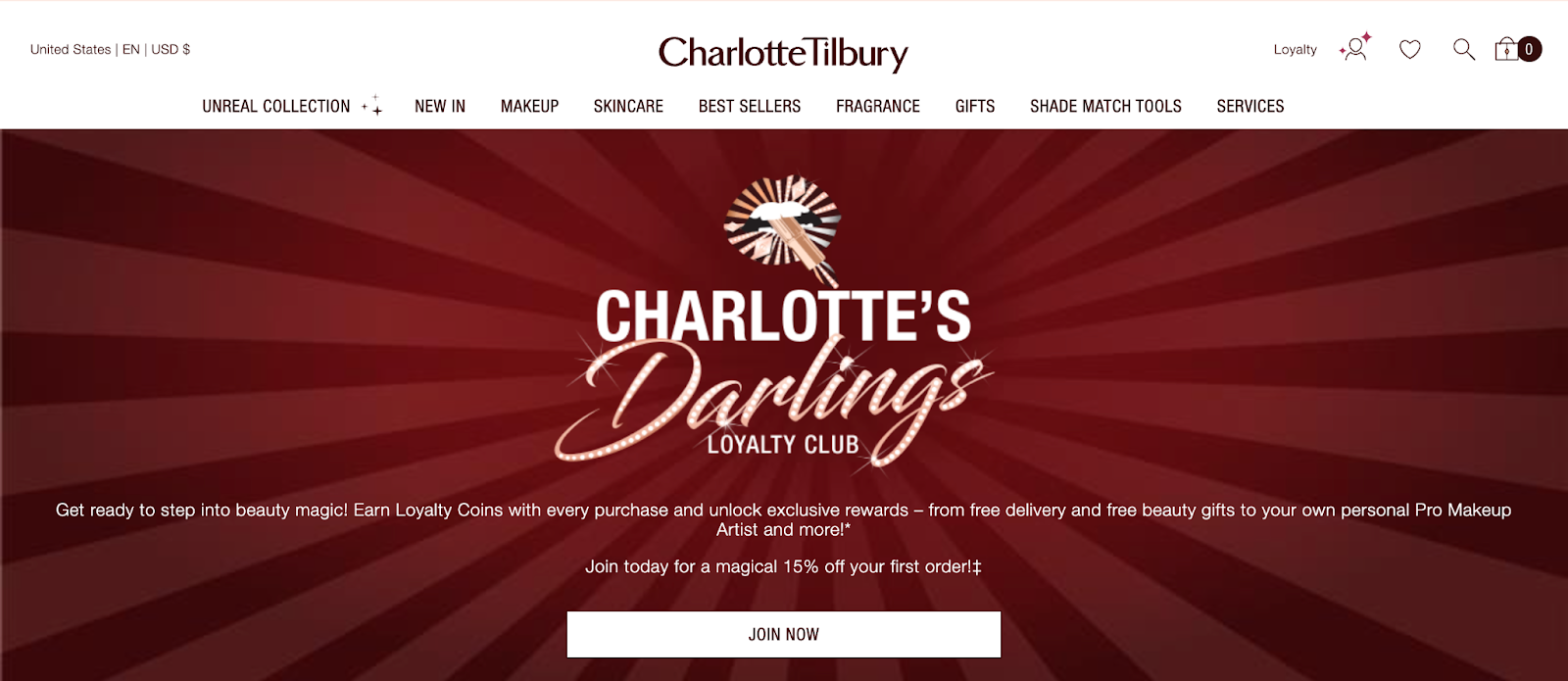
6. Charlotte Tilbury
Charlotte Tilbury’s ecommerce mirrors the brand’s glamorous in-store feel. The site blends high-end aesthetics with innovative tools like virtual consultations, AR try-ons, and content-driven selling. Every touchpoint is designed to feel premium while keeping the shopping journey smooth, personalized, and conversion-friendly.
- Virtual artistry tools
Charlotte Tilbury’s AR try-on tools let shoppers test lipsticks, eyeshadows, and foundations from home. Combined with the Pro Shade Match quiz, it recreates the consultation experience digitally. This builds confidence in high-investment purchases, reducing friction while bringing a luxury counter experience directly into ecommerce.
- Exclusive access and loyalty perks
The site layers in exclusivity with early access to launches, members-only offers, and loyalty rewards that feel elevated rather than transactional. These perks turn shopping into an insider experience, where customers feel part of a private circle instead of a general online crowd.
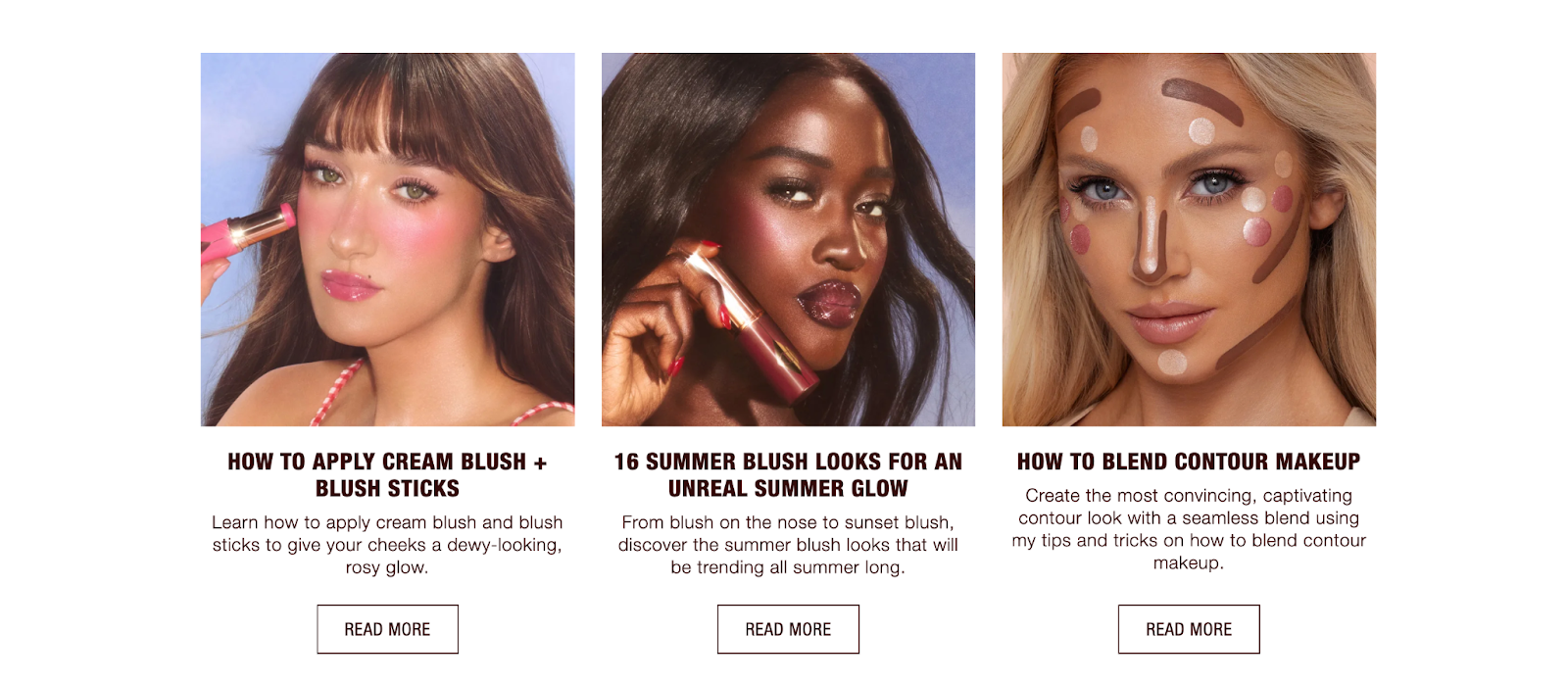
- Content-led commerce
Tutorials, how-to guides, and video demonstrations are integrated directly into product pages. The “Charlotte’s Beauty Secrets” content hub makes the site feel editorial as much as retail, educating while nudging toward purchase. Content cements trust, keeps customers exploring, and positions Charlotte Tilbury as both brand and beauty authority.
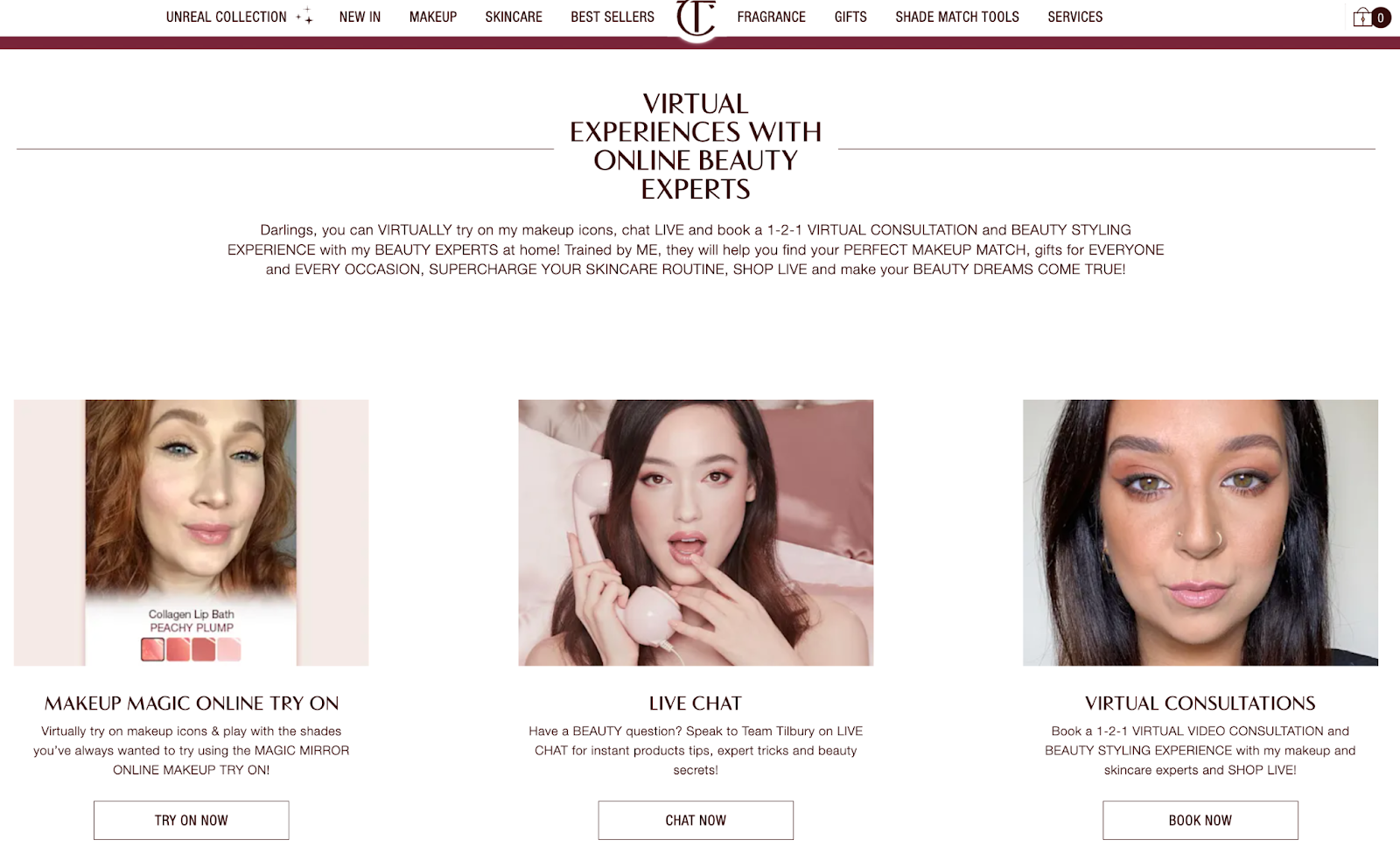
- Luxury service experience
Charlotte Tilbury builds premium service into its ecommerce. Virtual consultations with trained artists, exclusive kits curated by Charlotte herself, and flexible delivery options replicate the high-touch service of a luxury counter. It’s not just buying makeup, it’s being treated like a VIP online.
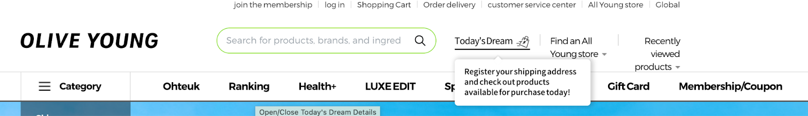
7. Olive Young
Olive Young is South Korea’s dominant beauty retailer and its ecommerce experience reflects that scale. The site connects seamlessly with 1,300+ physical stores while pushing innovations like AI-driven recommendations and one-hour delivery. It’s fast, content-rich, and built to make beauty shopping feel instant and effortless.
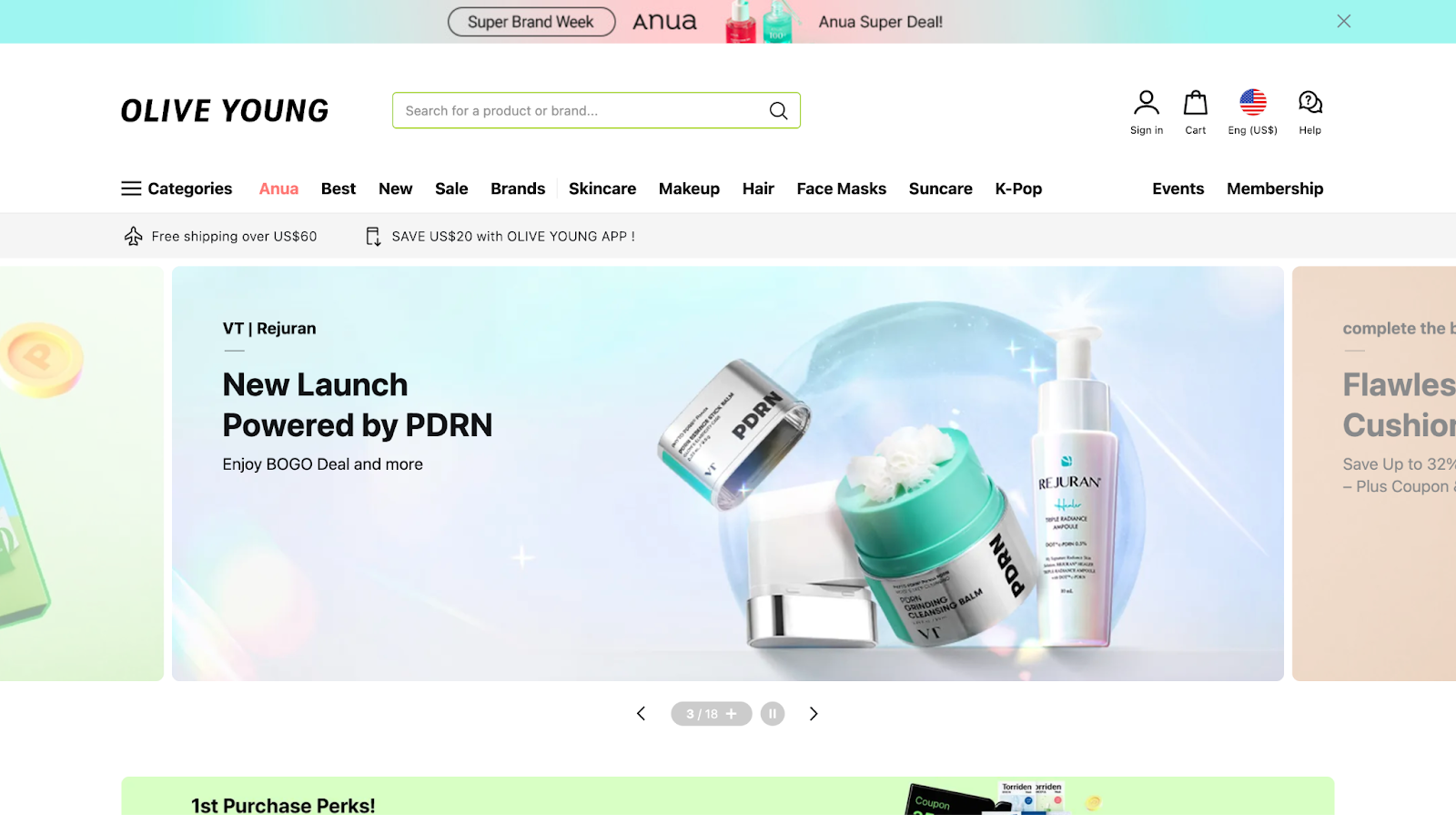
- Hyper-fast fulfillment
Olive Young’s “Today’s Dream” service enables one-hour delivery in South Korea, every day of the year. This q-commerce model sets a new bar for beauty ecommerce speed, proving how logistics and tech can transform convenience into a serious competitive advantage.
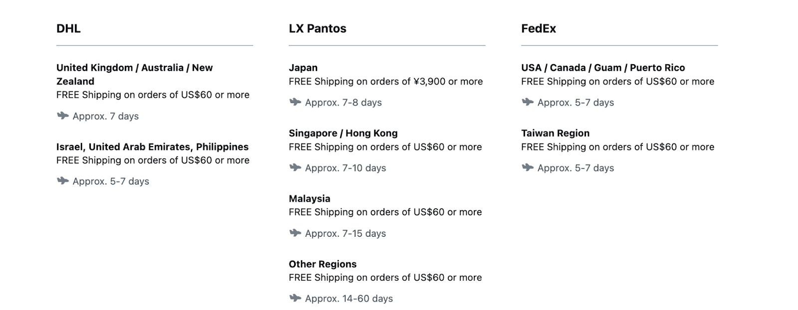
- Global reach with reliability
Through its Global Mall, Olive Young serves customers in 60 countries. A FedEx partnership ensures smoother shipping, particularly to the U.S. For global beauty fans, the platform delivers hard-to-find Korean products with the reliability of a mainstream retailer.
- AI and personalization
The site leverages AI to recommend products tailored to customer browsing and purchase history. Combined with curated collections, this personalization makes shopping less overwhelming and more engaging, guiding customers toward what’s trending and what suits their preferences.
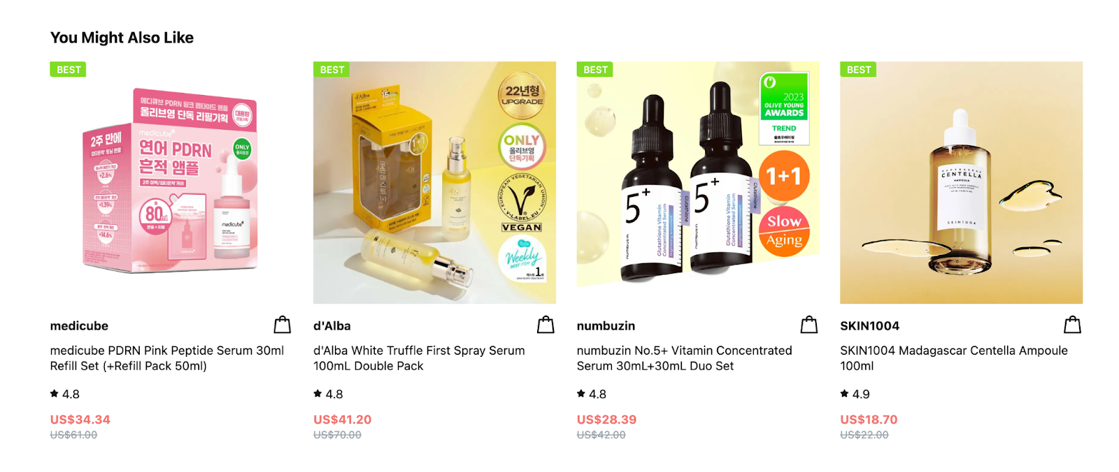
- Shoppable content experiences
Olive Young blends retail and media by embedding tutorials, product roundups, and live shopping streams directly into the site. Customers aren’t only scrolling, they’re engaging with interactive content that inspires and guides purchases, turning the ecommerce journey into entertainment and discovery.
What Successful Beauty Brands Teach Us About Ecommerce Experience
Looking across these brands, a clear set of strategies comes into focus. The next step is translating those into actions you can use right away without needing Rihanna’s or Hailey Bieber’s budget on speed dial.
Quick Wins You Can Steal Today
- Prioritize speed and mobile UX: Every leading beauty brand invests in fast load times and smooth mobile experiences. If your site stalls or feels clunky on mobile, you’re losing conversions before checkout even starts.
- Upgrade product pages: Don’t rely on static photos and copy. Add tutorials, swatches, or short demo clips to make your pages interactive. These small upgrades instantly boost trust and help customers make confident choices without leaving your site to hunt for more info.
- Make checkout effortless: Give shoppers multiple payment options (Shop Pay, Apple Pay, PayPal) and remove unnecessary steps. A clear, mobile-friendly flow keeps impulse-driven customers from abandoning cart, especially if they arrived via social or influencer-driven traffic.
Long-Term Strategies Worth Building Toward
- Personalization as a core feature: Tools like quizzes, shade finders, and AI-driven recommendations are retention engines. They’ve moved from optional extras to baseline expectations, reflecting the wider beauty ecommerce trends shaping how customers decide where to shop and who to stay loyal to. By personalizing the journey, you lower return risk, improve satisfaction, and keep shoppers coming back because the site feels tailored to them.
- Community integration: Reviews, UGC, and social content make your site feel alive. Sephora’s Beauty Insider and Rare Beauty’s UGC prove community-driven trust drives conversions. Build ways for customers to see real people using your products.
- Omnichannel consistency: The winning brands blend offline, online, and logistics. Shoppers expect convenience across channels. Building that consistency takes investment, but it’s what sets apart the leaders from everyone else.
Conclusion
Beauty ecommerce is wild, and the brands winning right now aren’t doing it by accident. They’re fast, fun, and built for the way we actually shop: scrolling TikTok at midnight, convincing ourselves “it’s basically free with points,” and buying anything Hailey Bieber touches.
The real takeaway? You don’t need a billion-dollar budget to make your store addictive. Start with speed, add interactive product pages, make checkout painless, and layer in community. Do those consistently, and suddenly your ecommerce flow feels less like a transaction and more like an experience people want to return to.
Because at the end of the day, beauty shoppers are chasing the thrill of finding something that feels made for them. Give them that, and you'll build loyalty every time they click “add to cart.”
[[cta5]]


.avif)

.avif)